10/26/09

FRED HARVEY on the road


Just a quick drop-in from along the road. 

Went to The Trees of Mystery today. Let's just say there's a HUGE statue of Paul Bunyan and his ox Blue standing out front. They're famous. I believe I even have some old postcards with their images, but just in case I bought a couple today. For decades I've driven by this place and never stopped. I'd laugh when I'd see Paul and Blue and think of roadside tourist attractions from my youth. Well this was worth the trip. An interesting walk through a forest, a ride in a tram to overlook the forest and the Pacific Ocean. Then they get you when you come to the finish. You walk through the door at the end of the trail into the gift shop and after paying for your visit you hear a woman saying "Free fudge sample." Oh man...I left a pound heavier...in a box to eat later. 

What really drew me to this place was the collection of Native American items in their museum. Beautiful baskets, including Pomo and Yurok, plains Indians clothes, all sorts of implements. A case of Kachinas that had me mesmerized. And then I saw this. I usually post items from my collection. I only wish I owned this. Fred Harvey Souvenir Playing Cards depicting various Native American tribes in the Southwest, all from tintype images. So though this is not in my collection, the photo of the photos is so I'm...oh geez, I'm going to say it...fudging things a bit this time.

fred harvey cards_tatteredandlost
Click on image to see it larger.

Back on the road. Catch you on the flipside.

10/21/09

The EYES have it


In 1873 Butterick Publishing Company began publishing a magazine, The Delineator, to show off it's various clothing patterns. The magazine was published until 1937. It was THE women's magazine of its day. 

During the 1930s many of the covers were done by the illustrator of the cover below, Dynevor Rhys. I've never been able to find out any information about this illustrator, but these covers are very collectible. To see more of the work from the 1930s click here

Delineator October 1931_Dynevor Rhys_tatteredandlost
Click on image to see it larger.

He also did illustrations for ads within the magazine as shown below. This one is on the inside cover of this issue of Delineator.

Dynevor Rhys_Rogers Bros. ad_1931_tatteredandlost
Click on image to see it larger.

I love these illustrations. They're stylized, vivid, and even if the eyes creep you out they draw you in. And they really do feel like the movies of the 1930s when people wished that life could maybe be truly grand even if their reality was something else. Wishes are like ephemera. Gone in a moment, replaced by something else.

10/18/09

The evolution of a PSYCHOTIC PENGUIIN


The penguin was content with his lot in life. 

He worked as a scientist for Sears and Roebuck in the Coldspot department. 


It was a good fit. He was used to fishing and keeping some of his catch on ice.


He lectured widely about the products he invented, giving clues to the clueless.


In his spare time he was a gentleman farmer. 

Planting.


Harvesting.


Cooking.


Enjoying.


But then he realized the true benefits of a Coldspot and farm life was never the same. I'll let the pictures speak for themselves. They were used as evidence in the trial.


Little Penguin had an ax,
He gave the chicken 30 whacks,
He gave the steer 30 more
Then opened up a butcher store.


10/17/09

This Halloween think of going as a HOME ECONOMIST!


Oh, I can get enough items from this 1954 Sears, Roebuck and Co. Coldspot Freezer booklet to last for days. It's a veritable gold mine of kitsch. When it came out it reflected what consumers were used to seeing, but today through the warped glass I view things...it's just a hoot.

Let's get started, shall we? 

Coldspot freezer_frontcover_tatteredandlost
Click on image to see it larger.

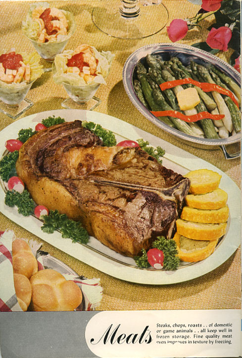
Food photos. Presentation is everything and as you'll see there are levels of success. The strawberry cake above, not bad. Not bad at all. Okay the color reproduction has that odd '50s look to it, but still it looks edible. I can't say the same for that hunk of meet that is on the inside cover. Oyyyyyyy...the fat on that slab of cow brings back memories. Not going there. Don't want to think about it. Let's just say I believe the color reproduction did little to whet anyone's appetite.  

Coldspot_slab of meat_tatteredandlost
Click on image to see it larger.

Now what about that limp overcooked asparagus?  Obviously cold or that pat of butter would have certainly melted under the lights. So I'm thinking okay, frozen over cooked asparagus. Not going to their house for dinner, but they are serving shrimp cocktail so it's not a total loss. Well...I think that's shrimp cocktail. Then again....

And then there are those yellow things next to the slab. I'm not really sure what that is? I'm thinking winter squash that's stuffed. There's no recipe in the book. Do you stuff them before freezing or stuff them with something that's thawed and unrecognizable that you've pureed? It doesn't matter what they taste like. Remember...now repeat it with me: PRESENTATION IS EVERYTHING

Which brings me to tablescaping. It's apparently a hobby. I only recently became aware of it. There are some seriously kitsch photos online of tablescaping. I'm hoping someone is gathering them for a future book. It boggles my mind. 

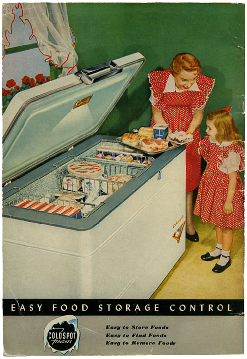
Speaking of boggling...do manufacturers still make mother/daughter outfits? I remember having mother/daughter/father outfits in Hawaii all made from the same Hawaiian print. I sort of like this odd domesticated scene on the back cover. Unnatural look to all of it just makes it even more fun. The mother is teaching her "little me"...are you ready? I think you can say it. PRESENTATION IS EVERYTHING.

Coldspot freezer_back_tatteredandlost
Click on image to see it larger.

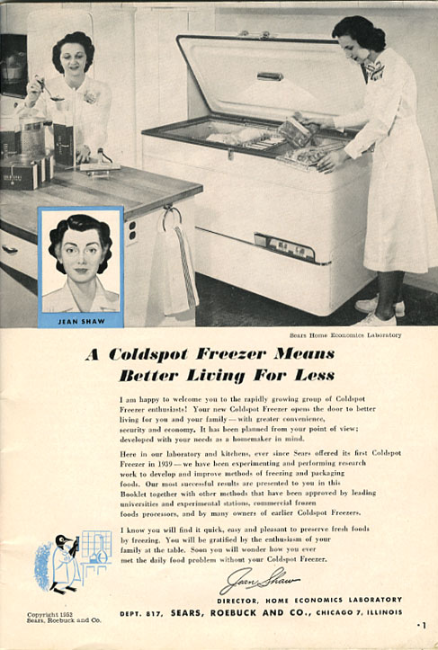
And lets not forget that apparently all of this was brought to us by the home economic droids. Seriously, look at the women in the lab white nurse dresses. Between the two in the room and the inset they look like triplets. Droid triplets. I'm thinking if you're going to a Halloween party consider going as the lovely Jean Shaw. She's got a little bit of Bride of Frankenstein and Betty Crocker going on. And what would you think if this woman with this expression were to bring in that slab of meat and place it before you? I'd be thinking "Oh shoot, left over parts. She's serving me left over parts!" and I'd be running out of the house past the villagers carrying pitchforks.

Coldspot home economists_tatteredandlost
Click on image to see it larger.

Now, I've left HIM for last. The penguin. Oh sure, he looks harmless enough. He's just a scientist penguin. Well, I will present evidence within the next few days that this little penguin is no ordinary penguin. Okay, I think I already made that point when I said he was a scientist. But no...I'm talking psychotic penguin. I think there's a reason this psychotic penguin and Jean "Bride of Frankenstein" Shaw are sharing the first page of this booklet. 

Stay tuned kids. Same penguin ephemera time. Same penguin ephemera channel.

10/16/09

HALLOWEEN EPHEMERA collected


If you're not familiar with some of the books of ephemera that Taschen has published you're missing out on some serious visual candy. One worth putting in your collection is Halloween: Vintage Holiday Graphics. A volume with page after page after page of wonderful imagery: postcards, photos of children in costumes, illustrations from children's books, masks, advertisements, etc. This will not be a book you'll
 thumb through once and put on the shelf. You'll be back to this one over and over again and each time you'll see things you didn't remember seeing the last time you picked it up. Okay, I'll say it...I give it two thumbs up. Thumbs seriously covered with chocolate from that Snickers bar I forgot about that's now melted into the seam of the bottom of my trick or treat bag. 

10/13/09

Driving my RED CADILLAC


When I was growing up Cadillacs were rich people cars. They had air conditioning. My folks had Fords, Chevys, and Oldsmobiles. We didn't have an air conditioner. Now Oldsmobiles are gone and Cadillacs are barely holding on. I drive a Japanese car. Who knew it would end up like this.

Cadillac ad_June 1955_tatteredandlost
Click on image to see it larger.

I just found this ad in the June 1955 National Geographic and it made me smile because I've spent moments today at the cyber ball at Willow Manor. Shows you what the net can do. Use your imagination and you can go anywhere. Today, I'm this frosty looking blond driving away in a red Cadillac with Thomas Crown at the wheel. My reality...stopped up sink, storm outside, power on and off, net access here and there. I think I'll step back into this piece of vintage ephemera and worry about that ugly clogged sink later. I can pretend I'm elegant even while I sit here in a dirty Relay for Life t-shirt, mismatched socks, and a pair of sweatpants that faded from their original color long ago. Of course this is exactly what this ad had in mind. Fool me into believing that if I bought this car I'd turn into Grace Kelly. Well, a girl can dream.

10/12/09

Al Buell, Brown and Bigelow, and TED MANTES


This is a little piece of ephemera I've kept for years. I actually don't know how old it is. It's at least from the '60s, could be the '50s. Until today I really didn't pay much attention to any of the information on it other than the Mantes name. 

Al Buell_calendar_Mantes Scale_tatteredandlost
Click on image to see it larger.

I knew T. R. Mantes, Ted Mantes. He was a very kind man, boisterous voice, extremely vice like handshake. He was well known in the scale business. He died many years ago. I worked during a Christmas break in 1969 at his office in San Francisco which was just down the street from the police station. I used to sit and look out the window at the station. Turns out they were watching us too. People used to come in to buy small balance beam scales and say, "Uhhh, I need a scale to weigh ceramic powder." We all knew what they were buying the scales for and it wasn't ceramic powder. Well the police station knew it too and they'd watch the buyers leave and apparently follow them. Somewhere along the line Ted was talking to someone from the station who let Ted in on the fact the place was being watched. They told him that quite a few of his scales were in the evidence locker. Ted, being the salesman that he was, asked if he could get them back so he could resell them. The cop said "no."

It was because of Ted that I have this old promotional ink blotter. That's what this card is. An ink blotter. It even has an ink stain on the blue backing. Today I decided to research a little bit about some of the other information given on the front.

First off is Brown and Bigelow, a promotional company that's been in business since 1896 when their founder, Herbert H. Bigelow, produced and sold a one-color cardboard calendar with a picture of George Washington for the St. Paul, Minnesota coal and wood company. In other words, Brown and Bigelow has been manufacturing ephemera for us for a very long time. They produced this ink blotter. According to the Brown and Bigelow website:
In 1936, our president Charlie Ward stunned the calendar industry by paying the then extraordinary sum of $10,000 for the exclusive rights to Maxfield Parrish’s "Peaceful Valley." Other artists, including Norman Rockwell, C.M. Coolidge, Gil Elvgren, and Zoe Mozert, soon joined our company as contract artists.
And then there's this very interesting information available at this website:
Remember those great-looking Boy Scout Calendars from back in the day? With the classic Norman Rockwell paintings? All-American stuff! Couldn't get more American than that. What you might not know is that the company in St. Paul Minnesota that published those calendars was quite an operation itself.

Hubert Huse Bigelow was the CEO of Brown and Bigelow and enjoyed a measure of fame for his meticulous management style and his tendency to wear unnecessarily "cheap" suites. When the Sixteenth Amendment created the federal income tax, Bigelow simply ignored the law and became the first target of government prosecutors. He was thus convicted on June 24, 1924, fined ten thousand dollars and sentenced to two years in the federal penitentiary at Leavenworth, Kansas.

Of course, prison life was not exactly Bigelow's gig. A guy like him needed "protection." That "protection" eventually came in the form of a new cellmate, one Charles Allen Ward, who was already four years into a ten-year sentence for violating the Harrison Anti-Narcotics Act. Ward was released on parole in 1925 and, when Calvin Coolidge pardoned Bigelow in 1928, Bigelow showed his gratitude and made his former cell-mate operating manager, then Vice-President, of Brown and Bigelow. He and Ward then proceeded, as a matter of company "policy," to hire hundreds of ex-convicts to produce those darling Boy Scout Calenders, playing cards and this and that. Franklin Roosevelt granted Ward a pardon in 1935 and Ward ran the company after Bigelow's death, until 1959. Bigelow and Ward, the former cell mates, both died as millionaires.
Brown and Bigelow is still in business as a "provider of promotional products and corporate merchandise services". Not bad for a company that started out hawking one calendar.


And now, the obvious. The lady of leisure. The pin-up gal painted by Al Buell. The following is from Wikipedia:
Alfred Leslie Buell (1910–1996) was an American painter of pin-up art. He was born in Hiawatha, Kansas in 1910, and grew up in Cushing, Oklahoma. He attended some classes at the Art Institute of Chicago, which, in concert with a trip to New York City, decided him on a career in art.

In 1935, Buell and his wife moved to Chicago, Illinois, where he joined the Stevens/ Hall/Biondi Studio. By 1940, he had opened his own studio. During this period, he did a number of pin-ups for the Gerlach-Barklow calendar company. Buell also did work for several other calendar companies in the early 1940s.

During World War II, Buell was rejected by the draft, so he spent the war painting a variety of popular and patriotic pin-ups for Brown & Bigelow. After the war was over, he began contributing to Esquire's Gallery of Glamour.

Buell returned to Brown & Bigelow in the late 1950s. He continued to paint glamour and pin-ups until about 1965, when he retired from commercial art. He remained active until he was injured in an accident in 1993, after which he remained in a nursing home until his death in 1996.
To see more of Buell's work see the following sites:
retrogirls.com which shows more work in the same style as shown on this blotter


A few more blotters at Majorettes

And finally HernĂ¡n Restrepo which shows the famous WWII poster
Until today this little card never meant much to me. Now I see a bit of the history involved on how it came to be. I value this now even more, though knowing it was from my family friend Ted Mantes was really enough. It's one of those little gems of ephemera that most people tossed away decades ago. A piece of paper with a history.
________________________

New book available on Amazon.
Tattered and Lost: Forgotten Dolls

This one is for those who love dolls!

Snapshots from the last 100+ years of children and adults with dolls. Okay, there are a couple of dogs too.

Perfect stocking stuffer!


10/10/09

Champion International = Modern Screen = MARILYN MONROE


Champion-International Paper was a large paper manufacturer originally founded in 1937 as U.S. Plywood Corporation. There's a good bet that if you collect ephemera you've got something manufactured by Champion. Perhaps an old movie magazine like say...Modern Screen.

Modern Screen debuted in 1930 as a magazine providing pictorials and interviews with movie stars. Somewhere in this house I know I have an old copy of Modern Screen from the 1960s. The magazine ceased publication in 1985.

But at one point, specifically the April 1955 National Geographic, Champion-International and Modern Screen came together to use Marilyn Monroe. Didn't everybody use Marilyn Monroe? Did she get a piece of the action for this ad? Did her agent work out a deal or were laws so different then on how a celebrity likeness could be used that this was as much as a surprise to her as those who opened National Geographic and saw Marilyn smiling back at them?

Well Champion-International is now International Paper. Modern Screen is no more. And Marilyn? Marilyn is still out there hawking products whether she likes it or not.

Marilyn Monroe_Modern Screen_Champion-International_tatteredandlost
Click on image to see it larger. (SOURCE: National Geographic April 1955)

10/9/09

Hi, and thanks for playing APOCALYPTIC NOW!


You'll be allowed to choose from one of the following answers in this round of 1955 APOCALYPTIC NOW! 

America Fore ad_July 1955_tatteredandlost
Click on image to see it larger. (SOURCE: National Geographic, July 1955)

You're alone with your wife/girlfriend/secretary on a back road when one of the following happens:
  1. The Communists attack, the Red Menace. Nuclear attack! Do not look towards the light!! Duck! Cover!
  2. Aliens have invaded plant earth and you and your wife/girlfriend/secretary/woman you picked up at the bar are left to fight off the alien space ships with nothing more than a make-up travel case and a flask of bourbon. It's the WAR OF THE WORLDS and you're Gene Barry (NOT Tom Cruise).
  3. You're stuck in a drive-in movie detective story, not even a B movie. There's a gang of thugs hunting for you and your luck you've got the mob guys doll with you. She chews gum and never shuts up.
Do you:
  1. Ask the usher for your money back because you've seen this movie done better with Sterling Hayden?
  2. Find a cheap motel with a flashing "otel, otel" sign, pull the drapes and place your gun on the top of the dresser, all the while clutching the bloody wound on your arm, keeping an eye on the doll who is keeping an eye on the gun?
  3. Or do as they tell you to do and contact a G-man at Department G, 80 Maiden Lane, NY NY?
I don't know about you, but I think they're pushing a lot of buttons in this ad. Every fear of the 1950s seems to be showing up here. But maybe that's just me 54 years later with a slightly twisted interpretation. Nahhhhhh...they knew what they were doing. They were trying to scare the you know what out of you so you'd buy insurance not knowing that one of those drone insurance salesmen sitting in your living room in the gray suit would convince you the War of Worlds had happened and the aliens won!

10/8/09

Penny loafers, hot rods, Coke, and A BOY NAMED BIFF


"They" had me convinced this is what life was going to be about. I thought I'd hang out at a malt shop, wear poodle skirts, sigh over Paul Anka, and go to the hop. Nobody warned me the 60s were coming and malt shops would be turned into head shops. And boys that looked like Biff would say nasty things to any guy who had hair touching his collar. 

I give you another in the Cola wars. Which person looks the least like your neighbor?

Coca Cola ad_June 1954_tatteredandlost
Click on image to see it larger. (SOURCE: National Geographic, June 1954)

10/7/09

Beach Party with CLASSIC COCA COLA


I must say the traditional glass Coke bottle is a beautiful design. And it looks especially inviting in this ad. The roundedness, the script casting slight shadows, the lovely water droplets making me want a nice cold frosty Coke. Advertisers knew what they wanted and illustrators knew exactly how to draw us in. It's a shame more work like this isn't being done for ads by illustrators. Everything is photography. Worse yet, everything is stock photography where everything looks a little too perfect and lacking in true emotion. Slick is the word I'd use. 

This Coca Cola ad is on the back cover of the July 1954 National Geographic. Again, just your basic generic middle-class white folk out having a carefree time. I related to these people back then. I was one of those families. At least I felt like we were. It makes me think of the time my dad went out to buy wood to build a sewing machine table for my mother and instead came home with a '56 Chevy convertible and three straw hats. This is the sort of thing you'd expect from the guy in this ad. 

Again, I have no reference as to who the illustrator was. Really a shame. I'd like to be able to give credit to those that did the work that has become iconic. I leave the door open to anyone who can supply names for these various illustrations. 

Coca Cola ad_July 1954_tatteredandlost
Click on image to see it larger. (SOURCE: NATIONAL GEOGRAPHIC, JULY 1954)

10/6/09

Brothers who drank COKE TOGETHER


So, is this the brother of the soda jerk at Woolworths? It's certainly NOT Eddie Fisher, though people these days wouldn't know that. You have to be of a certain age to know Eddie Fisher and young people today would assume Eddie was a bowler who had a weekly show and drank Coke in table cloth shirts.

Coca Cola_1954_tatteredandlost
Click on image to see it larger. (SOURCE: National Geographic, April 1954)

I'd say this is by the same illustrator as yesterday's and again I have no clue who it was. I'd say they worked from photos which means somewhere out there are people who posed for these illustrations or perhaps their relatives who cherish these images. 

This is on the back cover of the April 1954 National Geographic. National Geographic is a gold mine, I tell you. A GOLD MINE!

Unfortunately the next year, 1955, the Coke ads are photographs, no illustration, though I haven't yet found the December issue.

10/5/09

Remembering COCA COLA


Recently I was thinking back to the old Coca Cola machines that used to sit outside gas stations in the 50s. I saw one in a movie sitting outside an old store. I was suddenly drawn back to hot days in the car, pulling into a gas station, and hearing the "ding ding" as you drove across the bell cord announcing your arrival. Then the begging to get a cold drink would start. My mom or dad giving me a nickel for a coke. That red metal box was an oasis. Lift the lid and look down to see what was available. Sometimes what was inside was cold, just as often it wasn't. Decide which bottle you wanted, deposit your coin, and then drag the bottle along the rack to the end where, if the coin had deposited just right, you'd be able to lift your bottle up and out. Then sticking the cap into the bottle opener hole, pressing down, and wait for the sound of it popping off and falling down into the machine amongst the other caps. The sound of the soda's effervescence escaping from the bottle soon followed. Put the bottle to your mouth and usually you could feel the fizziness against your noise. If you finished the bottle while still at the station you'd put it in a wooden box next to the machine so it could be returned to the bottler to be filled again and again and....

I found this ad on the back of the February 1954 National Geographic. It brings back memories of trips to the lunch counter at Woolworth's with my grandmother and mom in Harrisburg, PA. Having a burger and a Coke while out shopping. Good times. Good times. 

coca cola advertisement_1954_tatteredandlost
Click on image to see it larger.

I do not know who the illustrator was. If anyone ever reads this and knows I'd be happy to add the information.

One other thing, the ad copy. "Because its goodness never changes" sure couldn't be said these days. Yes, I drank Coca Cola as a child and teenager, but not a lot. But when they stopped using sugar and went with the high fructose corn syrup...aaaakkkkkk!!!! Hate the stuff. Can't get it down. I remember for awhile my best friend had a "stash" from Mexico where they still used sugar. The difference in flavor is amazing. These days the only time I drink a soda is when I'm sick. Then I crave 7-Up or root beer. The rest of the year I won't go near the stuff. So Coke screwed up. They lost me as a customer a very long time ago. New Coke didn't even come close to old traditional Coke. You had a good thing going until you let ADM convince you "corn syrup" were the words of the future.

10/4/09

SANTA FE RAILROAD ad, tattered


This ends my theme of National Parks, Fred Harvey, and the colorful illustrations used to sell the Southwest.

Here's a Santa Fe Railroad ad from Holiday magazine, March 1949. As you can see, somewhere along the line, someone wanted something and took their scissors and did a little clipping on it, chopping out the Native Americans in the lower corner of the illustration. Looking online I haven't found this ad anywhere else so we'll just have to fill it in with our imaginations. To see other ads for the Santa Fe Railroad look here and here. And to read a little history about the railroad click on Atchison, Topeka, and the Santa Fe.

Santa Fe Railroad_Fred Harvey_Grand Canyon_tatteredandlost

I think you can see how the style of illustration became pretty iconic, including the paperdoll I posted on October 2nd, Blue Feather and Silver Cloud. Hope you've enjoyed this little visit through this lovely style of illustration all brought to my mind because of the National Park postcards I purchased years ago.

10/3/09

Fred Harvey, the Grand Canyon, and NATIVE AMERICANS


Here's one of those postcard booklets with the flip-down-two-sided cards. This one was part of the collection Fred Harvey sold. As usual, the illustrator is not given any credit. I love the front cover of the Hopi Pueblo and the back of the Navajo sheepherder in Monument Valley. Both really lovely illustrations in Southwestern colors. Each would make a really nice framed print. I wonder if these paintings even exist anymore? As you'll notice on the Navajo one there is the slit where the flap is to slip in to enclose the card booklet.

Arizona_Grand Canyon_Fred Harvey_tatteredandlost
Click on image to see it larger.

The shot of the Grand Canyon is also quite interesting. A black and white shot that had color tinting applied, most likely as overlays on the mechanical, it gives the Canyon a sort of candy colored rainbow look.

This dates most likely to the mid-to-late 1940s.

10/2/09

BLUE FEATHER and SILVER CLOUD Indian Cut-Out Dolls


Keeping with the theme this week, and a similar illustration style, I give you the 1944 Samuel Lowe Blue Feather Indian Cut-Out Doll. The dolls are very fragile and it took me years to find an intact set. So because of their condition I've only scanned the cover and the first interior page.

Blue Feather Indian Cut-out Doll_cover_tatteredandlost
Click on image to see it larger.

The set is very large measuring 8.3750" x 16.25". I love the illustrations and the cover reminds me of the old Santa Fe Railroad ads. I have never found any information about who or what Kay May is. I'm assuming this was the illustrator. I would love to see other work done by them. I'm assuming if their name was important enough to put on the cover they must have been well known. Anyone out there in the paper doll community have any information?

Inside each page deals with the clothing and everyday objects associated with a specific Southwestern tribe. I wonder if these dolls were sold along the highways at the old trading posts alongside those rubber tom-toms. I know I never saw them until just a few years ago and then became obsessed with getting a set. Once I had it I moved onto the next "want". There's always a "want". The sickness of collecting. At least with the wanting of ephemera you know you can always find a place to store it. Well, sort of, but it's better to not think about that mess behind me.

Blue Feather Indian Cut-out Doll_interior_tattereandlost
Click on image to see it larger.

10/1/09

RANGERDOUG.COM


My collection of National Parks WPA postcards from www.rangerdoug.com arrived today. I'm THRILLED with them. Each one is beautiful. Sure, it's early to even start thinking about Christmas, but if you want to give a really nice gift to someone who loves ephemera and has fallen in love with our National Parks via Ken Burns documentary or need the perfect stocking stuffer, do consider these cards, posters, etc. They're simply lovely. And 1% of their gross sales are given back to our National Parks. 

There are 24 cards total in the collection so there are many you haven't seen.

As I said in my post on Sept. 28, in no way am I affiliated with this company. I simply was lucky enough to find a few cards while on vacation in Wyoming. Now I look forward to framing these cards as a nice colorful grouping, historical in nature. 

www.rangerdoug.com_tatteredandlost

FRED HARVEY through the Southwest

 
If you're of a certain age and you travelled through the Southwest during the 1950s or earlier you'll recognize the Fred Harvey name and logo. I know I ate at a few Fred Harvey restaurants, but by the time I was there the romance of what they'd been had long since vanished. In their heyday they were the place to eat along the Atchison, Topeka and the Santa Fe railroad. And nothing made it seem grander than Judy Garland in "The Harvey Girls" singing that Oscar winning song. 

You can read about the real Fred Harvey at Wikipedia and how he started this chain of restaurants. Also how once he got the tourists off the trains and into his restaurants he was not through with them when they'd finished dessert. He wanted them to see his version of the Southwest and the Native people that lived there. Postcards and guide books were ready and waiting for his customers.

The guide book below dates from 1950 and is the 23rd edition. The first edition was published in 1917. No information is given about the illustrator, but it's similar in graphic style to so much of the work being done at the time for the Santa Fe Railroad posters. There are some wonderful photos inside, but I'm not willing to risk the binding to scan them. Occasionally this book comes up for auction on Ebay. It's a nice little book, but don't go paying much for it. The best part of it, for me, is really the cover.

Story of the Grand Canyon_tatteredandlost

And in my head I can now hear the opening notes to the Grand Canyon Suite by Ferde Grofé. Time to just close my eyes and drift away.