1/31/11

MARTIN AIRCRAFT At War In 1943


It was easy for a manufacturer of airplanes to run an ad during World War II. They were obviously part of the war effort. This ad is from the November 1943 National Geographic.

Martin Aircraft ad_1943_tatteredandlost

Click on image to see it larger.

I will give you some ads this week that didn't have it as easy as Martin Aircraft. In fact I'd say one company was nearly pulling at loose threads in order to show they were doing their part. But more of that tomorrow.

1/27/11

NEW YORK CENTRAL RAILROAD in 1943


I would have loved this ad as a child because of the miniature people and the fact that they showed a whole little world inside the train. Okay, it reminds me of the little buildings a friend and I used to build in tiny boxes. Take the lid off and a whole tiny world was inside. But this nonsense is not why I'm posting this vintage ad.

New York Central_1943_tatteredandlost
Click on image to see it larger.

Another World War II ad from the November 1943 National Geographic. This ad is full of war time talk including the apparent need to remind customers to be polite and not steal. Oh, and Buy War Bonds.

The New York Central is no more. To read the history of this railroad click here.

1/26/11

MILWAUKEE RAILROAD During World War II


Is this ad corporate propaganda? I think we can figure out what's going on here without reading the text, but the text does add more color. Try to imagine a large corporation running an ad like this today? The idea that through their efforts the enemy is being killed. I don't recall seeing any defense contractors going to the general public with this message today. They don't need our approval. They've got representatives bought and paid for. I think they'd rather we not know how they are profiting from the wars.

The nation was different in World War II. The citizens were united in one effort. Not today. From today's perspective I find this ad unnerving. Perhaps in 1943 I'd have felt different. I don't know. I have a hard time demonizing a group of people instead of just individuals.


Milwaukee Rail_1943_tatteredandlost

Click on image to see it larger.

To read a brief history about the now defunct Milwaukee Road click here.

1/25/11

BELL AND HOWELL During World War II


Keeping with the theme from yesterday about companies advertising their products during World War II, even if they weren't available to the general public due to rationing, I give you Bell and Howell. The copy is pretty interesting. Try to imagine a company saying this to customers today.

From the November 1943 National Geographic.

Bell and Howell_1943_tatteredandlost

Click on the image to see it larger.

To read an interesting bit of history about the use of Bell and Howell cameras during WWII go to The World at War.

1/24/11

When GLAMOUR AND TIRES MET


Yesterday I found a November 1943 National Geographic at the flea market. The country was at war and the advertisers were on board. Corporations were often pulled into production for the war with few of their products available to the general public. Were people making blood money from the war? Sure they were, but it wasn't as blatant as what we have today. I'll say no more.

The illustration in this ad is stunning. What an interesting way to sell something as mundane as tires. A glamourous girl and, might I say, a truly stunning looking tire! Sadly there is no signature by the illustrator. I'd love to know who did this. If anyone has information about the illustrator please let me know so I can credit them.

National Geo_Nov_1943_tatteredandlost
Click on image to see it larger.

UPDATE: Leif Peng, from Today's Inspiration, a wonderful site about 20th century illustrators, has sent me some links and verified the artist to be Dal Holcomb. To see more General Tire ads by Dan Holcomb click here, here, and here. And click here to go to Leif Peng's Flickr account to see thousands of wonderful vintage illustrations.

As to who was Dal Holcomb? I found the following biographical information at wilnitsky.com.

1/23/11

EARL STANLEY GARDNER and Perry Mason Through the Years, PART 3


Finally, the end of the Earl Stanley Gardner/Perry Mason cover posts. These date from the mid-1940s to mid-1950s. These are the cover styles I grab when I see them.

On the left 1953, the right 1956.

Earl Stanley Gardner_1953_1956_tatteredandlost

This one dates from 1952. I love the back cover.

Earl Stanley Gardner_1952_tatteredandlost

The one on the left is from 1944, the one on the right from 1949.
I find the use of lowercase letters on the 1949 cover interesting.

Earl Stanley Gardner_1944_1949_tatteredandlost

Interesting to see how often red and yellow were used over the years until we hit the 60s.

I find it fascinating to see how one author has been marketed through the years. What the publisher in each decade thought would sell. Do they reflect each decade or did the publisher sometimes miss the boat completely? I have no idea, but I know I'll keep collecting them when I find them in used bookstores and thrift stores. I like to be surprised by them when I find one and won't be buying them on eBay. eBay isn't fun anymore. It's cold and corporate.

And finally, all past Earl Stanley Gardner posts so you can compare the covers:


1/21/11

EARL STANLEY GARDNER and Perry Mason Through the Years, PART 2


Now, where was I before I was so rudely interrupted by bandwidth issues?

Continuing where I left off, I now give you some Perry Mason covers dating from 1959 to 1966.

This very lazy series cover dates from 1966. I'm assuming it was a decision by the publisher to make the most simplistic series style possible requiring little effort by all involved to say nothing of cheap. No photographer or illustrator to pay. Bring it in the front door, shove it out the back. Or as one fellow designer calls it, "sausage making." I'm not blaming the designer because cover designs are done by committee. Too often way too much input from too many people. This is just a sad case of everyone giving up. In a few years the publisher gave up with this idea and decided sex sold better (see my previous post). Sex sold the year before and sex sold the following years. What was there about 1966? I don't remember pirate things being particularly popular. Yes, I know that skull and cross bones signify death, poison, etc., but this was the best they could come up with in '66?

Printed in 1966.

Earl Stanley Gardner_1966_tatteredandlost

So let's go back a year to 1965 when sex was selling. Subtle sexuality. These photos could have just as easily been found in a woman's magazine. And though a series design, it was at least flexible. Okay, I have no idea what the redhead on the left is doing. Scouring the shower wall in the middle of the night? Did she sleepwalk and do windows? I can't say the images are particularly thought provoking, but then let's remember the direction the covers went the next year. Let's call these the Stepford years. Mindless looking women posing.

Printed in 1965.

Earl Stanley Gardner_1965_tatteredandlost

1962 and 1964. We've finally arrived at covers I'm interested in collecting. Yes, the illustrations look like they could have been from an early '60s Playboy, but they're interesting. You look at these women and know something is going on. They make you wonder what the story is. Well, what I wonder the most is why there's an arrow forming the first part of "Perry Mason" on the 1962 cover. I can guarantee you that someone at the publisher said, "...but is it too clever? Too gimmicky?" There was a committee decision behind this arrow. At least one person had to be convinced the arrow was important.

The cover on the left is from 1962, the one on the right from 1964.

Earl Stanley Gardner_1962_1964_tatteredandlost

1959. Now we're talkin'! This cover, front and back, is just plain fun. A seductress on the front with a strange modern painting of a guy behind her and a brochure in her hand. An interesting blend of vertical and horizontal movement for the eye. Not a stunning cover, but eye-catching. I do wonder what's going on here. On the back we get Earl Stanley Gardner's signature (how many people thought they had just bought an autographed book?) AND an ad for the Perry Mason show staring Raymond Burr.

Printed in 1959.

Earl Stanley Gardner_1959_tatteredandlost

The original tv series was on the air from 1957 to 1966. Earl Stanley Gardner died in 1970 (though one post on Wikipedia says 1969). I wonder how much input Gardner had in each final cover design if any?

To read Wikipedia's post about the Perry Mason tv show click here. Their post about the character of Perry Mason is here. To read about the author, Earl Stanley Gardner, click here. To read a very interesting post about Gardner click here.

Seriously, no matter what you think of the writing or of the show, Perry Mason has been around for a very long time. Good marketing or good storytelling? I'm thinking both.

More Mason covers to come in the next post showing the evolution of marketing one product through many decades.

1/8/11

EARL STANLEY GARDNER and Perry Mason Through the Years


Since I was moving things, specifically Perry Mason books, around on a bookcase I thought it time to do another post about the small collection I have. I have written about this collection twice in the past:

I haven't added anything to the collection in quite awhile because I haven't seen any from the time periods I like. This leads me into this post. Marketing a specific author in a specific time period.

It's fun to see how as decades passed covers changed to reflect what the publishers hoped was their market. The covers I like are from the 1940s and early to mid-1950s. They start to loose me in the late 60s, loose me completely in the 70s, and then barely redeem themselves in the 90s.

As I've said in past posts, I used to collect these books for my landlady who died in 1997. The two covers below were from editions that were on the shelf in bookstores in the 90s. They are simple, mainly typographic, with images that are all but forgotten. At the time there were a lot of vintage mystery authors being sold that had really nice covers. Earl Stanley Gardner was not one of them. They were boring. The publisher was obviously choosing safe colors, type style, and a boring image to attract readers. They all looked the same because the illustration was so secondary and pointless. It was sort of rote mystery buying. Mind you, they were only publishing a small selection of Gardner's work. I believe they were counting on Gardner fans to be their market and were not looking to attract new fans. Within a few years I never again saw a newly printed Perry Mason on any bookstore shelves.

The cover on the left is from 1995, the one on the right from 1989.

Earl Stanley Gardner_1995_1989_tatteredandlost

So let's go back to the 1970s when marketing was obviously geared mainly towards men who wanted to think all women were sexy babes. Many of the covers had what I would call "sex kittens" as their image. Graphically they are very 70s and pretty silly. I can't help but think of Laugh-In when I look at them. Okay, they also look a bit like ads you'd see these days for sex phone lines. The women look a bit stupid, slightly sexy, and the type who would have hung out (so to speak) at Hefner's house.

The cover on the left is from 1970, the one on the right from 1971.

Earl Stanley Gardner_1970_1971_tatteredandlost

Now, let's try Bond, James Bond. Well of course these aren't Ian Fleming novels, but they certainly do seem to be putting the idea of Bond girls on the covers. These date from the late 1960s. I don't collect these. Nor do I collect the ones from the 1970 through the 90s. They're all just so boring and stupid.

The cover on the left is from 1969, the one on the right from 1968.

Earl Stanley Gardner_1969_1968_tatteredandlost

The next post will deal with some of the images from the early 1960s and 1950s. For me these are interesting with a point of view that makes some sense to both men and women.

Now, the good and bad news. Some of Gardner's books are again in print. The bad news is that they are POD (print on demand) and have very uninteresting covers. The publisher is House of Stratus in the UK. Okay, I think the covers are pointless and poorly done which is often the case with POD books. I will leave it to you to decide if you think any of these books make you want to read them or if they in any way project the idea of Perry Mason. I give the company credit for getting Gardner out to a new audience, but these anemic covers would have me looking elsewhere for Gardner books. Namely used bookstores.

1/7/11

World War II, Books for Soldiers, and MARION HARGROVE


Yesterday’s post was partially about a mystery author from the early part of the 2oth century who appears now to be virtually unknown. Fame doesn’t last and a writer’s work can soon be forgotten except by the devoted fans who must search out used editions. Makes me continue to wonder about books in the future on digital devices. There won’t be books to pass down to family and friends. No books found at thrift stores. What will even be in libraries?

Authors, such as Anthony Berkeley, could actually enjoy a resurgence if a publisher chooses to reissue the books digitally, but first there needs to be a demand and how will that happen if he’s forgotten? In this respect I really like what Google Books is attempting to do. The writing from the past will not be forgotten. But again it will all be ultimately determined in this country by supply and demand. If there isn’t a profit to be made the words of a deceased author may simply vanish. I happen to like the fact that I will always have books in my life and hope to be gone before everything becomes digital. Which brings me to today’s post...

This book was found on a table at my post office where they used to allow a book and magazine exchange. The current postmaster has stopped this practice, turning what was a fun and friendly place into just another boring post office I rarely visit.


See Here, Private Hargrove_tatteredand lost

See Here, Private Hargrove__bk_tatteredandlost

I have not read this book, but eventually will having now found out some interesting information about the author (I will also be reading the one from yesterday). And isn't it interesting that the author's name does not appear on the cover except as part of the title?

Again, one of the things that drew me to the book is the fact it too was published during war time, World War II, just as yesterday’s book was.

First, let us deal with that little black box on the back cover. In yesterday’s post it was noted that the publisher, Pocket Books, encouraged readers to “share” the book with someone in uniform. Today’s book, published in 1944, a year before yesterday’s, asks you to “Send this book to a boy in the armed forces anywhere for only 3 cents.” Now we’re talkin’! This makes sense. Why did things change in ’45? Did they sense the war was coming to an end? Had too many people taken them up on the 3 cent deal and they’d found their profits dropping? Had the government stepped in and changed the rules? I haven’t a clue. Probably something worth researching.

Take a look at the following pages and try to imagine a company today asking anyone to give something of themselves for the country. We are told on a daily basis to take, take, take and buy, buy, buy. We are not asked to put ourselves second by any corporation, or for that matter even by many in the government. The war and those serving are someone else’s problem. Unless we are constantly reminded about the fact we’re at war we conveniently forget it.

help win the war_tatteredandlost

paper drive WW2_tatteredandlost

list of Pocket Books 1944_tatteredandlost

Marion Hargrove, the author of this book, which was originally published in 1942 by publisher Henry Holt, is a man who left his mark on many of us, even if we don’t know it.

Did you ever watch the much loved movie The Music Man? Mr. Hargrove wrote it. He wrote for the tv shows Maverick, The Rogues (a show I loved during its brief run), I Spy (LOVED that show), 77 Sunset Strip, even The Waltons. So most likely at some point you’ve seen some of Marion Hargrove’s work.

As to this book, here’s a bit of a piece posted at AMC’s site that explains how the book came about:
Marion Hargrove was an author, Hollywood screenwriter, and writer for television whose initial success came through a series of accidents, including numerous experiences in military training. Born Edward Thomas Marion Lawton Hargrove, Jr. in Mt. Olive, NC, and later raised in Charlotte, he developed an interest in journalism while in high school. At age 20, he took a full-time job with the Charlotte News as a features and women's page editor as well as a writer and rewrite man. In July of 1941. Hargrove was drafted and, through a combination of physical ineptitude and an individualistic approach to following orders, achieved an astonishing level of incompetence as a rookie soldier. He became a legendary incompetent at Fort Bragg, the camp where he was stationed, and he wrote about some of his experiences for his old newspaper.

Fate took a hand in early 1942 when, by sheer chance, he was assigned to show playwright Maxwell Anderson around the base. He presented some of his writing about his comical exploits to Anderson, who, in turn, passed it along to publisher Henry Holt, who was impressed enough to assemble Hargrove's columns into a book, which was published as See Here, Private Hargrove (1942). The book enjoyed combined hardcover and paperback sales of over two-and-a-half-million copies and also earned the blessing of the War Department, which wisely saw Hargrove's gently self-deprecating, humorous vignettes of army life as a way of reassuring prospective draftees and their families that military service wasn't all danger and hardship. (SOURCE: AMC)
Click on the source link above to read more of their column. And click here to see his listing at IMDB.

Wikipedia provides the following information:
Marion Hargrove (October 13, 1919 – August 23, 2003) was an American writer noted for the World War II bestselling book See Here, Private Hargrove, a collection of humorous newspaper columns written mostly before the United States entered the war. (The book was made into a 1944 movie with Robert Walker as Hargrove and Donna Reed as his love interest.) During the war, he served on the staff of Yank, the Army Weekly. After the war he wrote two novels: Something's Got to Give (1948) and The Girl He Left Behind (1956). He also wrote for various popular magazines, and served as feature editor of Argosy.

In 1955, Hargrove settled in Los Angeles and began writing television and film scripts. His credits include Cash McCall (1960), The Music Man (1962), and television episodes of Maverick (1957), The Restless Gun (1957), Colt .45 (1957), Zane Grey Theater (1957), the pilot script for 77 Sunset Strip entitled Girl on the Run (1958), The Rogues (1964), I Spy (1966), The Name of the Game (1969), Nichols (1972), The Waltons (1975), and Bret Maverick (1981). Collaborator Roy Huggins discusses Hargrove at length in his Archive of American Television videotaped interview. Hargrove was one of three Hollywood writers interviewed and analyzed at length in Prime Time Authorship (2002), by Douglas Heil. While working at Warner Bros. in 1959, he was the center of a successful grass-roots letter-writing campaign to acquire a suitable couch for his office on the studio lot. A selection of these letters was published in Playboy Magazine under the title Hollywood Horizontal (1959) and anthologized in The Playboy Book of Humor and Satire (1965). With characteristic modesty, Hargrove never publicly claimed to be their sole author. (SOURCE: Wikipedia)
Click here for another column with photos of Mr. Hargrove.

And you can click here to read a rather touching post from his son following his father’s death.

All in all I’m quite happy I took this little old paperback off the shelf today.

1/6/11

ANTHONY BERKELEY, Mystery Writer


First off, when you receive a software update notice and you find that update is over 1 gb and you're on satellite...your online usage comes to a standstill. So it was for me yesterday. I set the download going and just walked away from the machine. Everything now is neatly installed, ship to shore up and working. All clear.

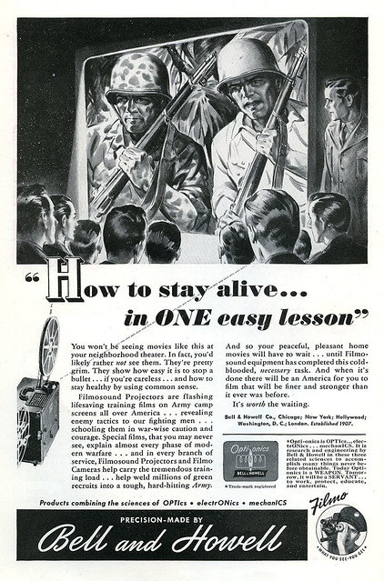
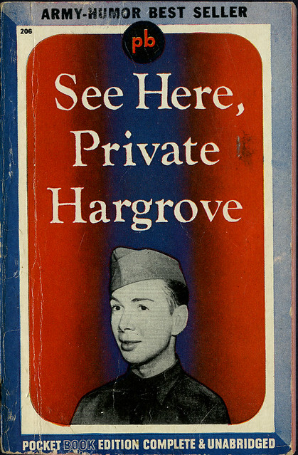
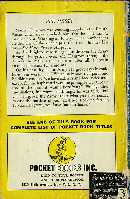
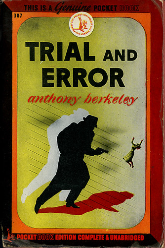
Today I feature a book I found at a thrift store years ago. The graphic image grabbed me as well as the fact that it was one of the special war time issues in which the publisher included a blurb on the back cover stating "Share this book with someone in uniform." They gave no information as to how you were supposed to do this and no information that they would provide a free or discounted copy in a way that would lead you to believe they were being especially patriotic. I'm guessing they just thought you should give your copy to someone in uniform (and guys working at gas stations in uniforms need not apply). But then we come to the word "share" which means that you are not actually giving the book to someone and you expect to be able to get it back. You are after all just sharing the book.

So let's say you met a soldier in a drug store in 1945 and you felt all patriotic and walked up to him and said, "I want to share this book with you." The soldier, taken aback by your kindness, takes the book from you and puts it in his pocket after saying, "Thank you." You remind him that you aren't giving it to him, you're just sharing, and that you've left your address on the inside cover so that he can return it to you when he's finished with it. Now this might have worked as a genuinely good come-on if he was especially appealing to you, but if you were just sharing because you thought it patriotic...I think you can see where I'm going. Nowhere.

Trial and Error_anthony berkeley_tatteredandlost

Trial and Error_anthony berkeley_bk_tatteredandlost

As to the book Trial and Error by Anthony Berkeley I have found the following, though nothing specifically about this October 1945 edition of a book originally published in 1937.

First off, neither movie that was made with the title Trial and Error (Peter Sellers and Richard Attenborough in 1962; Jeff Daniels and Michael Richards in 1997) have anything to do with this novel. Apparently this is not a copyrighted title. So if you're thinking of writing a cookbook you might find this a useful title, especially for a book on cakes (which makes me think of the book Cake Wrecks, one of the funniest books I've ever seen and which got its start at this blog: www.cakewrecks.com).

Now, if you Google "Trial and Error" you'll find over 3,500,00 results, including a book published by Oxford University Press in 1985 with the subtitle "The American Controversy Over Creation and Evolution." Okie dokie then. Not opening up that can of billions of years old worms or 6000 year old worms, depending on your DNA.

After looking at 10 pages of Google suggestions and seeing nothing about this particular book I reluctantly tried Bing which said there were 157,000,000 entries. Yeah, I'm not feeling the love of those Microsoft Bing clearing-your-brain-of-clutter ads.

You will find that the first Google entry is actually Wikipedia's discussion of the phrase "trial and error" and the surrounding methodology:
Trial and error, or trial by error, is a general method of problem solving, fixing things, or for obtaining knowledge. "Learning doesn't happen from failure itself but rather from analyzing the failure, making a change, and then trying again." (SOURCE: Wikipedia)
So basically we have no idea why this author, Anthony Berkeley, chose this title and have no idea how it pertains to the copy on the back cover.

As to Mr. Berkeley himself there is some information to be had.

First from our favorite, Wikipedia (you know one of these times I'm going to slip up and type Wikileaks and then I'll end up on the no-fly list for sure):
Anthony Berkeley Cox (5 July 1893 – 9 March 1971) was an English crime writer. He wrote under several pen-names, including Francis Iles, Anthony Berkeley and A. Monmouth Platts.

Life
Berkeley was born in Watford, England, and educated at Sherborne School and University College London. After serving in the Army in World War I, he worked as a journalist for many years, contributing to such magazines as Punch and The Humorist. In 1938 he took up book reviewing for John O'London's Weekly and the Daily Telegraph, writing under his pen name Francis Illes. He also wrote for the Sunday Times in the 1940s, and for the Manchester Guardian, later The Guardian, from the mid-1950s until 1970. (SOURCE: Wikipedia)
They then give a listing of his novels with "Trial and Error" listed under "Other novels" which seems a tad disrespectful. "Oh yeah, that's one of his other novels."

Looking at the site Fantastic Fiction in the UK you'll see at some point the book was reissued with a different cover. Checking Amazon shows only used books so I'm making a huge assumption that he is not being published in the US these days.

To actually read an interesting piece about the author go to Martin Edwards Books. And to see a photo of the author go to Classic Crime Fiction.

To see a picture of Peter Sellers click here which will take you to the official Peter Seller's website. Yes, it's true, the deceased and much missed Peter Seller's has a website. And yes, they offer "news" updates. Okay, not asking why they offer news updates. And by the way, when I clicked on "News" nothing showed up so I guess they've got the whole news thing covered.

And how is it I ended this piece with Peter Sellers? Trial and error of course.

1/3/11

A NEW YEAR With a Couple of Recommendations


Now that we're officially out of the season, though my tree is still up and looking beautiful, it's time to move away from festive ephemera or anything pertaining to the holidays. You'll soon find I'm reneging on this.

This post is about two books you might be interested in, both with links to Amazon in the left column where you can see pages from their interiors and read reviews. One about ephemera, the other about being an artist.

Breathless Homicidal Slime Mutants by Steven Brower. Okay, I actually think they could have chosen a better title because this is simply too "hip" for a lot of people. It doesn't really give you an idea of the wonders between the covers. If you like collecting vintage paperbacks this is the latest book to provide a quick fix. Page after page of wonderful, odd, and salacious covers of all genres. Mysteries, science fiction, westerns, romance, even the classics, and so much more are covered. I was pleased to find a few books I actually own including this one below, I Want to Live.

A movie tie-in book for a film noir starring Susan Hayward for which she won an Academy Award. Want to see the movie? Turner Classics will be showing it on January 16th, check your schedule for the exact time.

I Want to Live_Susan Hayward_tatteredandlost

I Want to Live_bk_tatteredandlost


Now, the second book is a complete opposite. Signed, Abiah Rose is a wonderful children's book that my friend, who is an illustrator, gave to me for Christmas (told you I wouldn't let the holiday go in this post). An edition signed by the author Diane Browning. A tale of a young girl in the 18th century who wishes to be an artist. Though allowed by her father to paint, she is discouraged from signing her work, her mother telling her it would be "prideful." Oh my how times have changed. Abiah chooses to quietly sign her work with a rose. How many traveling artists from long ago were women hiding their identity? A beautifully illustrated book with an uplifting story. Do check out her blog at http://www.dianebrowningillustrations.com/.

As I said, totally different subject matter, but each book well worth owning.

1/1/11

SLIDIN' INTO THE NEW YEAR


New Year post card_S. Garre_tatteredandlost

New Year for me is the day I finally get to take the shrink wrap off my new calendar. Each year I buy the Cynthia Hart Victoriana calendar. Drives me nuts waiting to open it, but it's my own weird tradition. The calendar also includes some specially made post cards, a little calendar booklet, and a freestanding cardboard calendar. I think I've been buying this calendar for around 14 years. I never throw them away. If you like vintage ephemera scrap images you'll probably love this calendar. There's a link to it at Amazon in the left column so you can read about it.

I also recommend the book Cynthia Hart did in 1989 called Victorian Scrapbook. You can buy it for virtually pennies on Amazon. Current lowest price is 18 cents + shipping. I'm not kidding. I love the images in the book and the way Hart puts them together. Again, there is a link to the left at Amazon. There are a few images of interior pages available at the link.

As for today's image, I really know nothing. I can tell you that if you search the artist, S. Garre, you'll find a variety of holiday images at various sellers. I cannot find any bio material about Garre, so if anyone knows anything let me know. The card was printed in Germany, copyrighted in 1909. Little piece of paper that's survived over 101 years. A greeting from one friend to another, hopes of seeing each other soon. With my care this card should survive even longer and eventually someone else will need to be guardian.

New Year post card_bk_tatteredandlost

And I'm throwing this in for post card lovers. My best friend gave me this packet of chocolates for Christmas. I will never eat them because I love the way they look. Plus, she said the chocolate is not very good. I think they're, oh geez, I'm going to say it...cute. Yes, they're cute. Not cool, but cute. And you will never catch me saying anything is awesome. I will not use that phrase.

House of Dorchester_chocolate post cards_tatteredandlost

Hoping all had a safe New Year's Eve and a pleasant New Year Day. I'm hoping the actual year is a lot better than last year. I could use a break in the clouds.