Since I was moving things, specifically Perry Mason books, around on a bookcase I thought it time to do another post about the small collection I have. I have written about this collection twice in the past:
I haven't added anything to the collection in quite awhile because I haven't seen any from the time periods I like. This leads me into this post. Marketing a specific author in a specific time period.
It's fun to see how as decades passed covers changed to reflect what the publishers hoped was their market. The covers I like are from the 1940s and early to mid-1950s. They start to loose me in the late 60s, loose me completely in the 70s, and then barely redeem themselves in the 90s.
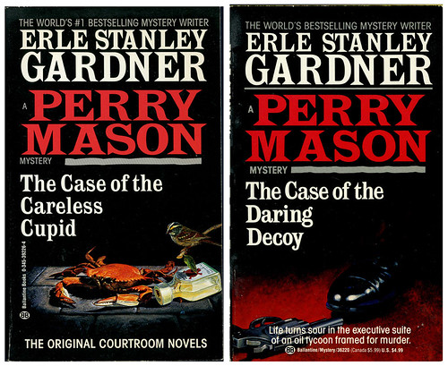
As I've said in past posts, I used to collect these books for my landlady who died in 1997. The two covers below were from editions that were on the shelf in bookstores in the 90s. They are simple, mainly typographic, with images that are all but forgotten. At the time there were a lot of vintage mystery authors being sold that had really nice covers. Earl Stanley Gardner was not one of them. They were boring. The publisher was obviously choosing safe colors, type style, and a boring image to attract readers. They all looked the same because the illustration was so secondary and pointless. It was sort of rote mystery buying. Mind you, they were only publishing a small selection of Gardner's work. I believe they were counting on Gardner fans to be their market and were not looking to attract new fans. Within a few years I never again saw a newly printed Perry Mason on any bookstore shelves.
The cover on the left is from 1995, the one on the right from 1989.
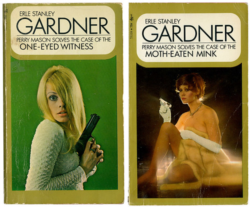
So let's go back to the 1970s when marketing was obviously geared mainly towards men who wanted to think all women were sexy babes. Many of the covers had what I would call "sex kittens" as their image. Graphically they are very 70s and pretty silly. I can't help but think of Laugh-In when I look at them. Okay, they also look a bit like ads you'd see these days for sex phone lines. The women look a bit stupid, slightly sexy, and the type who would have hung out (so to speak) at Hefner's house.
The cover on the left is from 1970, the one on the right from 1971.
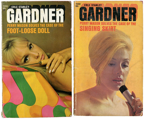
Now, let's try Bond, James Bond. Well of course these aren't Ian Fleming novels, but they certainly do seem to be putting the idea of Bond girls on the covers. These date from the late 1960s. I don't collect these. Nor do I collect the ones from the 1970 through the 90s. They're all just so boring and stupid.
The cover on the left is from 1969, the one on the right from 1968.
The next post will deal with some of the images from the early 1960s and 1950s. For me these are interesting with a point of view that makes some sense to both men and women.
Now, the good and bad news. Some of Gardner's books are again in print. The bad news is that they are POD (print on demand) and have very uninteresting covers. The publisher is House of Stratus in the UK. Okay, I think the covers are pointless and poorly done which is often the case with POD books. I will leave it to you to decide if you think any of these books make you want to read them or if they in any way project the idea of Perry Mason. I give the company credit for getting Gardner out to a new audience, but these anemic covers would have me looking elsewhere for Gardner books. Namely used bookstores.


I'm with you. These are boring and simply stupid gratuitous attempts at attracting the eye and not the mind.
ReplyDeleteIt wasn't just the covers that changed over the years.I was raised on the hyper-ethical 1950's television Perry Mason and was shocked by the shady shenanigans he got up to in the early novels when I read them. He planted evidence, broke and entered, lied to the law and generally had a fine disregard for the stickier bits of legal nicety.
ReplyDeleteThanks for this blog. I read and enjoy every posting. Also, thanks for the lead to AUNT OLGA'S CHRISTMAS POSTCARDS. Lovely book!
Gloria, you're absolutely right. Having grown up watching the show, with it's 1950s values, it was a surprise to find how much Mason bent the rules in the books. He became a completely different character than the extremely moral tv version. He was far more interesting.
ReplyDeleteHave to wonder if the reissues being done by the company in the UK are the exact text as the originals or have they been edited?
I also collect very old Nancy Drew books and to read some of the language in the books from the early '30s compared to when they rewrote them in the '60s is pretty startling.
Glad to know you enjoy it here. Thank you.
Gloria, glad you mentioned the book AUNT OLGA'S CHRISTMAS POSTCARDS. I had meant to mention it in the column. I received it as a Christmas gift and was really taken by it. I will now do more than simply put it in the Amazon column. It's such a fun book for kids, but also a real eye catcher for collectors.
ReplyDelete