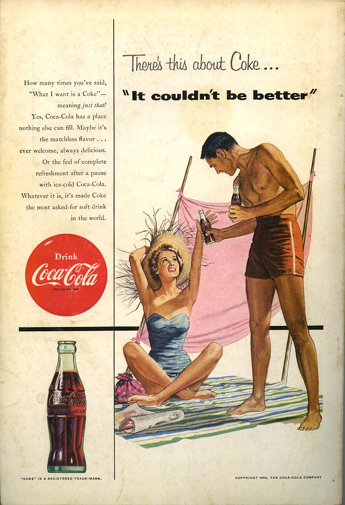
I must say the traditional glass Coke bottle is a beautiful design. And it looks especially inviting in this ad. The roundedness, the script casting slight shadows, the lovely water droplets making me want a nice cold frosty Coke. Advertisers knew what they wanted and illustrators knew exactly how to draw us in. It's a shame more work like this isn't being done for ads by illustrators. Everything is photography. Worse yet, everything is stock photography where everything looks a little too perfect and lacking in true emotion. Slick is the word I'd use.
This Coca Cola ad is on the back cover of the July 1954 National Geographic. Again, just your basic generic middle-class white folk out having a carefree time. I related to these people back then. I was one of those families. At least I felt like we were. It makes me think of the time my dad went out to buy wood to build a sewing machine table for my mother and instead came home with a '56 Chevy convertible and three straw hats. This is the sort of thing you'd expect from the guy in this ad.
Again, I have no reference as to who the illustrator was. Really a shame. I'd like to be able to give credit to those that did the work that has become iconic. I leave the door open to anyone who can supply names for these various illustrations.
Click on image to see it larger. (SOURCE: NATIONAL GEOGRAPHIC, JULY 1954)


I think I'll post my Coca-Cola eight ounce glass on my blog for Postcard Friendship Friday. I took a photograph of a frosted glass full of Coke with two straws in in for a Love stamp issue many moons ago. I still like the image, just like I really enjoy the advertising illustrations that predated our current crop of Photo Slugs.
ReplyDeleteYes, do post it and then post a link here so we can easily track to it.
ReplyDeleteI do bemoan what has become the public saturation of stock photos. I've really grown to hate them. I guess because I have to use them and often they're just so safe and boring I want to scream. Today I spent time looking for photos of college students and found nothing but phony smiles, perfect hair, color coordinated. For those who have never seen these things page after page after page imagine Stepford children. When one or two is used in a pharmaceutical ad people don't even notice. When you really start looking you'll realize how much stock photos have permeated everything. There's no soul in the work and I can't blame the photographers. It's the buyers who are too chicken to want anything else.
I totally agree. The illustration of the icy cold coke makes me really want one. You just can't beat "handmade illustrations" sometimes. Stock photography has its uses but it often feels like there are only five photographers left on the planet.
ReplyDeleteYes, I believe you're right. At least there seems to only be 9 college age students posing. Now they look over this shoulder. Now they look over that shoulder. Tilt head this way, then that way. But always smile. Smile. SMILE! or look concerned but not angry. Never angry. And the way we use these things. The rules given by clients are always interesting. One of the first is "if you must crop out someone from the photo make sure it's not a person of color." That one always makes me laugh.
ReplyDelete