Showing posts with label 1960s ephemera. Show all posts

3/29/12

1960 Boy Scout Handbook ADVERTISEMENTS: Part 5


Use a Kodak, earn a badge. I'd have enjoyed getting that badge.


Click on image to see it larger.

This is another ad from the 1960 Boy Scout Handbook.

The camera below belonged to my grandmother.


To see more vintage Kodak ads visit Tattered and Lost Vernacular Photography and click on one of the following labels: Kodak advertisement, Kodak.

3/24/12

1960 Boy Scout Handbook ADVERTISEMENTS: Part 4


As a Boy Scout you never know what type of support you'll need.

Surely you'll need a reliable motor so you aren't left stranded alone in the middle of a lake as the sun goes down and the wolves start howling and you realize all you brought along, other than your fishing gear, was a flashlight which has batteries about to die, no sweater, and you're wishing you hadn't eaten that bologna sandwich at 9:30 in the morning. You're still trying to get a grasp on the whole "be prepared" motto.

Click on image to see it larger.
Johnson Outboards

Johnson Outboards was a US based manufacturer of outboard motors. The original company to make Johnson inboard motors and outboard motors was the Johnson Bros. Motor Company of Terre Haute, Indiana, United States. A few years after the Johnson brothers' factory in Terre Haute was destroyed by a tornado in March 1913, the brothers relocated to South Bend, Indiana and then Waukegan, Illinois. The company was first acquired by Outboard Marine Corporation (OMC) and then later by Bombardier Recreational Products.

Today

Bombardier Recreational Products no longer sells outboards under the Johnson brand, as they have moved all sales entirely to Evinrude Outboard Motors. They support existing Johnson outboard motors through servicing and parts. (SOURCE: Wikipedia)
To see an old Johnson Sea-Horse neon sign click here.

But at least a particular part of your body will stay warmer through the cold long night.


The jockstrap was invented in 1874 by C. F. Bennett of a Chicago sporting goods company, Sharp & Smith, to provide comfort and support for bicycle jockeys riding the cobblestone streets of Boston. In 1897 Bennett's newly-formed Bike Web Company patented and began mass-producing the Bike Jockey Strap. The Bike Web Company later became known as the Bike Company. Today, Bike is still the market leader in jockstrap sales. (SOURCE: Wikipedia)
Click on the "Boy Scout" label below to see previous scouting posts.

11/7/11

JUSTICE IS SWIFT if somewhat confusing


This is an odd vintage post card. The copy on the back doesn't seem to make much sense or provide any guidance as to what this was about.


Click on either image to see it larger.

Here's what I have found.

The manufacturer, Elba Systems based in Denver, created video and audio content for rather dry subject matter. The company was actually E. L. Barrett & Associates dba (doing business as) Elba. I believe this card, titled "The Case That Nobody Won," was for a filmstrip for the Guarantee Mutual Life Co. The image below is from here.

Other exciting Elba titles released as 33-1/3 RPM recordings include:
Bury Me In Eden
Introduction to Modern Tools
and yes, you can even get "The Case That Nobody Won" as a record.

Thinking to yourself, "Well doggone it! I want a copy of this post card!" Spend $1.79 + postage and you can get it here. But better rush because the auction mallet will be coming down within 22 hours. Suitable for framing if you're an attorney with a license from some online diploma mill.

So if you ever do find it hanging on the wall of an attorney you're using try to remember you've been warned.

7/19/11

LITTLE ME by Bell Poitrine


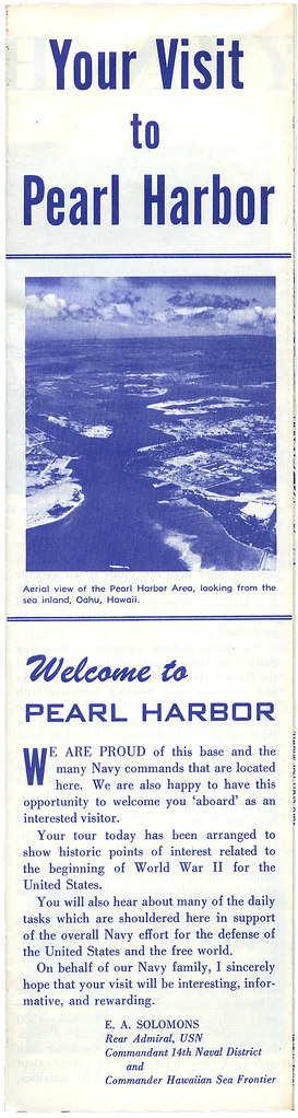
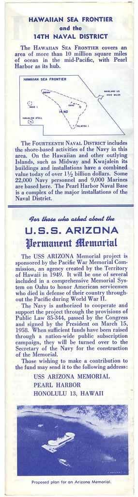
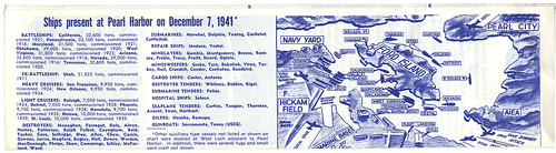
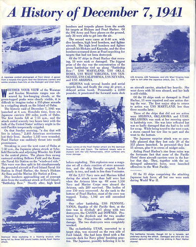
Little Me sat on the bookshelf at the family cabin for years. I don't know if anyone ever read it. When the cabin was sold I brought home all of the old books. It turns out there's been a real lu-lu sitting on the shelf all those years.

Little Me says it's "the intimate memoirs of that great star of stage, screen and television" as told to Patrick Dennis.


Don't believe any of it, even the name Patrick Dennis.
Little Me was the parody "confessional" self-indulgent autobiography of "Belle Poitrine" (French for "Pretty Bosom"), subtitled The Intimate Memoirs of the Great Star of Stage, Screen and Television, by Patrick Dennis, who had achieved a great success with Auntie Mame. A bestseller when introduced in book form, the work was also later staged on Broadway as a musical.

The heavily illustrated work featured numerous photographs by Cris Alexander, who combined retouched stock photographs with original photographs taken to create Belle Poitrine's life. Published in 1961, it was considered pretty risqué at the time. (Several of Alexander's photographs were rejected by censors.) The book also featured family and friends of Dennis and Alexander, including Dennis' wife, Louise, as "Pixie Portnoy", and ballet dancer Shaun O'Brien (Alexander's life partner) as Mr. Musgrove. Actress Dodie Goodman and comedienne Alice Pearce were prominently featured. Actress Jeri Archer portrayed the often overexposed, self-centered and clueless Poitrine, and Kurt Bieber was her beefcake co-star and paramour, "Letch Feely". Little Me was reissued in 2002 with a new preface by Charles Busch and foreword by Alexander.

The plot of Little Me tells the rags-to-riches-to-rags-to-riches, etc. story of Maybelle Schlumfert, an overdeveloped and self-deluded girl who rises to become Belle Poitrine. (An example of her delusion: Belle is born in 1900 and the book proceeds with a chapter for each decade- but chapter six is titled "Frankly Forty") Throughout the book, Poitrine's character trumpets her successes (which are few) while glossing over her failures (which are many). The book was a stinging parody of the cult of celebrity and self-importance stemming from the numerous "personality overcoming obstacles" biographies of the late 1940s and early 1950s. (SOURCE: Wikipedia)
So who was Patrick Dennis? Oh my, even the author isn't what he seems and doesn't that make this even more fun?
Patrick Dennis (May 18, 1921 – November 6, 1976) was an American author. His novel Auntie Mame: An Irreverent Escapade (1955) was one of the bestselling American books of the 20th century. In chronological vignettes "Patrick" recalls his adventures growing up under the wing of his madcap aunt, Mame Dennis. Dennis wrote a sequel, Around the World with Auntie Mame, in 1958.

"I write in the first person, but it is all fictional. The public assumes that what seems fictional is fact; so the way for me to be inventive is to seem factual but be fictional." All of Dennis's novels employ to some degree the traditional comic devices of masks, subterfuge and deception.

Patrick Dennis was born Edward Everett Tanner III in Evanston, Illinois. His father nicknamed him "Pat" before he was born, after the Irish heavyweight boxer Pat Sweeney, "a dirty fighter known for kicking his opponents." When he was old enough to say so, he let it be known that he liked "Pat" better than "Edward," and so Pat he became. Pat attended Evanston Township High School where he was popular and excelled in writing and theater.

In 1942, he joined the American Field Service, working as an ambulance driver in North Africa and the Middle East.

On December 30, 1948, Dennis married Louise Stickney, with whom he had two children.

Auntie Mame
's first edition spent 112 weeks on the bestseller list, selling more than 2,000,000 copies in five different languages. The manuscript was turned down by fifteen publishers before being accepted by the Vanguard Press. Dennis and a friend marketed the book to the booksellers. At the height of its popularity, it was selling more than 1,000 copies a day; throughout 1955 and 1956, it sold between 1,000 and 5,000 a week. In 1956, with Auntie Mame, The Loving Couple: His (and Her) Story, and Guestward, Ho!, Dennis became the only writer ever to have three books on the New York Times bestseller list at the same time.

Working with longtime friend, actor and photographer Cris Alexander, Dennis created two parody memoirs, complete with elaborate photographs. The first, Little Me, recounts the escapades through life and love of glamour girl Belle Poitrine "as told to Patrick Dennis." His wife, Louise, appeared as "Pixie Portnoy" in the book's photographic illustrations, which included their children and an employee as well. The second "bio," First Lady (1964), is the life story of Martha Dinwiddie Butterfield, oblivious wife of a robber baron who "stole" the presidency for thirty days at the turn of the century.

Throughout his life, he struggled with his bisexuality, at one point becoming a well-known participant in Greenwich Village's gay scene.

Dennis' work fell out of fashion in the 1970s, and all of his books went out of print. In his later years, he left writing to become a butler, a job that his friends reported he enjoyed. At one time, he worked for Ray Kroc, the founder of McDonald's. Although he was at long last using his real name, he was in essence working yet again under a pseudonym; his employers had no inkling that their butler, Tanner, was the world-famous author Patrick Dennis.

He died from pancreatic cancer in Manhattan at the age of 55.

At the turn of the 21st century there was a resurgence of interest in his work, and subsequently many of his novels are once again available. His son, Dr. Michael Tanner, wrote introductions to several reissues of his father's books. Some of Dennis' original manuscripts are held at Yale University, others at Boston University. (SOURCE: Wikipedia)
To see an article from the December 7, 1962 LIFE magazine about Patrick Dennis click here.

So what about the photographer, Cris Alexander, who created the altered photos?
Cris Alexander (born Alan Smith; January 14, 1920) is an American actor, singer, dancer, designer, and photographer.

As an actor he co-starred as Chip in the original Broadway cast of On the Town. Subsequent Broadway appearances included Present Laughter opposite Clifton Webb, Wonderful Town, and Auntie Mame. Mr. Alexander also appeared in the film version of Auntie Mame as the department store supervisor of actress Rosalind Russell.

Prior to retiring, Alexander was a successful photographer, noted for his celebrity portraits. For many years he was the official photographer for the New York City Ballet.

Alexander contributed hundreds of original and altered photographs to two of Patrick Dennis's best selling books. Little Me, a mock biography documenting the life of the world's worst actress Belle Poitrine, features more than 150 of Alexander's photographs. Alexander also wrote the novel's preface. Dennis' First Lady: My Thirty Days at the White House told of Martha Dinwiddie Butterfield (Peggy Cass), wife of a robber baron who literally stole the presidency at the turn of the century. Using friends and professional models and actors, Alexander's zany photographs were essential to the novels' success. For several years he served as Chief Photographer at Andy Warhol's Interview magazine. He is a long time resident of Saratoga Springs, New York, and he is also the life-partner of former New York City Ballet dancer Shaun O'Brien. In the 1940s, Alexander was romantically involved with the dancer and choreographer John Butler. (SOURCE: Wikipedia)


I bet you were thinking I was going to post something from Montez Lawton's scrapbook? Believe me, there's nothing like this in her collection.

This edition of Little Me was published in November 1962.

1/21/11

EARL STANLEY GARDNER and Perry Mason Through the Years, PART 2


Now, where was I before I was so rudely interrupted by bandwidth issues?

Continuing where I left off, I now give you some Perry Mason covers dating from 1959 to 1966.

This very lazy series cover dates from 1966. I'm assuming it was a decision by the publisher to make the most simplistic series style possible requiring little effort by all involved to say nothing of cheap. No photographer or illustrator to pay. Bring it in the front door, shove it out the back. Or as one fellow designer calls it, "sausage making." I'm not blaming the designer because cover designs are done by committee. Too often way too much input from too many people. This is just a sad case of everyone giving up. In a few years the publisher gave up with this idea and decided sex sold better (see my previous post). Sex sold the year before and sex sold the following years. What was there about 1966? I don't remember pirate things being particularly popular. Yes, I know that skull and cross bones signify death, poison, etc., but this was the best they could come up with in '66?

Printed in 1966.

Earl Stanley Gardner_1966_tatteredandlost

So let's go back a year to 1965 when sex was selling. Subtle sexuality. These photos could have just as easily been found in a woman's magazine. And though a series design, it was at least flexible. Okay, I have no idea what the redhead on the left is doing. Scouring the shower wall in the middle of the night? Did she sleepwalk and do windows? I can't say the images are particularly thought provoking, but then let's remember the direction the covers went the next year. Let's call these the Stepford years. Mindless looking women posing.

Printed in 1965.

Earl Stanley Gardner_1965_tatteredandlost

1962 and 1964. We've finally arrived at covers I'm interested in collecting. Yes, the illustrations look like they could have been from an early '60s Playboy, but they're interesting. You look at these women and know something is going on. They make you wonder what the story is. Well, what I wonder the most is why there's an arrow forming the first part of "Perry Mason" on the 1962 cover. I can guarantee you that someone at the publisher said, "...but is it too clever? Too gimmicky?" There was a committee decision behind this arrow. At least one person had to be convinced the arrow was important.

The cover on the left is from 1962, the one on the right from 1964.

Earl Stanley Gardner_1962_1964_tatteredandlost

1959. Now we're talkin'! This cover, front and back, is just plain fun. A seductress on the front with a strange modern painting of a guy behind her and a brochure in her hand. An interesting blend of vertical and horizontal movement for the eye. Not a stunning cover, but eye-catching. I do wonder what's going on here. On the back we get Earl Stanley Gardner's signature (how many people thought they had just bought an autographed book?) AND an ad for the Perry Mason show staring Raymond Burr.

Printed in 1959.

Earl Stanley Gardner_1959_tatteredandlost

The original tv series was on the air from 1957 to 1966. Earl Stanley Gardner died in 1970 (though one post on Wikipedia says 1969). I wonder how much input Gardner had in each final cover design if any?

To read Wikipedia's post about the Perry Mason tv show click here. Their post about the character of Perry Mason is here. To read about the author, Earl Stanley Gardner, click here. To read a very interesting post about Gardner click here.

Seriously, no matter what you think of the writing or of the show, Perry Mason has been around for a very long time. Good marketing or good storytelling? I'm thinking both.

More Mason covers to come in the next post showing the evolution of marketing one product through many decades.

1/8/11

EARL STANLEY GARDNER and Perry Mason Through the Years


Since I was moving things, specifically Perry Mason books, around on a bookcase I thought it time to do another post about the small collection I have. I have written about this collection twice in the past:

I haven't added anything to the collection in quite awhile because I haven't seen any from the time periods I like. This leads me into this post. Marketing a specific author in a specific time period.

It's fun to see how as decades passed covers changed to reflect what the publishers hoped was their market. The covers I like are from the 1940s and early to mid-1950s. They start to loose me in the late 60s, loose me completely in the 70s, and then barely redeem themselves in the 90s.

As I've said in past posts, I used to collect these books for my landlady who died in 1997. The two covers below were from editions that were on the shelf in bookstores in the 90s. They are simple, mainly typographic, with images that are all but forgotten. At the time there were a lot of vintage mystery authors being sold that had really nice covers. Earl Stanley Gardner was not one of them. They were boring. The publisher was obviously choosing safe colors, type style, and a boring image to attract readers. They all looked the same because the illustration was so secondary and pointless. It was sort of rote mystery buying. Mind you, they were only publishing a small selection of Gardner's work. I believe they were counting on Gardner fans to be their market and were not looking to attract new fans. Within a few years I never again saw a newly printed Perry Mason on any bookstore shelves.

The cover on the left is from 1995, the one on the right from 1989.

Earl Stanley Gardner_1995_1989_tatteredandlost

So let's go back to the 1970s when marketing was obviously geared mainly towards men who wanted to think all women were sexy babes. Many of the covers had what I would call "sex kittens" as their image. Graphically they are very 70s and pretty silly. I can't help but think of Laugh-In when I look at them. Okay, they also look a bit like ads you'd see these days for sex phone lines. The women look a bit stupid, slightly sexy, and the type who would have hung out (so to speak) at Hefner's house.

The cover on the left is from 1970, the one on the right from 1971.

Earl Stanley Gardner_1970_1971_tatteredandlost

Now, let's try Bond, James Bond. Well of course these aren't Ian Fleming novels, but they certainly do seem to be putting the idea of Bond girls on the covers. These date from the late 1960s. I don't collect these. Nor do I collect the ones from the 1970 through the 90s. They're all just so boring and stupid.

The cover on the left is from 1969, the one on the right from 1968.

Earl Stanley Gardner_1969_1968_tatteredandlost

The next post will deal with some of the images from the early 1960s and 1950s. For me these are interesting with a point of view that makes some sense to both men and women.

Now, the good and bad news. Some of Gardner's books are again in print. The bad news is that they are POD (print on demand) and have very uninteresting covers. The publisher is House of Stratus in the UK. Okay, I think the covers are pointless and poorly done which is often the case with POD books. I will leave it to you to decide if you think any of these books make you want to read them or if they in any way project the idea of Perry Mason. I give the company credit for getting Gardner out to a new audience, but these anemic covers would have me looking elsewhere for Gardner books. Namely used bookstores.

12/7/10

In MEMORY OF PEARL HARBOR


To those I knew who were there that day and to those who lost their lives.

The full brochure is too large to scan and post so I give you just a few folded and unfolded pages. This dates from early 1960s when I lived in Hawaii. In fact, that sandy looking shore at the entrance to Pearl Harbor is where I lived in military housing, two blocks from the beach.

Welcome to Pearl Harbor_tatteredandlost

U.S.S. Arizona_tatteredandlost

Ships present at Pearl Harbor_tatteredandlost

history of December 7.1941_tatteredandlost