7/31/09

THE DOUBLE MINT TWINS of 1934


Sometimes ephemera just makes you sit down right where you are and say "WT...?!?" This is one of those times.

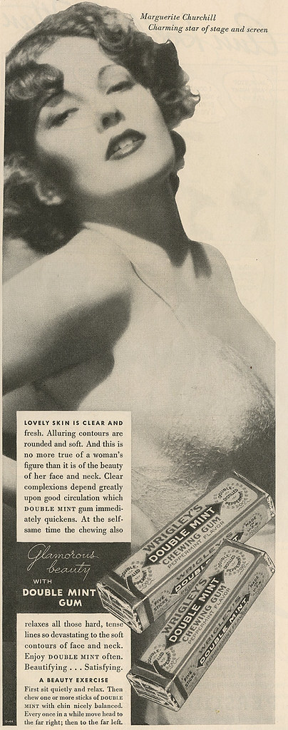
Marguerite Churchill_Double Mint Bum_tatteredandlost

This advertisement for Double Mint Gum is from the May 1934 issue of Delineator. According to the Wrigley official website:
1939
The Doublemint Twins concept makes its advertising debut. Since then, the Doublemint twins have been part of one of the most successful and long lasting advertising campaigns ever created. In the early days of the campaign, one Wrigley-sponsored radio program featured double piano players, double violinists and double talking comedians.
So, if the twin idea hadn't come along yet exactly what were they going for in this ad? I mean, when I first saw it I figured lingerie or creams or soaps. No. Gum. Chewing gum as a beauty aid. I'm not kidding you. Read the copy. According to this "Double Mint gum immediately quickens" your circulation. Yeah, sure. The babe in the slip has nothing to do with it. How long after this ad did someone say "Wow, that was a pair. You know, we should do an ad with twins."

As to who this woman is and why she's posing like this for gum...starlet. Marguerite Churchill was born on Christmas day 1910 in Kansas City, Missouri. She had a film career that spanned from 1929 to 1952 and appeared in more than 25 films with such stars as John Wayne, Will Rogers, Spencer Tracy, and even Boris Karloff. She died January 9, 2000 at the age of 89 from natural causes in Broken Arrow, Oklahoma. You can read more about her here. I think she probably had a pretty interesting life. Click here to see her in a fun clip from Dracula's Daughter from 1936. Unfortunately they will not allow embedding of the clip. She was quite lovely. But the gum ad??? It's just plain strange.

7/30/09

STUDEBAKER?


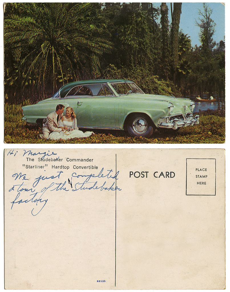
Okay, everything I said in the previous post about Studebaker...ummmmm...maybe not so much. But I do see they stayed with the nautical theme, but now they were down to canoes.

Studebaker Commander Starliner_tatteredandlost
Click on image to see it larger.

7/29/09

Wouldn't you like to own a STUDEBAKER?


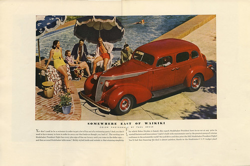
American cars once really were beauties as this piece of ephemera shows. There were diverse designs, elegance, style...not boxes that looked like tanks. The industry has done a lot of harm to itself. When the money crunchers took over control and kicked the design department to the side we ended up with behemoths with pinheads behind the wheels or small cars too ugly to want to spend a hard earned dime on. Sorry, they lost me the last time I went shopping for a car. At least I did get to experience the last hurrah of the 50s and 60s. You used to be able to tell what model a car was simply by seeing the silhouette.

The Studebaker Wheel July 1937_cover_tatteredandlost

This cover is from The Studebaker Wheel, July 1937. It cost 10 cents. 20 interior pages, including inside covers. Articles varied from yachting to "A Cop Looks At Motor Manners" written by Police Lieut. F. M. Kreml from Evanston, Illinois. I especially liked this:
"I don't believe that it is just plain 'orneriness' that makes us act as we do when driving. Certainly I don't believe that we are all sadists at heart, getting a big kick out of offending, scaring and even injuring other people.

I prefer to believe that our tendency towards bad motor manners is merely part of the huge comedy that makes us human beings--and makes us careless and selfish....

Sometimes you hear the remark, too, that people are just too dumb and slow-witted to learn how to operate anything which responds as quickly as the modern automobile. It is argued that people can walk without continually bumping into others, because of the thousands of years of practice they have had since their ancestors came down from the trees; but that it will take us hundreds of years at least to learn how to deport ourselves as instinctively orderly drivers.

Yet, it has been my observation that few drivers really deserve a dunce cap. Rather, most accidents are the result of mere thoughtlessness on the part of driver and pedestrian. All of us have numerous friends who have driven five--ten--fifteen years or more with never an accident or at least never a serious accident. Those who have had accidents may be inclined to cal these clean records the result of better luck; but undoubtedly, if we check into the driving habits of people who had had no accidents, or very few accidents; and then check the minority--those who have had a series of accidents--we shall find important difference in driving habits."
Okay, this gentlemen never dreamed of Hummers with pinheads behind the wheel texting and drinking a double grande soy latte whatever while changing channels on their DVD player on the freeway. And just imagine if a car magazine today were to give any credence to Darwin's theory as this fellow did. We're talking massive boycotts.

I would actually look at this car and think, "Yeah, I can imagine myself behind the wheel traveling across country. I'd look good in this car." This car sold romance, not machismo or boredom.

The Studebaker Wheel July 1937_cent.spread_tatteredandlost
Click on image to see it larger.

To read more about the Studebaker click on:

7/25/09

GREEN with envy


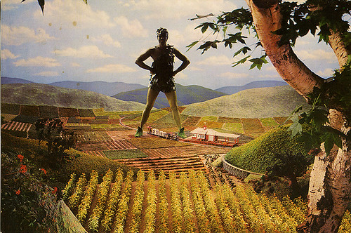
Something a little special today for the blog. I've managed to bag an interview with one of America's big icons. A lot of negotiations took place with agents, company reps, etc. along with a binding contract that I not give the exact location where the interview took place. I'm more than happy to give this giant in the industry his privacy.


First a little background information. Jolly Green grew up in Minnesota, making his first appearance in 1928, the year before the Great Depression. He came from modest means, a happy family, but frankly, he wasn't real popular. He was sent to charm school in the 1930s and gradually over the years developed into the charming fellow we all love.


jolly green giant postcard_front_tatteredandlost


jolly green giant postcard_back_tatteredandlost

Click on either image to see it larger.


I CAN say that this interview took place while he was on vacation in California along the North Coast amongst the redwood groves.


Tattered and Lost: Mr. Green...


Jolly Green Giant: Call me JG.


T & L: Okay, JG. What brings you here to the forests of the North Coast?


JG: Well, as you can imagine it's hard for me to just get away, be myself. I don't tend to blend in and if I go to the beach that's pretty much it for anybody else who was planning to go for the day. By the time I've thrown down a beach towel and stretched out the tide usually goes out. I try to find places now where I can spend some quiet time. I can walk through this forest and actually feel small. I don't get that very often.


T & L: I understand completely. Well, actually I have no reference point for this, but I can imagine.


JG: I feel I have certain responsibilities to my fans, the "little people" and I don't want to disappoint any of them. My folks didn't name me Jolly for nothin'. (laughing)


T & L: I was going to ask you about that. Is it tough always having to be so upbeat?


JG: Oh no, not at all. (laughing) What have I got to worry about? I can see things coming from miles away so I'm always prepared. That's how I've tried to live my life. Look off into the distance and be ready for anything. Keep a positive attitude.


T & L: Can I ask you a little about work?


JG: Sure.


T & L: Well, you've done a lot of television spots over the years. Where were they filmed?


JG: Oh we film those in Minnesota, in the valley where I was born and raised. Beautiful place, simply beautiful. Have you been there?


T & L: No, I'm sorry to say I haven't.


JG: Oh you must. Do you like vegetables?


T & L: Of course.


JG: Then you'll like the valley. Hard working little people producing some great products.


T & L: Well, that brings up a subject that gets talked about a lot.


JG: Oh, I know where this is going.


T & L: You do?


JG: Sure. You want to know about my niblets. Right?


T & L: Actually yes, we're all sort of curious about them.


JG: I'm proud of my niblets. You won't find finer niblets on the shelf. Quite a package if I do say so myself.


T & L: Was there ever any concern about calling them niblets?


JG: No, not really. We thought of trying kernel but it had different meanings in different parts of the country depending on how people spelled it so we decided to stay with niblets. What can I say (laughing), people just LOVE my niblets.


T & L: I can imagine with your size there are some funny stories to tell about filming. Anything really wild ever happen?


JG: Oh, all sorts of wild stuff, but usually only if they bring in a crew from out of the area. The locals all know me and we all work together as a tight unit. Time is money, so we get into the valley and out, usually in two days. I like to be a one take guy if at all possible. Usually the hardest part is waiting for the lighting to be just right. You know, magic hour.


T & L: This might be a bit personal, but because of your size has anything unfortunate ever occurred?


JG: Really, only the one time and I'm not sure people are aware of this so I guess I'm giving you an exclusive.


T & L: Wow, let's here it.


JG: (laughing) Now this happened many years ago and since then we've implemented a variety of safety procedures to make sure it doesn't ever happen again. You know how sometimes when you sneeze you just sort of loose control? An arm or a leg might...well...sort of flail around?


T & L: Oh no.


JG: (nodding) Yup, I spun around trying to not sneeze on the crew in the valley, started to loose my footing and BAM! my left foot came down on the train station. Completely flattened it. Fortunately nobody was in it at the time. The problem came the next day when the director realized we needed to do some re-shoots at the station. I mean, my crew is good, but they can't reconstruct the station overnight. So a friend of a friend called Lionel Trains and they brought in a modular station the next day. Had it up in place within no time. It just snapped together. If you look real close in the commercial you can see it's different, but the people in the valley used that station for a good six months while the insurance people did their thing. Eventually a check was cut and the station was replaced and looks just like the original.


T & L: Well, I'm thrilled for the exclusive and equally thrilled to hear it had a happy ending.


JG: Me too. Me too. Size can be a burden.


T & L: Speaking of endings, I guess I better wind this up.


JG: Oh, is it over already? I was just getting into the groove of this.


T & L: This has been really, and I can't say it enough, a big thrill to meet you.


JG: I hope I didn't let you down.


T & L: Oh, no, not in the least. But speaking of which...


JG: (laughing) I guess you want out of the tree, don't you?


T & L: Uhhh, yes please.


JG: How was it up there?


T & L: Great actually. I'm glad you thought of it. It was much easier doing this interview being able to look you in the eye instead of standing down at your big toe yelling up.


JG: Like I said, I'm always trying to be prepared, think ahead. It's all in how you look at things.


7/24/09

Living in a PARALLAX PANORAMAGRAM UNIVERSE


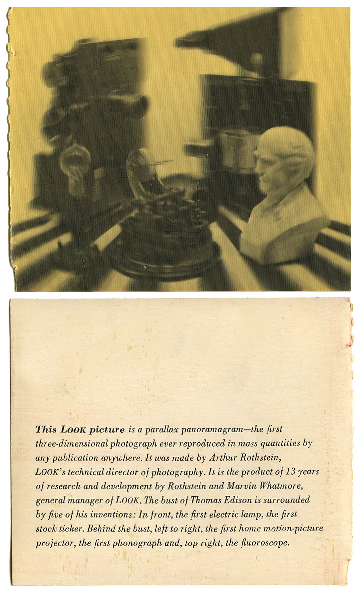
Does anybody remember these? Little cards that were inserted in the back of Look magazine back in the 60s? This first one shows a bust of Edison surrounded by some of his various inventions.

parallax panoramagram_Edison_tatteredandlost
Click on image to see it larger.

Parallax Panoramagram. Rolls off the tongue nicely doesn't it? Okay, when I google it I get bored really fast because of information like this:
Parallax panoramagram having improved depth and sharpness

United States Patent 6850210

Abstract:  A parallax panoramagram has increased depth and sharpness when a sharpness filter is applied after interdigitation of multiple image portions. An optical path of wave train (204) (on-axis) and wave train (205) (off-axis) intersect a single lenticle (201). The lenticle has a focal length (208) and the on-axis (204) and off-axis (205) wave trains correspond to different stripes. These wave trains (204 and 205) comme to focus at points (206 and 207) respectively. The surface (202) has a cylindrical curvature, and bracket (203) denotes the width of the lenticle (201). Each eye of the observer sees its own perspective view when looking at a lenticular stereogram. (SOURCE: http://www.freepatentsonline.com/6850210.html)
I get the basics of what they're talking about, but I just don't care. On the other hand a 1964 issue of Time has the following:
"A LOOK FIRST: 3-D PHOTO," proclaimed the message on the cover. The Parallax Panoramagram "may mark the beginning of a new era in graphic-arts," said the press release. As it turned out, Look's first ran almost last in the magazine. On page 105, just short of the back cover, persevering readers found a stiff, postcard-size appendage, attached in the manner of a subscription renewal card. On the card was a black and white picture that showed a bust of Thomas Alva Edison surround ed by some half-dozen of his inventions. What made most readers stop and look twice was the picture's distinct illusion of depth.

Look's stunt, the result of 13 years' research, constitutes the latest effort to translate the real world of three dimensions into the picture world of two. Artists have employed trompe I'oeil three-dimensional techniques for centuries. But true success for photographers awaited the invention of the stereopticon camera in the 19th century, which took two pictures of the same subject through lenses that were separated like a pair of human eyes. When the viewer saw each picture separately, through separate lenses, his brain automatically supplied the missing dimension of depth.

The Look process is almost identical. A specially designed camera takes pictures through a transparent screen that is serrated to break up the image into hair-thin vertical slices. The camera is then moved slightly to the right or left, as other, sliced-up pictures are taken on the same negative.

The process is laborious, costly and slow, and not yet adaptable to highspeed printing. Merely to pose the static picture in last week's Look took two full days of work with a one-ton, cubical camera as complicated as an electronic computer. Five additional weeks were required to engrave the photograph, print it some 7,000,000 times on a sheet-fed offset press and then pour on and properly shape the clear plastic film that covers the picture with what amounts to a collection of lenses. The plastic lenses are so arranged that the viewer's left eye sees one of the serrated pictures, the right eye sees the other (see diagram).

Look and its partners in the enterprise, Eastman Kodak Co. and Harris-Intertype Corp., which built the equipment that adds the plastic lens coat, have high hopes of commercial success. Cowles Magazines & Broadcasting, Inc., Look's parent company, plans to establish a separate corporation, to be called Visual Panographics Inc., to sell its 3-D process to greeting-card manufacturers, display-art companies and anyone else willing to pay the price in money and time for an unspectacled illusion of depth. (SOURCE: TIME)
I don't know how successful this proved to be for all parties involved because the process does not seem to have become part of our general lexicon for printing processes. I do have some postcards from the mid-to-late 70s that seemed to have improved on the process. And I have a few football player cards from boxes of cereal that were done by Xograph. I'm actually not sure if Xograph was a company or simply the printing process. Britannica describes xograph as: 
three-dimensional printing technique ( in printing (publishing): Three-dimensional printing (1960s) )
...essentially an illustration bearing two views, superimposed, of the same image taken from slightly different angles, on a transparent mount striped with a multitude of imperceptible parallel strips (Xograph process). On account of these strips, each eye, looking at the print from a different angle, sees only one image. (SOURCE: ENCYCLOPÆDIA BRITANNICA)
The poor things haven't actually aged very gracefully. They've yellowed and beneath the surface they have cracked into what looks like puzzle pieces. All still together and you can't really feel the cracks, but they're just below the surface of the plastic. 

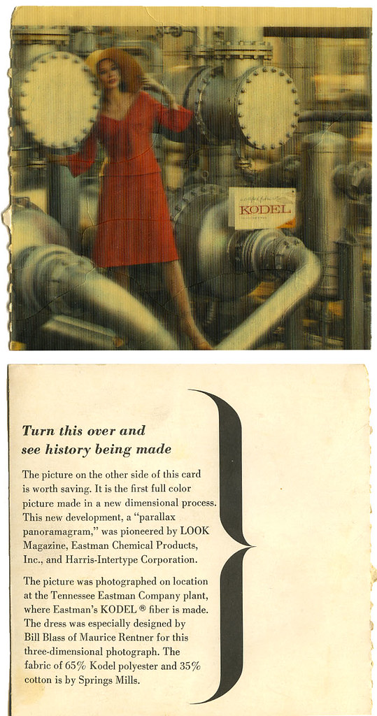
I've always thought this second one especially odd. The woman posing in some sort of industrial plant. I'm just not getting it. I always think of one word...plastics.

parallax panoragagram_Kodel_tatteredandlost
Click on image to see it larger.

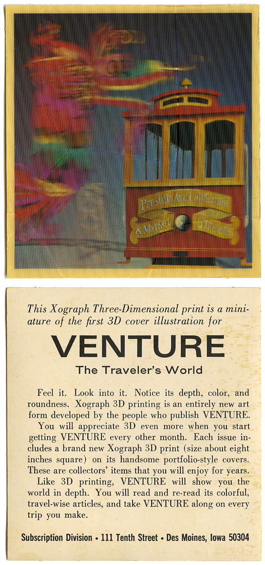
Here's an example of one labeled Xograph.

Xograph Three-Dimensional print_tatteredandlost
Click on image to see it larger.

If anyone knows anything about these I'd be happy to hear from you. Post a comment and let us all know.

UPDATE:  I did find a bit more about this technique online in this book History of Lenticular and Related Autostereoscopic Methods by David E. Roberts (©2003 Leap Technologies, LLC.). At the top of page 12 it states:
"Lenticular techniques showed rapid progress in the 1960's as large corporations recognized its advertising potential. Mass production became a reality on February 15, 1964, when a Look Magazine issue featured the first ink-printed postcard sized "parallax panoramagram". The black and white still life of the bust of Thomas Edison surrounded by some of his more famous inventions required a 1000-pound camera, tracked in a programmed arc, to photograph. The manufacturing process involved printing the image using a 300 line offset press and a special technique for coating and lenticulating a thin layer of plastic on the image at high speed. The process, known as "Xograph" was developed at Eastman Kodak in Tennessee and was credited to Arthur Rothstein and Marvin Whatmore. Over 8 million copies were sold. Look Magazine followed with a color lenticular on April 7, 1964.

With the growth in popularity of lenticular in the 1960's, several companies entered the market including Vari-Vue of New York, which was co-founded  by Victor Anderson, who contributed greatly to the practical commercial success of the product. Vari-Vue, along with companies such as Crowle Communicatons, Hallmark, Toppan ("Top Stereo") and Dai-Nippon of Japan and later Optigraphics ("Optipan" and "Linearoptics") produced a wide variety of products over the next twenty years, including Cracker Jack premiums, Political buttons, 3D baseball cards, postcards, magazine and book covers and point-of-purchase displays.

By the 1980's, as the novelty value of lenticular wore thin, the only significant manufacturer left in the US was Optigraphics who's success was largely the result of the continued expertise of Victor Anderson."
UPDATE: From Debbie Thorne in 2013:
I found your site when trying to do something special with all my fathers negatives, black and white photos and slides that he has collected from his travels as a photographer for Look and Venture magazines. i was excited to see his 3 d photos on your site. Our family has albums of the 3 d pictures. I also watched my dad shoot many 3d pictures at the look magazine building on madison ave in nyc. Then the studio in Arlington, texas. He would create a shadow box for some pictures where he would cut out the models or items they were advertising. The camera was very large and it would move slowly to shoot a blurred image and then my father would design a plastic coating to give the photo the 3d effect. I have a very large mac tonight picture he did for Mc donalds hamburger in the late 60's or early 70' My fathers boss and a friend was Arthur Rothstein. They worked for look and venture until spring of 1973. Victor Anderson was one of the men at opticgraphics.

7/23/09

AL WENZEL


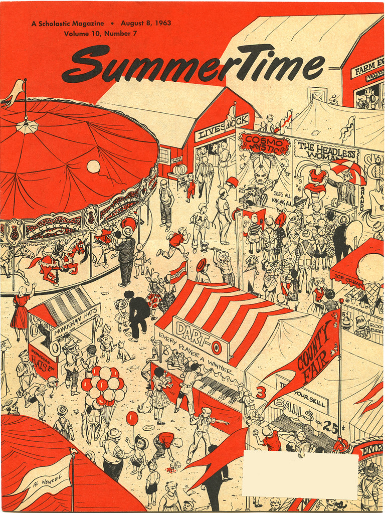
The county fair starts next week. I drove by the fairgrounds this morning and saw the carney folks setting up the rides. I don't go on the rides. I basically ignore that part of the fair. Maybe it's because I'm old, but it somehow doesn't look as enticing as it once did. Everything seems sort of plastic. I don't remember the day-glo colors being around when I was a child. There were bright colors, but there was a richness to them you don't see now. Plus there were more tents. Now they haul their game booths around behind their trucks or Winnebagos. It's lost its charm...or like I said, I'm just old.

Scholastic_Al Wenzel_August 8, 1963_tatteredandlost
Click on image to see it larger.

This is another cover done by Al Wenzel for Scholastic Magazine's SummerTime, August 8, 1963. I posted another one on July 17. The only other information I find online about Mr. Wenzel is:
Albert Borth Wenzel was educated at the Grand Central School of Art. He began his career in comics in the late 1940s by contributing to comic books by D.S. Publishing and Lev Gleason (a.o. Crime Does Not Pay, Little Wise Guys). He did romance stories for Marvel, fillers for DC and some horror work for ACG in the 1950s. He was an assistant on the syndicated 'The Spirit' (1951-52) and 'Steve Roper' (1957-59) strips.

He became Roy Crane's assistant on the 'Buz Sawyer' Sunday in 1960 and by 1962, he did scripts, pencils and ink. He continued to work on this strip, telling the urban adventures of Sawyer's sidekick 'Roscoe Sweeney', until 1974. In the late 1970s and early 1980s, he illustrated some giveaway comic books for the Federal Reserve Bank of New York. (SOURCE: http://lambiek.net/artists/w/wenzel_al.htm)
From reader Brian:
I know it's been a while since you posted this but I'm just now running across it. Albert Borth "Al" Wenzel was born July 7 1924 in Norwalk, CT. He was in the Army Air Corps during WWII and spent part of the first years of his cartooning career producing filler for DC comics, including the "Superboy's Workshop" pages of 1950s Superboy comics. He died September 15 1995, still in Norwalk. 

7/19/09

HENRY BOTHIN MAAS


This lovely illustration by Henry Maas is of a DC-3 flying over Treasure Island during the Golden Gate International Exposition. The Douglas DC-3 is:
...an American fixed-wing, propeller-driven aircraft whose speed and range revolutionized air transport in the 1930s and 1940s. Because of its lasting impact on the airline industry and World War II it is generally regarded as one of the most significant transport aircraft ever made. (SOURCE: Wikipedia)
If you took any commercial flights back in the 1950s I'd say you most likely flew on a DC-3.

Henry Bothin Maas_Standard Oil Bulletin_tatteredandlost
Click on image to see it larger.

As to the Exposition seen below the flight over Treasure Island
The Golden Gate International Exposition (1939 and 1940), held at San Francisco, California's Treasure Island, was a World's Fair that celebrated, among other things, the city's two newly-built bridges. The San Francisco – Oakland Bay Bridge was dedicated in 1936 and the Golden Gate Bridge was dedicated in 1937. The exposition was opened initially from February 18, 1939 through October 29, 1939. It opened again from May 25, 1940 through September 29, 1940. (SOURCE: Wikipedia)
My father has fond memories of going to the Exposition and in fact the island was later converted to military use and was where he retired from the Navy. His office was in one of the original Exposition buildings which today is a museum.

As to the illustrator, Henry Bothin Mass, unfortunately I've found little about him. He was born in Wisconsin on November 4, 1903 and resided in San Francisco from 1924-1940. He later moved to Walnut Creek, California. He died September 22, 1994. (SOURCE: Edan Hughes, Artists in California, 1786-1940.)

The Standard Oil Bulletin was published, I believe, monthly for stockholders. If you do a little bit of googling you'll find a lot of beautifully illustrated covers done by various illustrators. I wish there was more information about Mr. Mass. I'd love to see more of his work.

7/18/09

Hold onto the lamppost, I FEEL AN AFTERSHOCK COMING


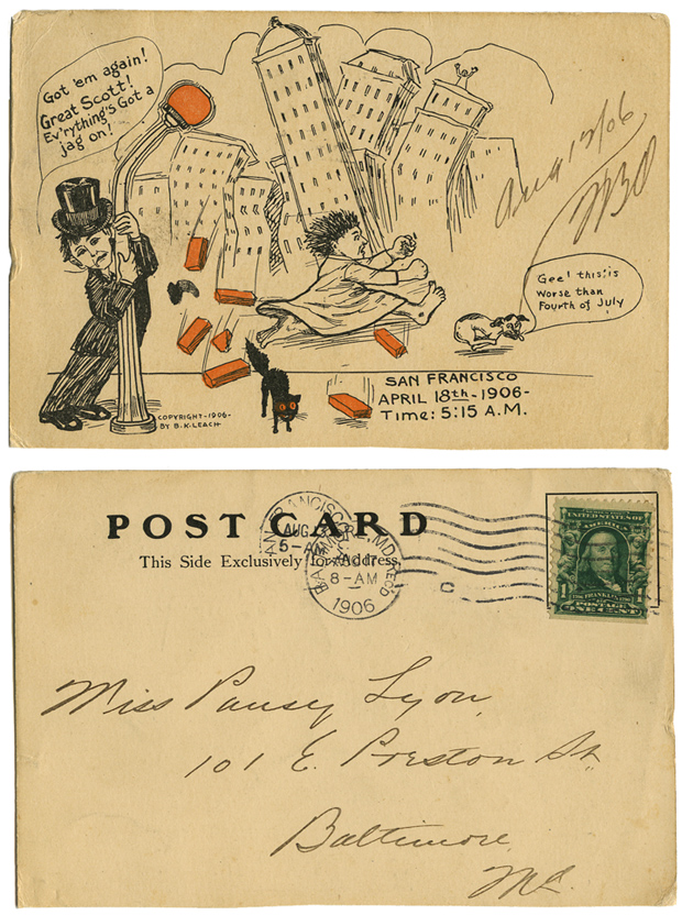
This is an interesting old postcard dating back to 1906 San Francisco. I've never seen this one before which does not mean it's rare, it just means I've never seen it. I enjoy finding things about the earthquake in San Francisco that aren't the usual photo cards of the city destroyed. Earlier I posted a card with a Chinese coin attached. Here's a new take on the event...humor. 

This is not an original drawing, it is a mass produced card made by B. K. Leach sent from San Francisco in August of 1906 to Maryland. I've found nothing online about B. K. Leach.

What intrigues me the most is how much the character in the nightshirt running for his life looks so much like a character from one of  Maurice Sendak's books, such as little Mickey from In the Night Kitchen.

B. K. Leach_San Francisco earthquake postcard_tatteredandlost
Click on image to see it larger.

7/17/09

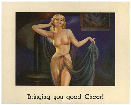
LOVE is like a butterfly...


or at least a sexy seductive blond. 

I went to a wonderful estate sale today and came home with a smile from ear to ear. A lot of fun. A lot of wonderful items. This is one of them. 

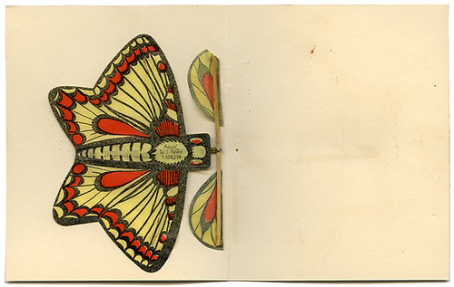
I saw this sexy seductive lady on a table and thought, "Hmmmmm...do I peek inside?" Imagine my surprise when I did and found a wind propeller butterfly. Never used. In near pristine condition. I remember little butterflies like this as a child, but not in packages like this. I certainly didn't go to THOSE kind of birthday parties. Imagine this little lady as a place card at a party. The adults in paper hats, a bit tipsy, and then they open these up and wheeeeeeeeeeeeeeeeeeeeee...butterflies all over the room. What a site to behold.

I think even people that don't understand collecting ephemera might enjoy this.

Butterfly Souvenir Card_front_tatteredandlost

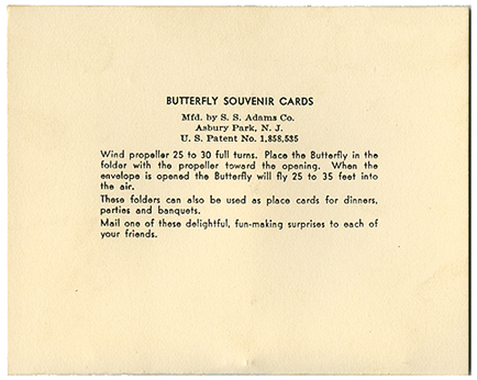
Butterfly Souvenir Cards_back_tatteredandlost

Butterfly Souvenir Card_back_tatteredandlost
Click on images to see them larger.

Well, I see I was too quick to post this without doing a little research. Turns out this was made by the S. S. Adams Company that also gave us sneezing powder, exploding cigarette boxes, snakes in the nut can, stink bombs, dribble glasses, bug in an ice cube, and the infamous hand buzzer, of which I have one from the early 60s that still works. You can read more about this inventive man, Søren Adam Sørensen, originally from Denmark, here. 

7/15/09

SUMMERTIME and the living was easy


Raise your hand if you remember getting the Scholastic Magazine at school and pouring over the pages that advertised the books they had for sale. What I'm talking about are issues from the early 1960s. 

In the summer of 1963 my folks got me a subscription to Scholastic's SummerTime. I loved it! For 8 weeks I got real mail. Something to anxiously wait for each week. Something new to read. Pages of books being advertised to pour over. Stories, games, movie reviews. I'll deal with some of those books and the other content in a later post. For now I wanted to post the cover of the June 27, 1963 issue. Volume 10, No. 1. I believe the illustrator is Al Wenzel, but I'm not sure. He may be the same illustrator that did some work for D.C. Comics.

Yes, I kept every single issue I got that summer and whenever I find them they make me smile and I'm a kid again. This illustration is so very much summer. All the good things a kid imagines about summer. Well, maybe not today. Kids don't go outside to play as much. They're all tethered to technology and leave their imaginations I don't know where. I'm not sure they just get to really be kids anymore. This illustration shows you what summer should be for a kid. Enjoy. Another time ephemera takes me back in time.

Scholastic Magazine_June 27 1963_tatteredandlost

7/13/09

THE "CANARY" MURDER CASE


In the past I've posted about a few of the movie tie-in books I have and how I started a collection without even realizing it. Well, this volume is the oldest of the bunch. 

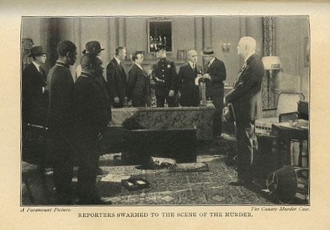
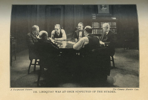
This particular book has a copyright of 1927 and contains several photos from the 1929 Paramount movie The "Canary" Murder Case starring William Powell, Louise Brooks, and Jean Arthur. I've never seen the movie, nor have I read the book. The story is as follows according to IMDB:
A beautiful showgirl, name "the Canary" is a scheming nightclub singer. Blackmailing is her game and with that she ends up dead. But who killed "the Canary". All the suspects knew and were used by her and everyone had a motive to see her dead. The only witness to the crime has also been 'rubbed out'. Only one man, the keen, fascinating, debonair detective Philo Vance, would be able to figure out who is the killer. (Written by Tony Fontana)
This book was the second in a series of Philo Vance novels written by S. S. Van Dine. Van Dine, whose real name was Willard Huntington Wright, was born in 1888 in Charlottesville, Virginia and died in 1939. To read more about him click here
By the time the second of the series, The Canary Murder Case, appeared a year later, Van Dine had become a best-seller, Vance was a household word, and guessing the author's identity was a favorite pastime. When Van Dine wrote an article for a Chicago paper, he responded to the editor's malicious request for a photo with a caricature of himself (having been a painter) which was faithful in every detail, yet unfaithful in general impression. It had the prehensile ears, hair parted to the right, beard, mustache, and monocle. This drawing led to a comparison of the works of S. S. Van Dine with those of Willard Huntington Wright, and thus to a discovery of the author's closely-guarded identity thru certain similarities in those works. (Source: Louise Brooks Society)
The "Canary" Murder Case_frontispiece_title pg_tatteredandlost

The "Canary" Murder Case-photo 1_tatteredandlost

The "Canary" Murder Case_photo 2_tatteredandlost

The "Canary" Murder Case_photo 3_tatteredandlost
Click on images to see them larger.

As far as the film is concerned, there is this interesting little tidbit at Wikipedia about the production:
The first film in the series of Philo Vance films adapted from the novels was The Canary Murder Case (1929), starring William Powell as Philo Vance and Louise Brooks as the Canary. This film became notorious as the film where Brooks -- having left for Europe to make two films for director G. W. Pabst -- refused to return to the U.S. to dub her dialogue for the sound version. Paramount Pictures then terminated Brooks, and hired actress Margaret Livingston to dub the dialogue for Brooks instead. (Source: Wikipedia)
It all looks a bit dry between the pages, no pun intended considering how yellowed they are, but the movie clip below makes it look interesting. I don't know that I'll ever get around to reading it with so many other books already stacked up on the floor awaiting my attention. But it's worth having just for the photos. I wish I knew which book was the first ever published with a studio tie-in. I've never found any information online. It's all just ephemera.

7/9/09

S. S. President Cleveland ON THE HIGH SEAS


To read an update to this post click here.

I can close my eyes and remember standing aboard ship and watching the sun set on the horizon as we sailed to Hawaii, each day feeling the sea breeze grow warmer. I wish I could experience it again. 

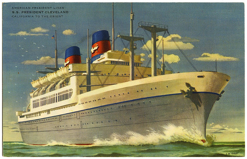
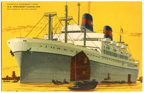
These lovely cards are of the S. S. President Cleveland which sailed from San Francisco to Asia and back again. I believe these date to the later 50s to early 60s. 

S.S. President Cleveland_front_postcardtatteredandlost
S.S. President Cleveland_postcard front_tatteredandlost
S.S. President Cleveland_back_postcard_tatteredandlost
Click on images to see them larger.

The S. S. President Cleveland was part of the American President Lines. 
In 1938 the U.S. Government took over the management of the Dollar Steamship Co. which was in financial difficulties and transferred their assets to the newly formed American President Line. The company operated trans-Pacific and round-the-world services, but the war in Europe disrupted services and after the entry of the United States into the war, all the company's ships were taken over for war duties. After the war, only two ships were returned to the round-the-world service and two new ships were built 1947-48 for the trans-Pacific route. Further ships were later added to the fleet, but by 1972 only the PRESIDENT CLEVELAND (2) and PRESIDENT WILSON (2) were sailing as passenger ships and both were withdrawn from service the following year. The company still trades as a cargo company. (SOURCE: The Ships List)
To see photos of the interior click on this link to the site Cruising the Past. And to read a complete history of the lines click here for Wikipedia. Unfortunately I can't find any information about either illustrator.

I hope this bit of ephemera brings back memories to those who sailed the high seas in style and gives those who didn't a moment to pause and dream.

7/8/09

My ears NEVER CAME OUT OF STORAGE


I had a pair of Mouseketeer Ears. They were lovely. Very heavy ears, felt beanie. No name on it. Just the Mickey Mouse Club logo. They were bought at Disneyland not long after the park opened. Unfortunately when we moved to Hawaii they went into storage somewhere in Maryland and I never saw them again. The Navy changed storage companies while we were in the Islands and when we returned a lot of our stuff was missing. Many of my dolls, toys, and books were to never be seen again. I have always missed those ears and really do wonder why my folks didn't let me take them along. I could have simply worn them. I know we were quite limited on what all we could have shipped to Hawaii, but seriously...Mouseketeer Ears? Like I said, I could have worn them the whole way on the drive across country, on the Matsonia out of San Francisco, and then happily along the streets of Waikiki.

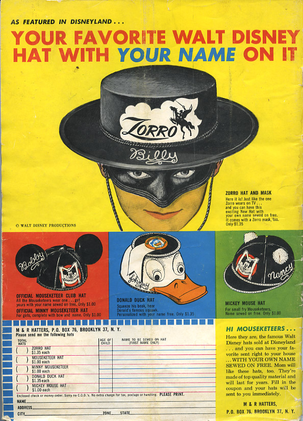
disney hats_tatteredandlost
Click on image to see it larger.

This advertisement is from the back cover of the August 1958, Volume III, No. 5 issue of Walt Disney's Magazine. The magazine was first published in late 1955 as Walt Disney's Mickey Mouse Club Magazine and was of course meant to publicize the show. To see all of the covers of each issue and see some of the internal pages click on this link to a blog called The Original Mickey Mouse Club Show. But back to the hats.

Who wouldn't want the Zorro hat with mask? What a gem. Zorro Billy indeed. I loved Zorro and unfortunately was caught telling a whopper about Zorro as a kid. I was visiting my grandparent's in Pennsylvania. My family had recently moved from Chula Vista, California to near Washington D.C. and I used to spend several weeks each summer at my grandparents home. I still recall telling the little girl down the street that while living in Chula Vista I had seen Zorro's grave. I said this to impress her. I was worldly, she wasn't. I was about 5 so you figure out exactly how worldly I really was. Indeed she was impressed as I elaborated on exactly what the grave looked like. She was so impressed that she told her dad I'd been to Zorro's grave. Ummmmm...her dad...not so impressed. Me? I imagine the blood drained from my face or the opposite and I turned bright red. Whatever I looked like I do know I felt hollow looking out through my eyes at that man's stare. He didn't say anything. He didn't contradict me. He just stared at me. One of those moments that still is buried deep inside that makes me squirm. My Zorro lie. And I allow this ephemera to drag it all back up to the surface. 

As to the Donald hat. Ummmmmm...I remember even at a young age feeling sorry for the kids running around Disneyland wearing those things. They were just somehow so undignified.

7/6/09

LET'S GET TECHNICAL, TECHNICAL, I want to get technical...


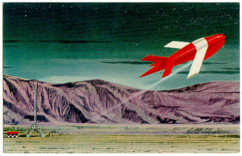
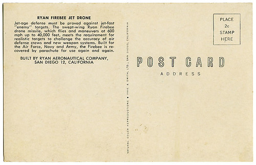
...let's get into technical. Suddenly from having the theme to Star Trek going through my brain after looking at this postcard I suddenly veered off into the dreadful "Let's Get Physical" of the 80s. So I need to divest myself of all information I've found about this little spaceship so I can go back to humming "Don't Fence Me In," my standby whenever a song starts looping in my head.

The Ryan Firebee Jet Drone, according to Wikipedia:
was a series of target drones or unmanned aerial vehicles developed by the Ryan Aeronautical Company beginning in 1951. It was one of the first jet-propelled drones, and one of the most widely-used target drones ever built.
I'm not sure which model this little drone is, but to read more about it at Wikipedia click here. There is also technical information available here and here. It is interesting to read:
The Peoples Republic of China is known to have recovered US AQM-34N Firebee units during the Vietnam War era, and reverse engineered it. The Chinese copy is known as Wu Zhen 5 (WZ-5), or Chang Hong 1 export name. The WZ-5 entered service in 1981 and is expected to be replaced by newer UAVs in the near future.
So I guess this means if you find an old one at a flea market you can tell if it's original or not by turning it upside down and checking for "Made in China" on the bottom.

Ryan Firebee Jet Drone_postcard front_tatteredandlost
Ryan Firebee Jet Drone_postcard back_tatteredandlost
Click on either image to see them larger.

By far the most interesting information I came across today was a piece of ephemera at the archives of Michigan State University. A newsletter called "Spartan Engineer" published in March 1958 makes mention of the Firebee, but the best thing about the newsletter are all the ads geared towards engineering students placed by large corporations hoping to entice them with future employment...or use of their products: 
Dow Chemical, General Motors, US Steel, Sylvania, Convair, Westinghouse, Standard Oil, Dupont, IBM, Douglas, Pratt & Whitney, Raytheon, Western Electric, Northrup, Sirkorsky, Allied Chemical, General Electric, and strangely enough Kodak and A.W. Faber-Castell and Eagle Pencil for drafting tools.
Now I always thought the card looked like something out at Area 51. I never actually paid attention to anything it said on the back. It looked like the 1950s and a spaceship. For that reason I liked it. It made me think of all the wonderfully silly spaceship scifi movies in the 50s and the "V" shaped spacesuits every astronaut seemed to wear. Okay, apparently even the astronauts from other planets used the same tailor as you'll see in these clips from "Teenagers from Outer Space," one of the all time great bad movies.


As with so many of my cards this was given to me by my best friend. I know she's out there right now saying "Yes, yes...I gave that to you!" And she's one of the only people on planet Earth that understands how my mind works.

Okay, I've droned on enough about this, never really saying anything of consequence, so to get all of it out of my head, and yours, I'll leave you with Roy singing "Don't Fence Me In". Take it Roy...


All information provided for entertainment purposes only. No animals were harmed during the writing of this blather.

7/4/09

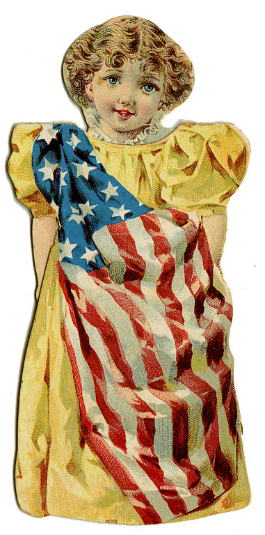
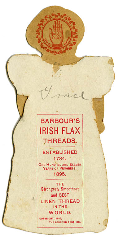
AMERICA paper doll


A little piece of paper 114 years old. One of a series of 12 little paper dolls offered by the Barbour Brothers Company of New York in 1895. This one was called "America" for obvious reasons. Originally they cost three two-cent stamps. I think it interesting someone named her Grace, the same name of the doll I posted last night. 

Barbours Irish Flax Thread_America paper doll front_tatteredandlost

Barbours Irish Flax Thread_America paper doll back_tatteredandlost

7/3/09

HAPPY 4TH!


Happy 4th of July! 

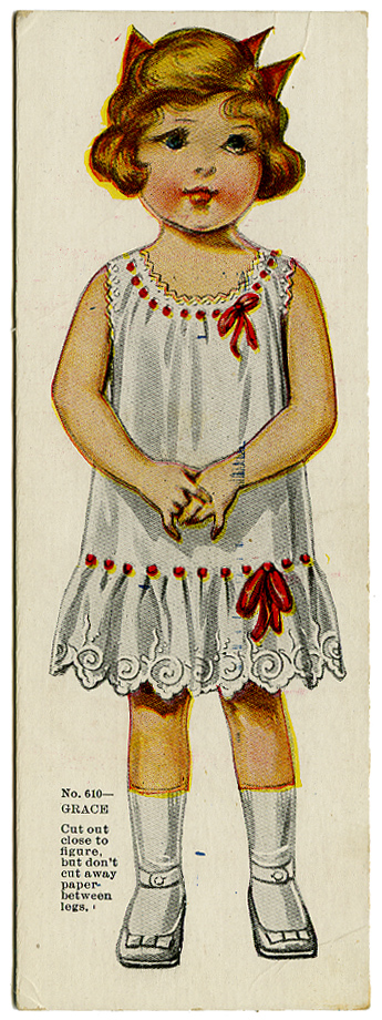
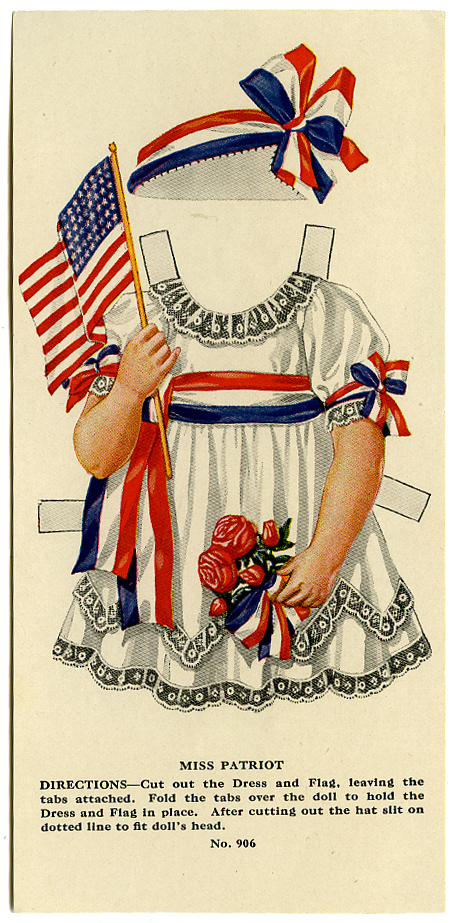
Though this little Miss has a misprint she's still worthy of celebration. She was made by the American Colortype Company during the first quarter of the 20th Century. Her name is Grace. Enjoy.

American Colortype Co_Grace_tatteredandlost
American Colortype Co_Miss Patriot_tatteredandlost
Click on either image to see it slightly larger.

Send them home with SOMETHING IN THEIR STOMACHS


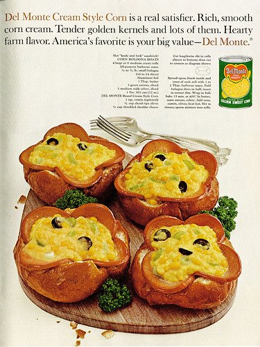
Looking for just the right dish to serve to guests this 4th of July? Something festive? Something colorful? Something that looks like you just threw it together the last minute? Look no further. Del Monte, Ladies Home Journal 1964, has supplied a simple recipe that would have a home economics teacher sighing. You'll send your guests home with something in their stomachs. I'm not sure how long they'll keep it down or if they'll even stay...but...perhaps if you have relatives coming that you wish would leave early....

Now, I know a lot of blogs offer recipes. Obviously this isn't the forte of my blog, but I didn't want to be left out completely. In my search through ephemera I'm often amazed, no make that stunned, by some of the recipes I find in magazines from the 50s through 70s. Earlier magazines still ran recipes where you were expected to cook, not just pour contents of cans into something. This recipe is the can pouring type. And whatever you do, don't take any shortcuts. Remember to use the garnish. The garnish is really what holds it all together. Presentation is everything. 

cream corn and bologna_July 1964_tatteredandlost
Click on image to see it larger...if you simply must.

My favorite book about these sort of recipes, shown in magazines and old cookbooks, is The Gallery of Regrettable Food by James Lileks. The book is hysterical. There is a link in the left column which will give you more information and reviews at Amazon. 

7/2/09

Mark Summers, Ray Milland, and LIZZIE THE NODDER


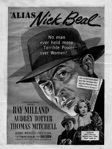
There are actually several unconnected reasons for this post, all of them centered on this ad from a 1949 Photoplay magazine. And so I begin.

Alias Nick Beal_tatteredandlost
Click on image to see it larger.

The first thing I was drawn to when I looked at this ad was the beautiful scratchboard illustration, which got me thinking about illustrator Mark Summers. Now I have no idea who did the work for this ad, but Mark Summers work is something you're likely familiar with if at some point you've shopped at Barnes and Noble. Mr. Summers is without a doubt one of the finest illustrators working today and for years has been the literary identity for B & N. His illustrations have graced the shopping bags, bookplates, posters, etc. Beautiful and elegant black and white work. To actually read about him click on this link which will take you to his representative's site. There you'll see samples of his work along with a brief biography. Make sure you click on "Case Study" to see how a work progresses. Summers has recently done the illustration for a U.S. postage stamp, Lincoln Railsplitter, that has a 2009 issuance date.

The next obvious reason for my interest in this is the movie it advertises, Alias Nick Beal. I don't believe I've ever seen it. From what sleuthing I've done on the net it appears that it has never been released on tape or dvd. I don't even know if TCM has ever shown it. I love noir films and this one sounds fascinating according to this synopsis at IMDB:
Righteous district attorney Joseph Foster's main goal in life is to rid his city of the gangsters infesting it. In order to be even more efficient in his war against crime he plans to run for governor. One day he meets a strange, shadowy man, Nick Beal, who offers to help him to achieve his end. Beal convinces hesitating Foster by dint of easy money, easy sex with an alluring young woman and the promise of easy success. Joseph Foster soon becomes an influential politician but a corrupt one. A minister of God manages to show him that he has been the plaything of the so-called Nick Beal, who might be "Old Nick" , that is to say Satan himself. Foster then decides to resign and to become an honest man again. (Synopsis written by Guy Bellinger)
I've checked Amazon to see if the movie is available, but all they have are knock-offs of the original 4 color movie poster. If the poster is so popular, you'd think somewhere along the line Paramount would have allowed the film out of their vault.

And finally, there's Audrey Totter down in the lower right corner. I'm afraid I don't recognize the name though I see at IMDB a list of films and tv shows she's appeared in since the mid 40s. I'm sure she's a face I'd normally recognize, but in this case...ummmmmm...I'm thinking of Lizzie the Nodder at my vernacular photography site. Poor Audrey was certainly not done any justice in this ad. Now it's common for a studio to release a movie poster with a star's head on someone else's "perfect" body. Usually you don't notice. This time...not so much. What were they thinking? Did they really think nobody would notice that ummm...HER HEAD DOESN'T FIT! Hello?! Something wrong here! Did someone at the studio dislike the original photo so much that they were willing to have this head stuck on her body all out of proportion with reality? Okay, I know, they wanted to feature her and the original was probably just a simple nice photo that had no punch. But this? Her head looks like it's going to fall off!

I said when I started this post that the reasoning behind it was a complete disconnect. I think I proved my point. I've ended with a woman whose head is disconnected from her body. And she reminds me of the post I did about Lizzie the Nodder at my other site.

Ephemera, it can lead you nowhere and back again.

Update: I just discovered this clip from the movie on youtube. Now it's really got me curious. Now I really want to see it.

7/1/09

We're lucky we aren't MORE NEUROTIC!


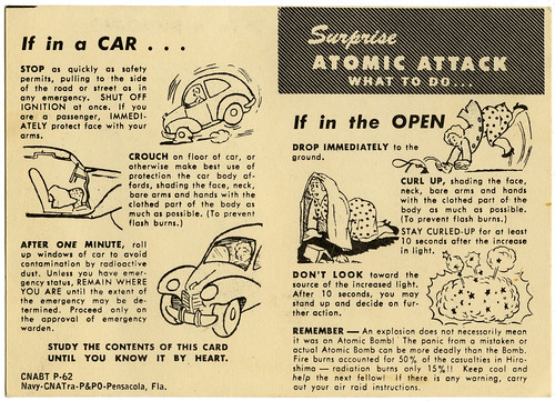
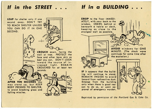
Today boys and girls we're going to talk about death. Not real death. Make believe death. The kind the government warned us Boomers about as we were growing up. Death at any moment. Or...maybe just a really bad sunburn. 

I found this brochure in with a bunch of other nonsensical stuff I've saved over the years. I have another one around here somewhere that was given to my family when we moved to Hawaii that shows the people doing duck and cover in Aloha shirts. I'm not kidding. But until I can find that one I give you this one from the early '50s provided by the Navy when we moved to Pensacola.

Government and corporate stupidity always amazes me and this is just plain stupid. The lies we were told about how we'd survive an atomic blast by simply doing duck and cover. Or as comedian Lewis Black has said "hide under kindling." Actually I think we're all lucky we didn't end up running around screaming all the time, arms waving madly over our heads, waiting for the bright light in the sky. Any minute now...no wait...it's coming...you have less than a second to make a decision on how to save your life. Seriously, is it any wonder drugs became popular?

Do click on either image to see it larger. Important life saving tips included.

back_tatteredandlost

atomic bomb to-do-list_interior_tatteredandlost.jpg

And to end, I give you the infamous "Duck and Cover" film, well worth watching as a classic comedy piece from the golden age of television. If you're of a certain age there are two sounds that will most likely bring about visceral feelings. The theme to the Captain Kangaroo show and the air raid warning siren. I still remember hearing the warning signal into the '60s. It stood strategically located in the neighborhood and was painted a bright yellow. I wonder when and if they ever took it down.

Nothing to see here. I'm okay. Move along. Move along. I'm fine. I've always had this nervous twitch.