Two covers for the same book published five years apart by the same company. How could they be so very different in such a short time?
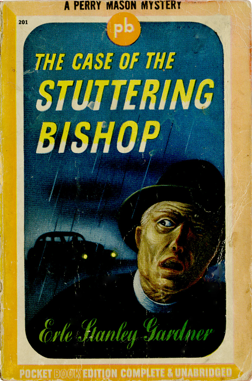
This first one is from 1943 and includes on the first page:
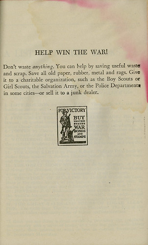
In order to cooperate with the government's war effort, this book has been made in strict conformity with WPB regulations restricting the use of certain materials.
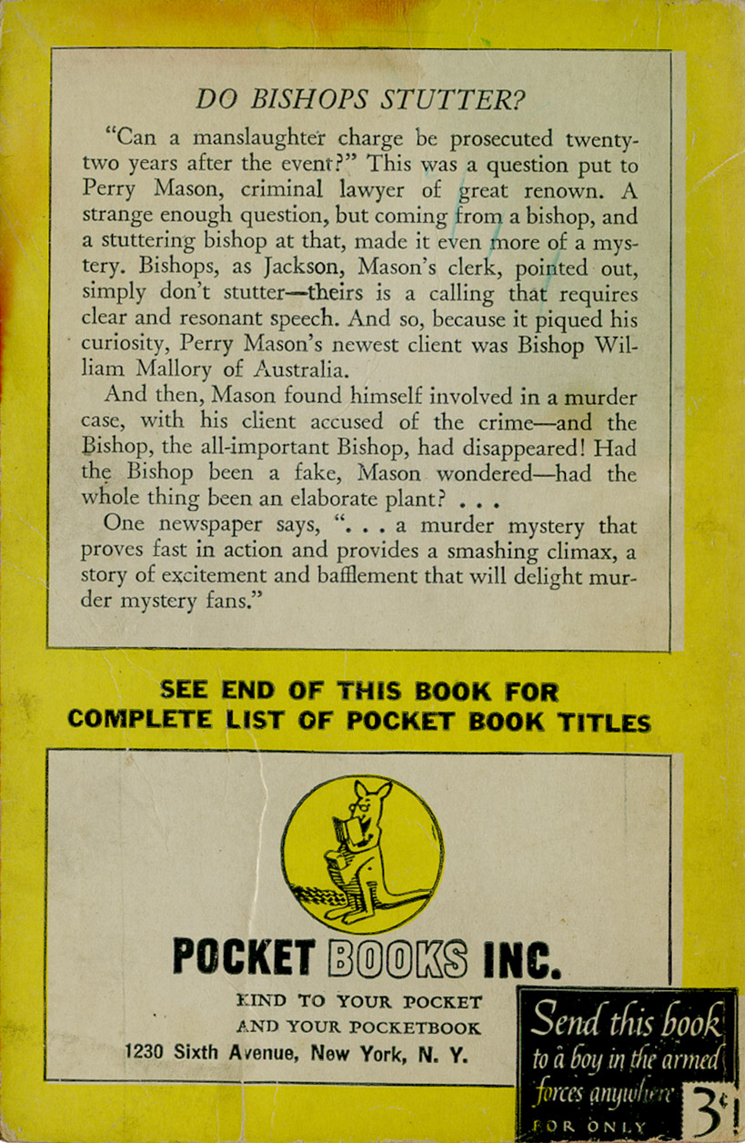
Editorial decided to, I guess, take a more literal direction for the cover illustration. Okay, the Bishop looks a bit like the Crypt Keeper, but that's coming from my 2010 perspective, not 1943.
Paperback books were still relatively new when this one was marketed so perhaps they hadn't really grasped the idea of splashing sexy babes and rugged guys on the cover. Still, Pocket Books put out 8 editions of this book in 1943. Have no idea if they all had this cover. This one is a second printing.
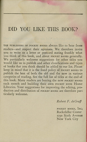
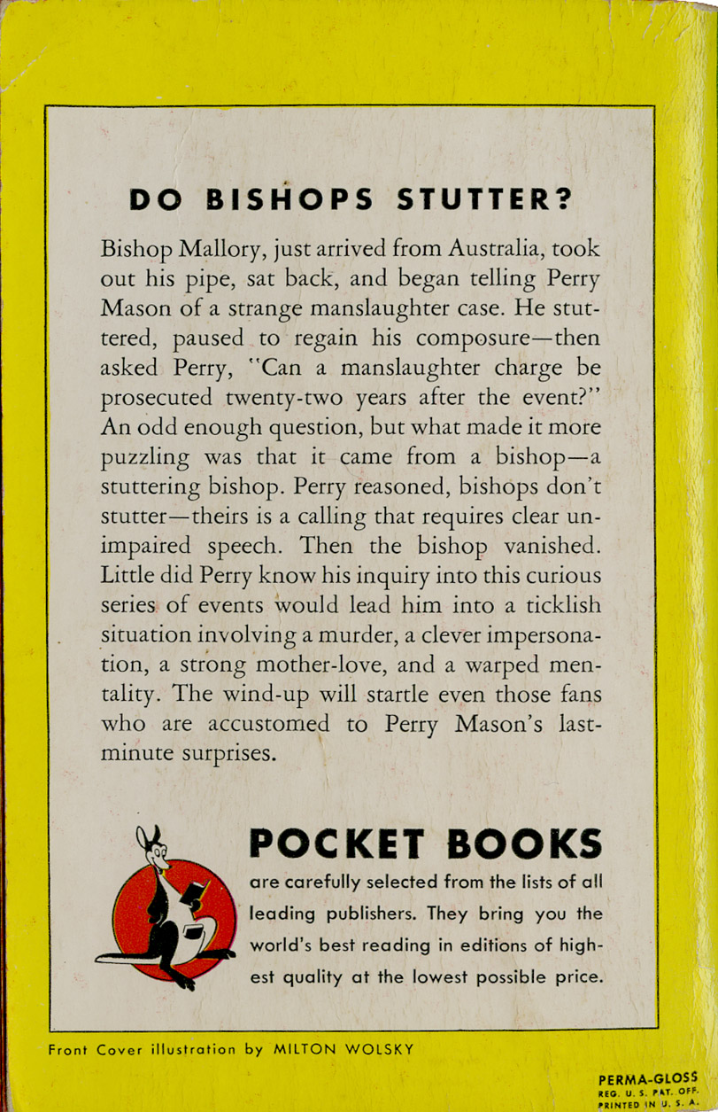
Notice on the back cover the "Send this book to a boy in the armed forces anywhere for only 3¢". And below are a couple pages from the interior. One is Pocket Books speaking to their buyers. The other is trying to show support for the war effort.
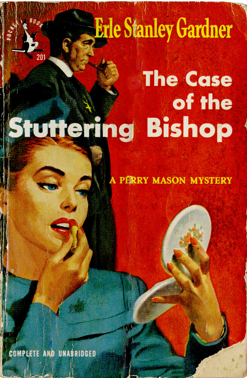
By 1948 the war was over and the boys were back and babes were primping. No stuttering Bishop on this cover. This was the 22nd edition by Pocket Books.
Brief history of Pocket Books thanks to Wikipedia:

Pocket produced the first mass-market, pocket-sized paperback books in America in early 1939 and revolutionized the publishing industry. The German Albatross Books had pioneered the idea of a line of color-coded paperback editions in 1931 under Kurt Enoch; Penguin Books in Britain had refined the idea in 1935 and had 1 million books in print by the following year.
In 1944, the founding owners sold the company to
Marshall Field III, owner of the Chicago Sun newspaper. Following his death, in 1957, Leon Shimkin, a Simon & Schuster partner, and James M. Jacobson bought Pocket Books. Simon & Schuster acquired Pocket in 1966.

Penguin's success inspired entrepreneur Robert de Graff, who partnered with publishers Simon & Schuster to bring it to the American market. Priced at 25 cents and featuring the logo of Gertrude the kangaroo (named after the artist's mother-in-law), Pocket Books' editorial policy of reprints of light literature, popular non-fiction, and mysteries was coordinated with its strategy of selling books outside the traditional distribution channels. The format size, and the fact that the books were glued rather than stitched, were cost-cutting innovations.
The first ten numbered Pocket Book titles:
Lost Horizon by James Hilton
Wake Up and Live by Dorothea Brande
Five Great Tragedies by William Shakespeare
Topper by Thorne Smith
The Murder of Roger Ackroyd by Agatha Christie
Enough Rope by Dorothy Parker
Wuthering Heights by Emily Brontë
The Way of All Flesh by Samuel Butler
The Bridge of San Luis Rey by Thornton Wilder
Bambi by Felix Salter
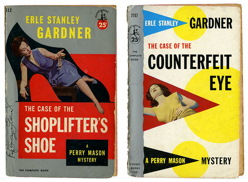
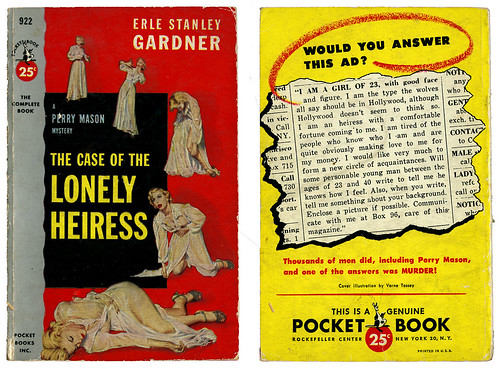
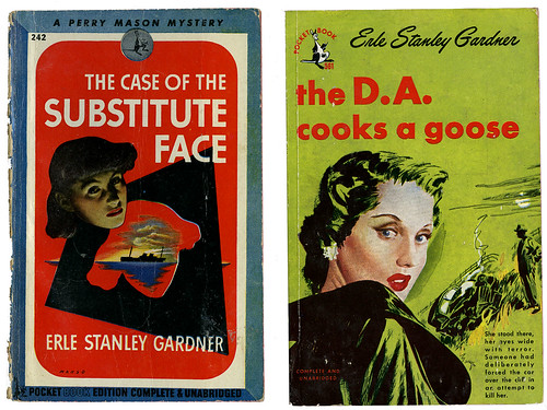
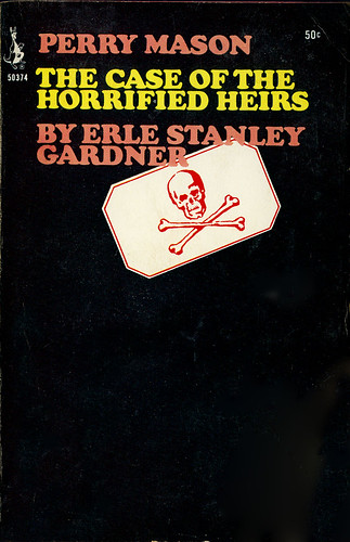
The edition of Wuthering Heights hit the best-seller list, and by the end of the first year Pocket Books had sold more than 1.5 million units. Robert de Graff continued to refine his selections with movie tie-ins and greater emphasis on mystery novels, particularly those of Christie and Erle Stanley Gardner.
Pocket and its imitators thrived during World War II because material shortages worked to their advantage. During the war, Pocket sued Avon Books for copyright infringement: among other issues, a New York state court found Pocket did not have an exclusive right to the pocket-sized format (both Pocket and Avon published paperback editions of Leslie Charteris'
The Saint mystery series, among others).
(SOURCE: Wikipedia)
Okay, I love that the kangaroo logo is based on the original artist's mother-in-law. So who did the update in 1948? Had the mother-in-law gotten younger and perkier? She apparently had lasik surgery or was wearing contacts.
And, one other little bit of information is that Pocket Books is headquartered in the same location it was in 1943. I guess once you get a good spot in Manhattan you sit on it. Just as Gertrude, the kangaroo.