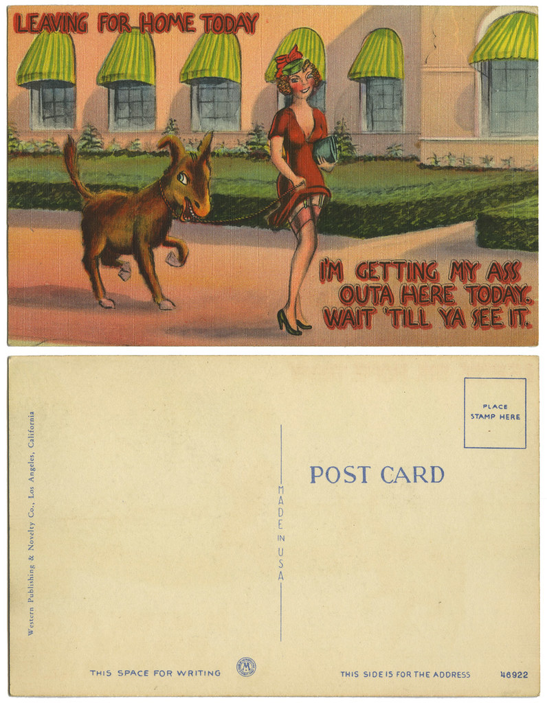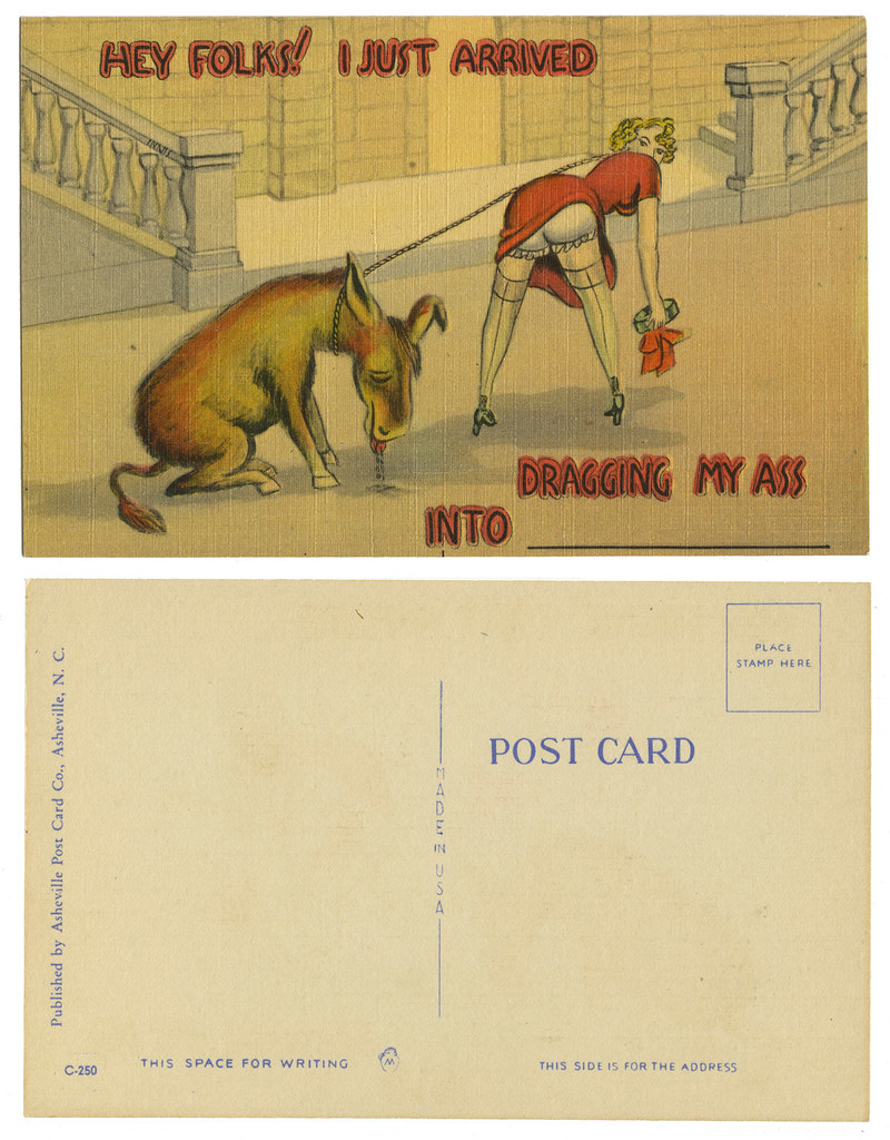
Do they still make post cards like these? I call them "snicker" cards because really about the best I can do when seeing them is snicker. I worry about people who find them thigh slapping tears running down their face funny. Nope. The best I can do is snicker or, if it catches me in the right moment, perhaps a light rip-snort.
The printing of these is sort of strange. The first says it's from the "Western Publishing & Novelty Co." located in Los Angeles. The second is from the "Asheville Post Card Company" located in Asheville, N.C. Drawn by the same person? I don't know. The lettering certainly looks the same, but that was probably put on later. Neither could be considered particularly good art. The face of the woman on the first card is incredibly bad, not that the back end on the other looks much better.

What I find most confusing is how similar the cards are and yet by different companies. But then we get down to the little almost insignificant logo. Each card has a different logo, but each features the letter "M". The first logo indicates the card was printed by the Metropolitan Lithograph Company that was located in Everett, Massachusetts. Is the second card also by them with a different logo which also featured an "M"?
If imitation is the sincerest form of flattery then who the heck was copying? Which "ass" card came first? And why were "ass" cards popular? Okay, sorry if I offended by referring to them as "ass" cards, but "donkey" or "burro" would have made the punch lines fall flat...on their ummmmmm...keister.
Oh no, I suppose this is a category. I will need to collect more. Then again, maybe not. Two is enough.


The leer on the burro is a little unsettling....love the awnings on the windows, a delicate touch for a sassy card.
ReplyDeleteI know. The perky little awnings are pretty funny.
ReplyDelete