
Finally, the end of the Earl Stanley Gardner/Perry Mason cover posts. These date from the mid-1940s to mid-1950s. These are the cover styles I grab when I see them.
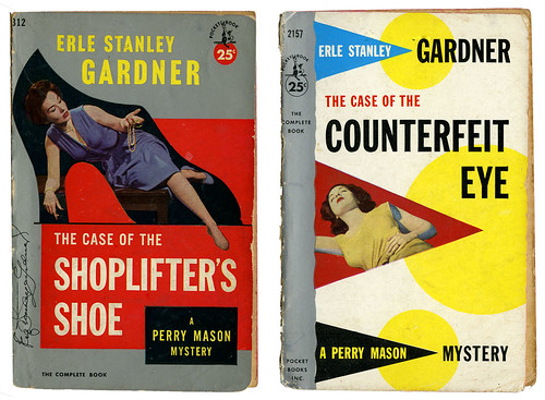
On the left 1953, the right 1956.
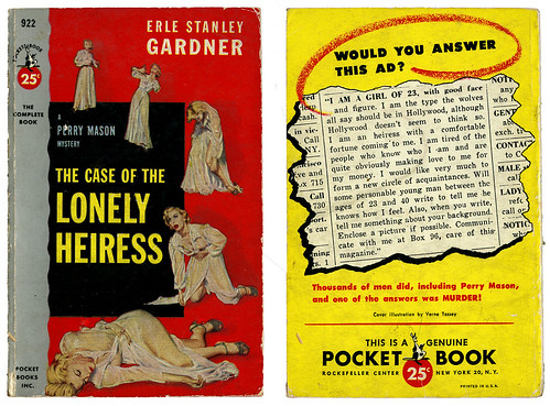
This one dates from 1952. I love the back cover.
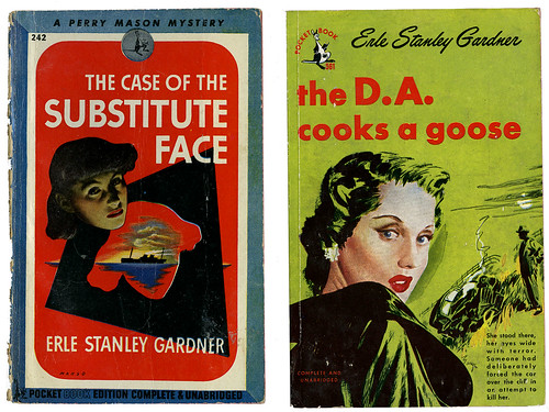
The one on the left is from 1944, the one on the right from 1949.
I find the use of lowercase letters on the 1949 cover interesting.
Interesting to see how often red and yellow were used over the years until we hit the 60s.
I find it fascinating to see how one author has been marketed through the years. What the publisher in each decade thought would sell. Do they reflect each decade or did the publisher sometimes miss the boat completely? I have no idea, but I know I'll keep collecting them when I find them in used bookstores and thrift stores. I like to be surprised by them when I find one and won't be buying them on eBay. eBay isn't fun anymore. It's cold and corporate.
And finally, all past Earl Stanley Gardner posts so you can compare the covers:


I'm taking a week for a trip to Seattle to see siblings and look for old paper. I'll have to look back at all of these when I get back.
ReplyDelete