Click on image to see it larger.
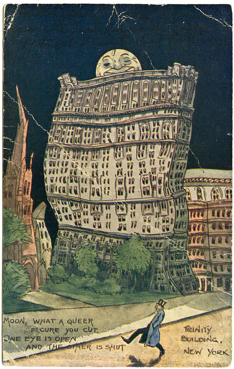
I just wanted to post this fun old postcard and get back to the jobs on tight deadlines. But then the little poem in the lower left corner called out and I just had to google it. Now I'm not saying I spent much time searching about either the poem or card publisher. But here goes...
First off the poem. The following comes from Project Guttenberg, specifically The International Magazine of Literature, Art, and Science, Vol. V., New-York, February 1, 1852. No. II
First off the poem. The following comes from Project Guttenberg, specifically The International Magazine of Literature, Art, and Science, Vol. V., New-York, February 1, 1852. No. II
Of tipsy drollery, a correspondent of the Evening Post (Mr. Bryant himself, we have no doubt), writes: "It is esteemed a mark of a vulgar mind, to divert one's self at the expense of a drunken man; yet we allow ourselves to be amused with representations of drunkenness on the stage and in comic narratives. Nobody is ashamed to laugh at Cassio in the play of Othello, when he has put an enemy into his mouth to steal away his brains. The personation which the elder Wallack used to give us some years ago, of Dick Dashall, very drunk, but very gentlemanly, was one of the most irresistibly comic things ever known. I have a mind to give you a translation of a German ballad on a tipsy man, which has been set to music, and is often sung in Germany; it is rather droll in the original, and perhaps it has not lost all of its humor in being overset, as they call it, into English. Here it is:"
OUT OF THE TAVERN, ETC.Out of the tavern I've just stepped to-night
Street! you are caught in a very bad plight.
Right hand and left hand are both out of place;
Street, you are drunk, 'tis a very clear case.
Moon, 'tis a very queer figure you cut;
One eye is staring while t'other is shut.
Tipsy, I see; and you're greatly to blame;
Old as you are 'tis a terrible shame.
Then the street lamps, what a scandalous sight!
None of them soberly standing upright.
Rocking and staggering; why, on my word,
Each of the lamps is drunk as a lord.
All is confusion; now isn't it odd?
I am the only thing sober abroad.
Sure it were rash with this crew to remain,
Better go into the tavern again.This is parodied or stolen by the clever author of the Bon Gaultier Ballads, in one of his best pieces.
Now, why this poem was placed in reference to the Trinity Building in New York City...haven't a clue. The original Trinity Building was built in 1853 from designs by Richard Upjohn who also was the architect of Trinity Church (completed in 1845). Apparently it was only a five story building. When this one was built I'm just not sure. To read an interesting article from the November 23, 1902 New York Times click here. The more "modern" skyscraper was constructed on:
...the very place where New York City's first office building once stood.This was a speculative venture of the Trinity Church.An addition to the north was constructed in 1906-1907, designed by Francis Hatch Kimball.Featured in the motion picture Spider-Man 2 as the Westside Tower, with its green lantern top providing the setting for a fight scene. (Source: Emporis.com)
Click on image to see it larger.
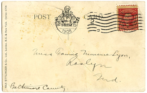
The card was published by Max Ettlinger & Co. The following is from the metropostcard.com site where you'll also see a variation of this card:
Max Ettlinger & Co. Ltd. 1901-1916
6 East 17th Street, New York, NY and London, England
Published a variety of card types, many of them real photo cards. Some of the real photos were hand colored and carried trade names of Lamanet, Photolet, and Photocolour. While most of the color work was printed in Germany and Prussia, a set of hand colored brown toned art cards were made in France. Their cards were generally issued under the Royal Series name.
I actually prefer my version of the card than the one at the site above. I do like that mine is tattered, of no value to any other collector. I like the scratches and bends that look like lightening. Turns it from just a drunk out for a walk on a moonlit night to a drunk walking through a storm.
If you like this card you might also enjoy one in a similar vein that I posted last year called "Hold Onto the Lamppost", a San Francisco earthquake card.
_________________
Christine, from the always interesting The Daily Postcard, has made a very observant comment about the artwork on this card. She compares it to that done by Winsor McCoy of Nemo in Slumberland fame. I agree. There is a strong similarity. I wish this card had an artist's signature hidden somewhere on the front, but alas there is nothing. But for those not acquainted with Winsor McCoy I'd recommend you take a look at the sites listed below. All I have of Nemo is one wonderful little book that my best friend gave me. It's a book of postcards that is now out-of-print. I notice other books of McCoy's Nemo work go for hundreds of dollars on Amazon. Note that there are two links below to Wikipedia where you'll find additional links to Winsor McCoy information.


O.K., seriously, I have a lot of work to do, so stop making me come over here and comment on your posts.
ReplyDeleteThis is a beautiful card, despite the wear. It reminds me a little of a card I posted back in November: http://postcardparadise.blogspot.com/2009/10/prohibition-noble-experiment.html
It reminds me even more of the illustrations of Winsor McCay, cartoonist for the NY Herald, and creator of Little Nemo in Slumberland. He was at the height of his career right when this postcard was made, but I suppose he would have signed this if it was his work.
Yes, yes, you're right. It does look like Winsor McCay. I love Nemo. I knew the work looked familiar, but couldn't place it.
ReplyDeleteGreat card at your site. Wonder what it was with the moon, buildings, and drunks?
So glad you stopped your work to find that poem and the story to go with it, it is a hoot! I love they way it looks kind of beat up and well handled, much better than something in pristine condition.
ReplyDeleteAnd now don't you especially want to hear it sung in its original German?
ReplyDeleteOh no, is it a bit like the Threepenny Opera? I can see the parallels.
ReplyDeleteI think it's more like biergarten mit lederhosen.
ReplyDeleteI absolutely love this!
ReplyDelete