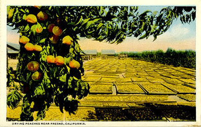
When I was in college we learned how to do overlays. Sometimes we used a product called ruby or amberlith. There was also Zipatone. Each of these required placing an acetate overlay over the black and white original artwork. You then used an x-acto knife to cut out the shapes that you wanted in color. You basically built the colors on the different acetates, but what you were actually looking at was either a ruby red or orange amber. The only colors you saw were the black and white art, the different overlays in the red or orange that each represented a different color to be printed, and then of course white. You had no idea what the final printed piece would look like. There were a lot of surprises when the final arrived. I'm thrilled I don't have to do this anymore. Took a terrible toll on the eyes.
The other method was to do washes on vellum or acetate which is most likely how these cards were done. It makes it look as if the photos were done by someone with a watercolor brush.


No comments:
Post a Comment