These vintage post cards most likely date from the mid-1940s to mid-50s. Back when you could stay at simple little Motor Courts. Remember those places with the little garages attached to each room? Or even separate little cottages? Usually there was a lawn somewhere around the office where you could go and sit on a warm summer night. And those metal chairs that sort of bounced with the seashell inspired back, various colors, but usually white metal for the curved base. Hot as all-get-out midday. Long before swimming pools were included with your stay.
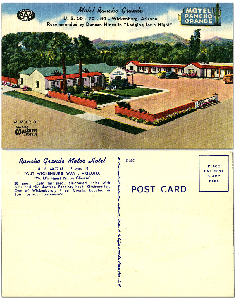
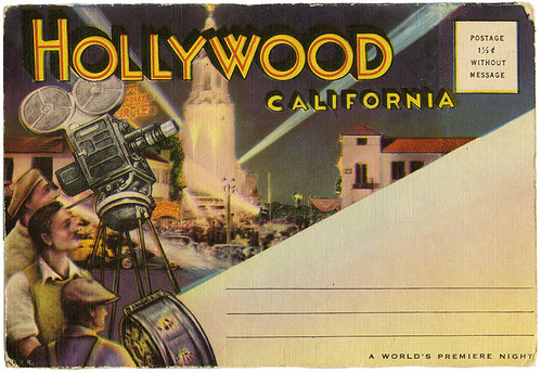
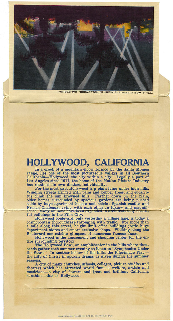
Click on image to see it larger.
Most of these places are gone or so run down that communities want to condemn them. Sometimes I see them in nearly abandoned towns with weeds growing everywhere. Ghost motels. I'm glad I've got memories of when you got a bed and a bathroom, a Gideon Bible, maybe some stationary and a post card. That was it. No air conditioning. You hoped the heat worked in the winter.
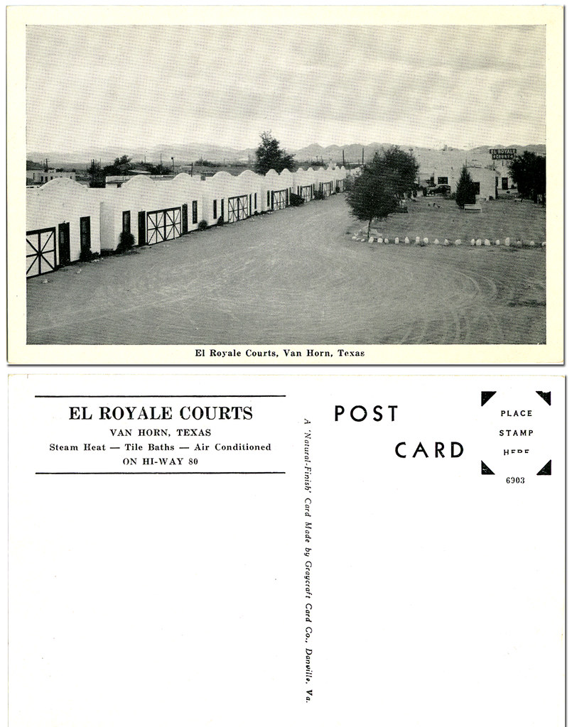
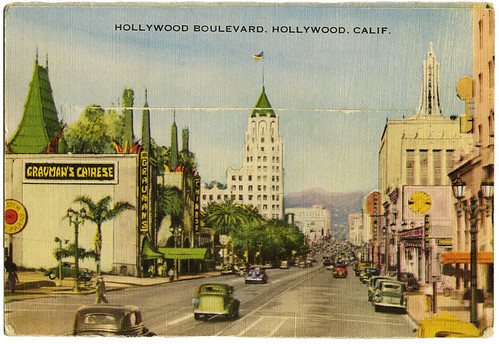
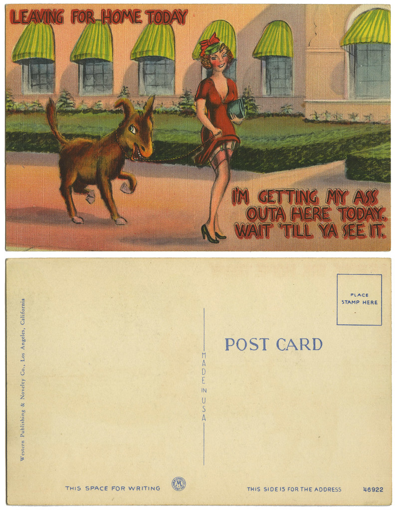
Click on image to see it larger.
And oh my the signs. The lovely neon signs. Surprisingly I have not found any books, old or new, about the old signs. It's a shame because now so many of them are gone or in disrepair that it would be difficult to to even put together a book.
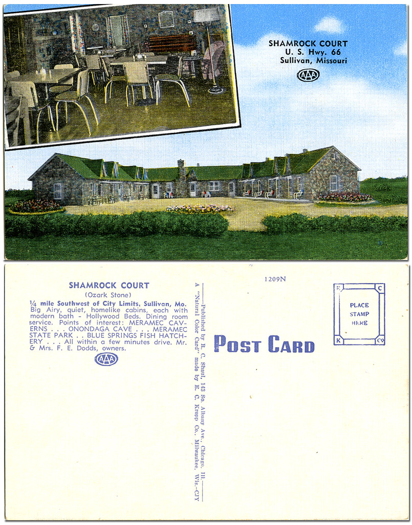
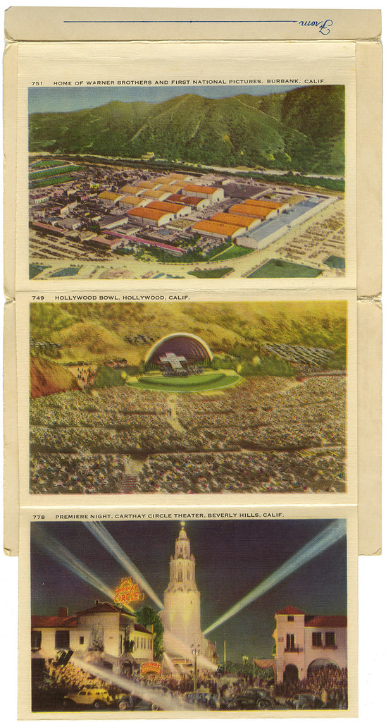
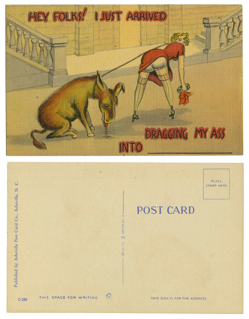
Click on image to see it larger.
Can neon possibly look better than on a rainy night when the flashing reflects off a wet highway, beckoning you to stop. My favorite signs were of the Mexican fellow sleeping next to a cactus with the neon "Z...Z...Z..." floating above him. And every town seemed to have a Flamingo Motel. Now it's all corporate and boring. I know, I'm old, but I miss the creativity that existed. It's all just too tiresome now.
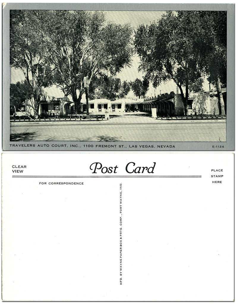
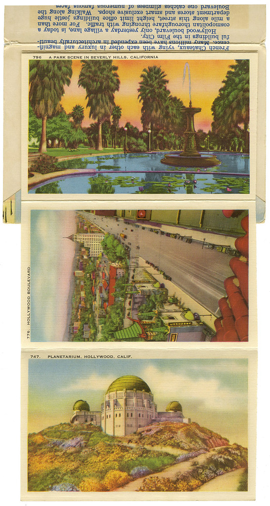
Click on image to see it larger.
_______

One more ephemera book I highly recommend is See the USA: The Art of the American Travel Brochure by John Margolies and Eric Baker.
A trip back in time to the romance of travel. Another book that I can sit and look at over and over again and always find something new each time. Good and bad design, beautiful and mediocre illustrations. You'll find all of them interesting if you love ephemera. And who knows, you might just decide to start a collection of your own.
The following pages from the book See the USA are all copyrighted ©2000 John Margolies.
 |
 |
 |
 |
 |