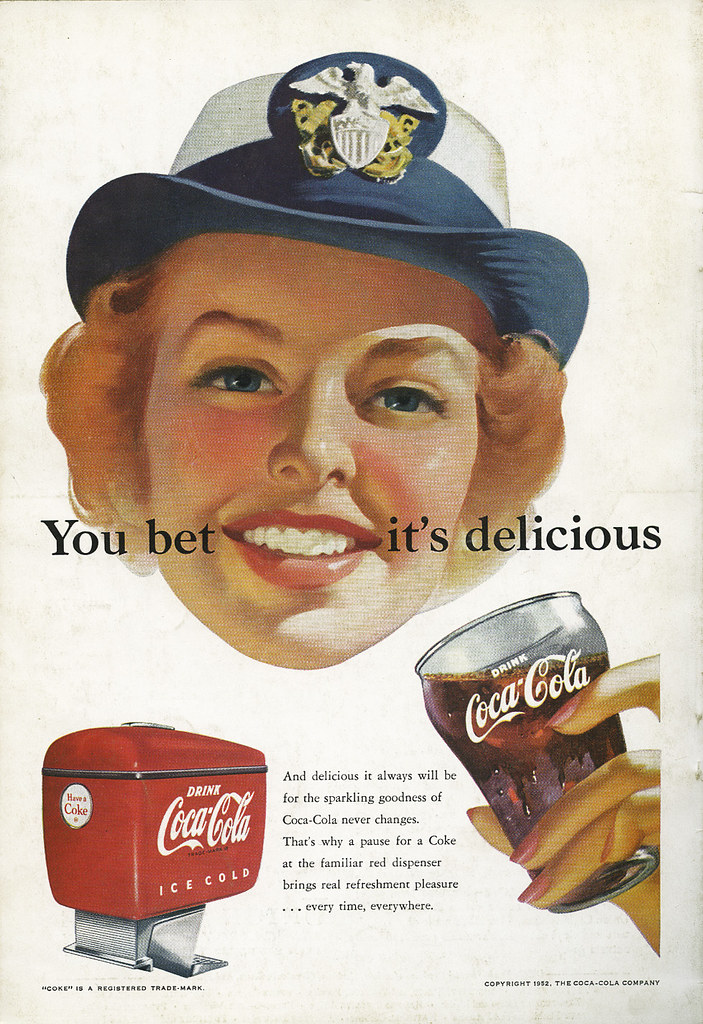
This Coca-Cola ad is on the back of the October 1952 National Geographic. Again, I have no idea who the illustrator was, and it's a nice illustration, but it's a bit of a strange ad.
Click on image to see it larger.
Why put the headline cutting across her face? It literally looks like she's been slashed. Am I the only one to notice this? A disembodied head with this headline cutting from ear to ear. It works, but it makes me uncomfortable.
Then there is the idea that in 1952 a women is being shown having a job, in fact a career. By '52 women were supposed to be back in the home and most ads show them in domestic situations. I think it's interesting that Coca-Cola was pitching the idea of a woman with a career years after Rosie the Riveter was forced out of her job. I'd have loved to have heard the conversations between Coca-Cola and their agency. Who was pushing this idea? I think it's great, but highly unusual.

So do I. Revolutionary as a matter of fact. And still using artists to do their ads, despite the fact that by 1946, a lot of businesses were using photographs in their ads. It is a bit disquieting, isn't it? I mean the copy from ear to ear. It does frame her open smile, (as in, delicious), but I see what's disturbing to you as well.
ReplyDeleteThe one tomorrow looks very much like a photo. Again a disembodied head. In a few years, other than Christmas ads, Coke pretty much went with photos. Never felt the same.
ReplyDelete