4/26/10

WAGON TRAIN san


This is me. No kidding. Okay, kidding a bit because actually this was who I occasionally imagined myself to be when my best friend and I played samurai and geisha when we were 9.


Click on image to see it larger.

Living in Hawaii you couldn't help but be influenced by Pacific Rim cultures. I'd moved from just outside D.C. to Hawaii. From cowboys to samurais. I still watched Wagon Train, Rawhide, and Have Gun Will Travel, but outside playing it was all kimonos and broom sticks. And tea parties as geishas.

Every Sunday morning one of the tv stations played samurai films with the white haired and dark haired shi-shi always battling it out. Good times. Good times. When I couldn't get my fix of samurai movie on Sunday and instead had to go to church I was an unpleasant little child.

This is the back cover of a Japanese movie magazine from the early 60s. Sorry to say I can't remember the name of the actor, but I'm sure my friend will eventually come along and post it. If she does, perhaps I can find an actual clip from one of his films.
______________

UPDATE: Okawa Hashizo with Misora Hibari

4/25/10

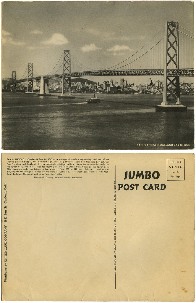
SAN FRANCISCO open the other gate


A beautiful day with perfect weather. How nice it would be to be out on the Bay. Alas, I have spent the day working. Bread before wine, or in my case, tortilla before apple juice. Don't ask.

San Francisco_Bay Bridge_tatteredandlost
Click on image to see it larger.

I'm not sure if this vintage post card dates from the 1930 or 40s. I do, however, remember the last ferry going across the Bay.

4/24/10

ADA, MINNESOTA


I give you a post card of Ada, Minnesota. Turn-of-the-century Midwest. The people dressed as if they just stepped out of the movie Pollyana.


Click on image above to see it larger.


What's so fascinating about worn out cards like this is that I can actually go online and see, through Google maps, what the town looks like from above today. I can also stand on a corner and do a complete 360 of one section of the town, strangely devoid of humans, which you can see here. Below is a shot showing the same buildings that are on this card off in the distance.


And here we have a close-up of the same buildings. If you click here you will go to the page where the original photo resides shot by hoss10. Then click on the shot and you'll see it larger.

(SOURCE: hoss10)

Ada was a small town then, it's a small town now with a population during the last census of around 1,600 people. Looking at it from above it's a town surrounded by farmland, just as I imagine it was over 100 years ago.

Minnesota is one of the three states I've never been to, the others being North Dakota and Alaska. I'll probably never get to Minnesota so Ada will have to do. The person who sent this card, oh so long ago, could have never imagined the future and how this card would end up in the hands of a person over 100 years later on the other side of the continent. And now, because of their choice to send this card I now share it with you.

4/23/10

Shooting STARS


You know those obnoxious little subscription cards blown into magazines that always fall out and annoy the heck out of you when you're trying to look through a magazine in a store? Do you bend over and pick them up or do you leave them on the floor? Don't worry, I'm not going to judge you one way or the other. More than once I've taken my foot and slid them under a counter just to get them out of the way so someone doesn't slip on the blasted things.

What you see below are insert cards I actually saved. These were in the American Film Institute magazine. I'm not sure if it was late 70s or early 80s, but I have a small stack with 20 different photos. Can you name the stars and the films? Give it a try and let me know. They're all pretty easy.


4/22/10

With GUNS ABLAZIN'...


I found this really really tattered book in a junk store, or maybe it was in the trash, a long time ago and always loved it. B-movie Western indeed. As I took it off the shelf to scan, it fell apart. This cowpoke is on his last legs. His repeater ain't goin' to be repeatin' for long.

Click on the dude to see him blazin' his guns even bigger.

The author, Lee Floren, was a slightly prolific writer in the Western genre, though apparently not a good one. He also had a penchant for writing bad soft-porn under the name Matt Harding. To see an example of his writing, if you aren't convinced that such a cheesy cover wasn't for a bad two-bit novelist, click here to see a complete story in the June 29, 1952 The Deseret News Magazine out of Salt Lake City, Utah (and yes, that's the correct spelling). Happy reading!

As to the company that published this gem:
Hillman Periodicals

Hillman Periodicals was an American magazine and comic book publishing company founded in 1938 by Alex L. Hillman, a former New York City book publisher. It is best known for its true confession and true crime magazines; for the long-running general-interest magazine Pageant; and for comic books including Air Fighters Comics and its successor Airboy Comics, which launched the popular characters Airboy and The Heap.

Founding
In the late 1930s and early 1940s, Hillman competed with Bernarr Macfadden and Fawcett Publications by publishing comics, true confessions magazines (Real Story, Real Confessions, Real Romances) and crime magazines (Crime Detective, Real Detective, Crime Confessions).

In 1948 Hillman began publishing paperback books. There were several series of abridged mystery and western novels published in the larger 'digest' size. The long running Hillman paperbacks first appeared in 1948 and lasted until 1961.

Pageant and Airboy
In 1944, Hillman launched a digest-sized, general-interest, "slick" (glossy paper) magazine, Pageant, with an initial print run of 500,000 copies. To obtain the paper during World War II wartime rationing, Hillman ended his detective magazines and comics, which together brought in a $250,000 annual profit. He returned to comics in 1946, resuming some titles from the earlier series.

Like most comic book publishers during the period fans and historians called the Golden Age of comic books, Hillman's titles included costumed superheroes. As trends in the comic book market changed, the focus shifted more to crime fiction/detective stories (Crime Detective Comics, Real Clue Crime Stories), and Westerns (Dead-Eye Western Comics and Western Fighters). Hillman's most notable character, continuing in new stories by another publisher, Eclipse Comics, in the 1980s, was the aviator-adventurer Airboy in Air Fighters Comics and its successor, Airboy Comics.

Later years
Hillman ceased publishing comic books in 1953, while continuing to launch such new magazines as Homeland and People Today, while also distributing Freeman, a journal of right-wing opinion. Amid a 1953 battle for control of directors and editors, Hillman announced his resignation as the Freeman treasurer because "it has been almost impossible for the past six months to run the magazine".

The following year, Hillman said he was thinking about launching a "conservative Republican" morning newspaper in Washington, D.C., but nothing came of it.

Hillman sold Pageant to Bernarr Macfadden Macfadden in April 1961, and the magazine continued until 1977.

Alex L. Hillman
Publisher Alex L. Hillman was a noted art collector who initially developed an interest in the field when he was a book publisher, commissioning artists to illustrate new editions of classic literature. He was married to Rita Hillman. He began his collection with such American painters as Raphael Soyer and Preston Dickenson, and expanded it to included impressionist and other painters. He eventually established the Alex Hillman Family Foundation, a private foundation in Manhattan, to oversee the collection. Gary A. Reynolds, curator of the Alex Hillman Family Foundation, died July 23, 1990 at the age of 40. (SOURCE: Wikipedia)
I've always hoped I'd find other books in the series because it's just so hokey, type and all. So far, nada.

4/16/10

TIME passes


For every television show that made it into lucrative reruns and our cultural history there are dozens more that aren't even remembered.

MASH made it. From the September 9, 1972 TV Guide.


Click image to see it larger.

The Paul Lynde Show, not so much. Also from the September 9, 1972 TV Guide.

Click on image to get the facts.

I think most people would be aware of the actors from MASH and what became of them, but what about the "stars" of The Paul Lynde Show? There's a whole generation that's been born and grown up without knowing who Paul Lynde was. That sort of boggles my mind. Perhaps most people remember him mainly as the center square on Hollywood Squares, but he was so much more, plus someone really really easy to imitate.

And what of his wife on the show, Elizabeth Allen?
Elizabeth Ellen Gillease in Jersey City, New Jersey, she began her career as a Ford Agency high-fashion model before landing the television role of the “Away We Go!” girl on The Jackie Gleason Show in the 1950s. Thereafter, she honed her stage skills by joining and performing with the Helen Hayes Repertory Group before expanding into the big and small screens. Elizabeth made numerous television appearances in guest starring roles on such programs as The Fugitive, Kojak, Columbo, and Buck Rogers in the 25th Century. She was also a regular cast member on TV's Bracken's World, The Paul Lynde Show, C.P.O. Sharkey, Another World and its spin-off, Texas. Her television, film and stage career spanned three decades.

The coolly attractive actress is perhaps best known on TV for her role as the creepy saleslady in the first-season episode of Rod Serling's original The Twilight Zone, entitled The After Hours, where actress Anne Francis (playing 'Miss Marsha White') finally realizes that she is a mannequin and that her month of freedom and living among the humans is over. Allen's saleslady character (seen by no one but Marsha) is the mannequin whose turn in the outside world is up next and has already been delayed by one full day, thus explaining her slightly peeved attitude.

In 1963, Elizabeth starred with John Wayne, Dorothy Lamour and Lee Marvin in the John Ford film Donovan's Reef. She also starred in Diamond Head with Charlton Heston and Yvette Mimieux. Both movies were filmed on location in Hawaii. Allen also appeared with James Stewart in Cheyenne Autumn and won a Laurel Award in 1963 as the year's most promising film actress.

She was twice nominated for Tony Awards for her performances on Broadway in The Gay Life and Do I Hear a Waltz?. She can still be heard today, singing beautifully throughout the original cast album of Waltz, available on CD. Her other notable stage productions on the Great White Way and beyond included Romanoff and Juliet, Lend an Ear, Sherry!, California Suite, The Pajama Game, The Tender Trap, Show Boat, South Pacific, and culminating in the 1980s Broadway musical 42nd Street, as fading star Dorothy Brock.

Allen quietly retired from show business in 1996, after touring numerous cities throughout the world for over a decade with her 42nd Street role from Broadway. This was her last, significant acting job after appearing in the 1980s TV series Texas for two seasons.

She was married briefly to Baron Karl von Vietinghoff-Scheel, but they divorced and she never remarried. She died from kidney disease, aged 77, in Fishkill, New York. She was predeceased by her only sibling, brother Joseph L. Gillease, and survived by her sister-in-law, Marion Gillease, her nephew and Godson, Patrick J. Gillease, her niece, Erin Gillease Phelan, and two grand-nieces, Alicia Phelan and Alexandria Phelan. (SOURCE: Wikipedia)
And John Calvin who played the son-in-law? No, not "THE" John Calvin, but an actor whose face is familiar even if his name isn't. I'm finding nothing about him but the post at IMDB.

Jane Actman, who played Lynde's eldest daughter, had an acting career that seemed to flourish in the 1960s and '70s. I'm not finding anything about her life after showbiz and hopefully that's a good thing. Remember folks, just because you're on tv one day and not the next does not mean your life doesn't go on. It's those people who only think their lives are real when they're on tv shows we need to worry about.

And finally there's Pamelyn "Pamela" Ferdin. Her face is so very familiar. She was one of those child actors who seemed to be on everything in the mid-1960s through the 1970s. Turns out she left showbiz and became a registered nurse and animal-rights activist. Personally I'll always remember her as one of the strange children on a very weird Star Trek episode (okay, I know "weird" and Star Trek in the same sentence is a given).

Actors come and go. The business is always looking for new faces to exploit. People thinking they're the latest-thing and believe the gravy train they're on is going to last forever should just pick-up some old TV Guide Fall Preview issues. Guaranteed stardom and the gold at the end of the rainbow because you're the face of a tv show? Not so much.

4/12/10

And now for ENTERTAINMENT PURPOSES ONLY


Ladies and Gents, Mesdames et Messieurs, meine Damen und Herren,
Leave your troubles outside. Zo...life ist disappointing...in here...life iz beautiful. Let me present to you from zee exotic Far East...zee one...zee only...FARARI who vill dance the dance of zee whole bunch of cheap veils for you. Remember gentlemen, noooooooooo touching! All will be revealed in time.


To get up close and personal with Farari just click her veil.

Shake it baby...SHAKE IT!

4/11/10

It's shimmy and shake DANCIN' SUNDAY


This is Goldie. She was purchased in the late '60s up in the Gold Country at an antique store. I purchased two crazy dancin' ladies that day. You'll just have to wait awhile to see the other. She's actually even stranger than Goldie.

Click on Goldie to see her larger.

Goldie's card is postcard size, but there's nothing on the back. So I'm guess this was strictly a card in a series that men collected. Risque, yes? No doubt kept in the bottom of the dresser drawer.

Shake it Goldie...SHAKE IT!

You can see my other dancin' lady, who is nameless, at my vernacular photography site. She's equally as talented, but bends in the other direction.

4/9/10

What do you do with A STUTTERING BISHOP?


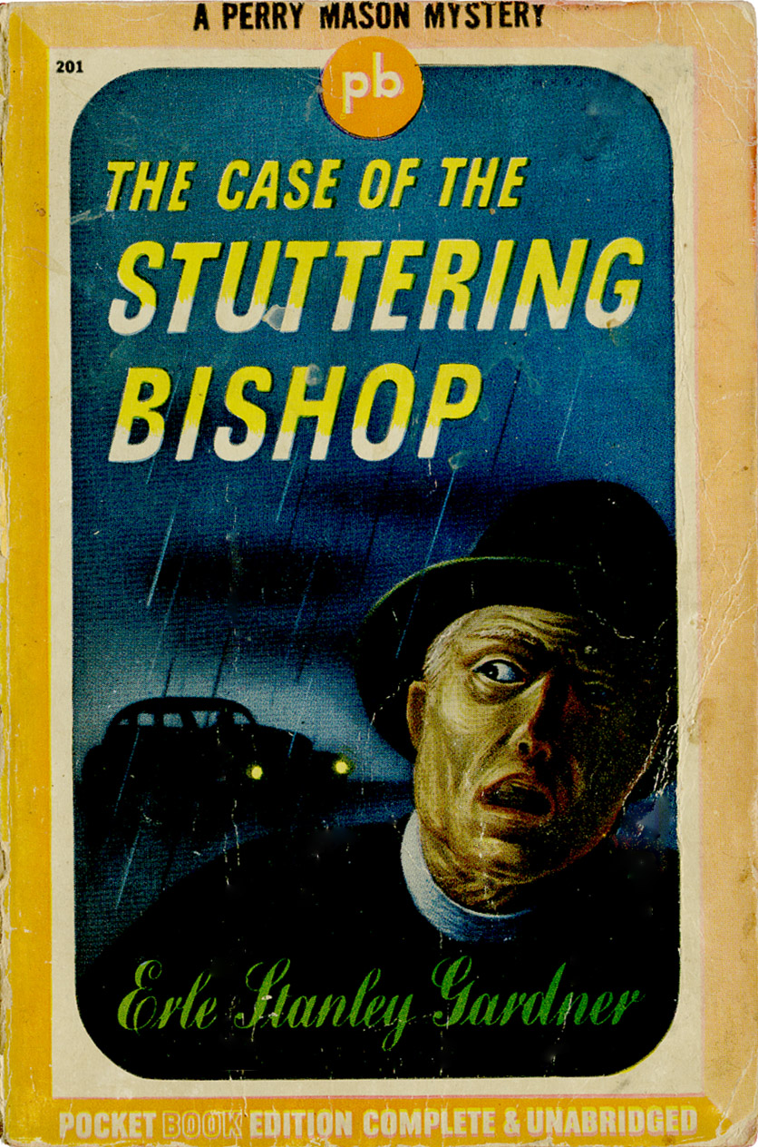
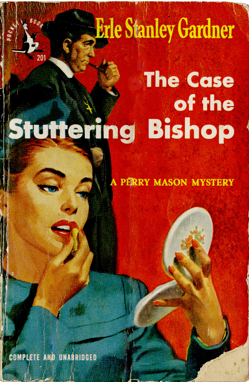
Two covers for the same book published five years apart by the same company. How could they be so very different in such a short time?

This first one is from 1943 and includes on the first page:
In order to cooperate with the government's war effort, this book has been made in strict conformity with WPB regulations restricting the use of certain materials.
Editorial decided to, I guess, take a more literal direction for the cover illustration. Okay, the Bishop looks a bit like the Crypt Keeper, but that's coming from my 2010 perspective, not 1943.

Perry Mason_Stuttering Bishop_1943_tatteredandlost

Mason_Stuttering Bishop_43_tatteredandlost

Paperback books were still relatively new when this one was marketed so perhaps they hadn't really grasped the idea of splashing sexy babes and rugged guys on the cover. Still, Pocket Books put out 8 editions of this book in 1943. Have no idea if they all had this cover. This one is a second printing.

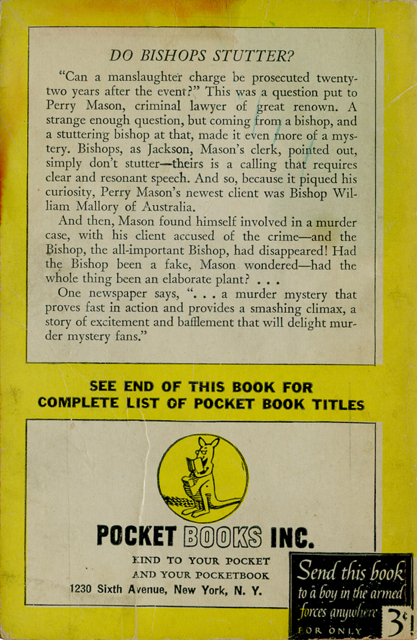
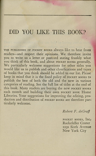
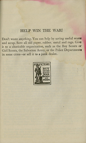
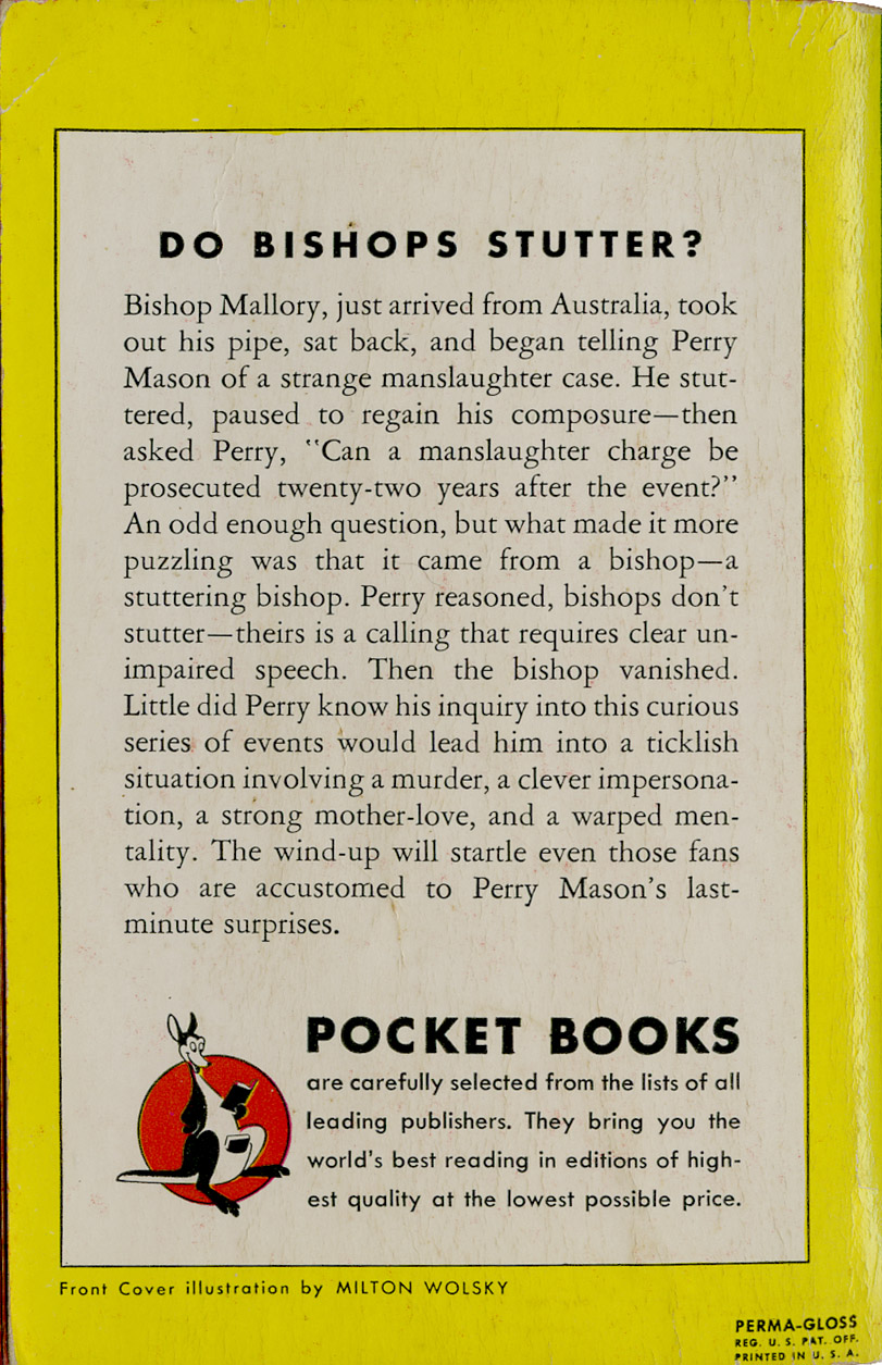
Notice on the back cover the "Send this book to a boy in the armed forces anywhere for only 3¢". And below are a couple pages from the interior. One is Pocket Books speaking to their buyers. The other is trying to show support for the war effort.

Mason_pocket book_tatteredandlost

Mason_help win the war_tatteredandlost

By 1948 the war was over and the boys were back and babes were primping. No stuttering Bishop on this cover. This was the 22nd edition by Pocket Books.

Perry Mason_Stuttering Bishop_1948_tatteredandlost

Mason_Stuttering Bishop_48_back_tatteredandlost

Brief history of Pocket Books thanks to Wikipedia:
Pocket produced the first mass-market, pocket-sized paperback books in America in early 1939 and revolutionized the publishing industry. The German Albatross Books had pioneered the idea of a line of color-coded paperback editions in 1931 under Kurt Enoch; Penguin Books in Britain had refined the idea in 1935 and had 1 million books in print by the following year.

In 1944, the founding owners sold the company to
Marshall Field III, owner of the Chicago Sun newspaper. Following his death, in 1957, Leon Shimkin, a Simon & Schuster partner, and James M. Jacobson bought Pocket Books. Simon & Schuster acquired Pocket in 1966.

Penguin's success inspired entrepreneur Robert de Graff, who partnered with publishers Simon & Schuster to bring it to the American market. Priced at 25 cents and featuring the logo of Gertrude the kangaroo (named after the artist's mother-in-law), Pocket Books' editorial policy of reprints of light literature, popular non-fiction, and mysteries was coordinated with its strategy of selling books outside the traditional distribution channels. The format size, and the fact that the books were glued rather than stitched, were cost-cutting innovations.

The first ten numbered Pocket Book titles:

Lost Horizon by James Hilton
Wake Up and Live by Dorothea Brande
Five Great Tragedies by William Shakespeare
Topper by Thorne Smith
The Murder of Roger Ackroyd by Agatha Christie
Enough Rope by Dorothy Parker
Wuthering Heights by Emily Brontë
The Way of All Flesh by Samuel Butler
The Bridge of San Luis Rey by Thornton Wilder
Bambi by Felix Salter

The edition of Wuthering Heights hit the best-seller list, and by the end of the first year Pocket Books had sold more than 1.5 million units. Robert de Graff continued to refine his selections with movie tie-ins and greater emphasis on mystery novels, particularly those of Christie and Erle Stanley Gardner.

Pocket and its imitators thrived during World War II because material shortages worked to their advantage. During the war, Pocket sued Avon Books for copyright infringement: among other issues, a New York state court found Pocket did not have an exclusive right to the pocket-sized format (both Pocket and Avon published paperback editions of Leslie Charteris' The Saint mystery series, among others). (SOURCE: Wikipedia)
Okay, I love that the kangaroo logo is based on the original artist's mother-in-law. So who did the update in 1948? Had the mother-in-law gotten younger and perkier? She apparently had lasik surgery or was wearing contacts.

And, one other little bit of information is that Pocket Books is headquartered in the same location it was in 1943. I guess once you get a good spot in Manhattan you sit on it. Just as Gertrude, the kangaroo.

4/8/10

DON'T JUDGE ANYTHING by its cover


Gilligan at Retrospace had a fun post today complaining about DVD covers versus the films original posters. Video releases of old films rarely live up to the advertising budget that was spent when the film was new. By now what the film is about is already part of our vocabulary thus the need for images to market isn't the same. There are a lot of variables that go into marketing something old, and one of them is how to market to the current audience.

Books are the same. Take a classic like Dickens Oliver Twist and dig up how many different book jackets/covers have been designed over the years and you probably won't have enough shelf space for all of them. And for each reissue of the title what did editorial think was the image to put forth for the market of the day?

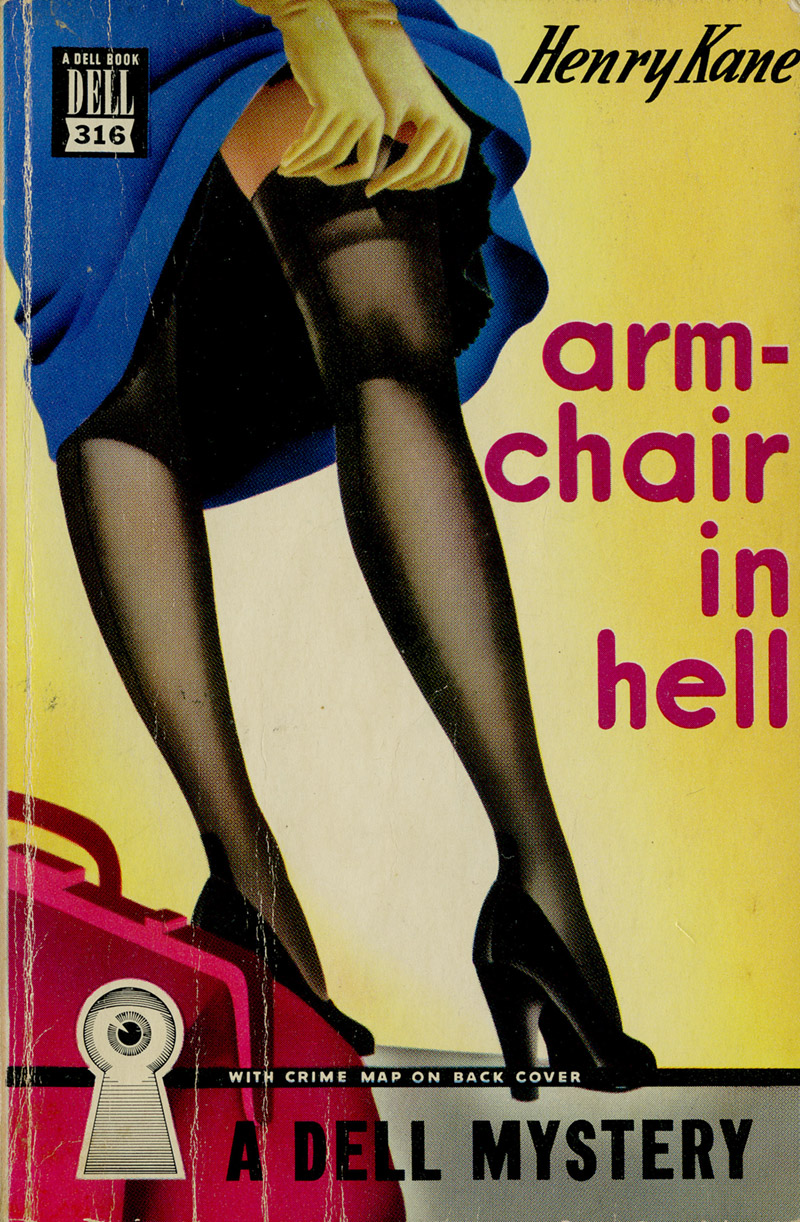
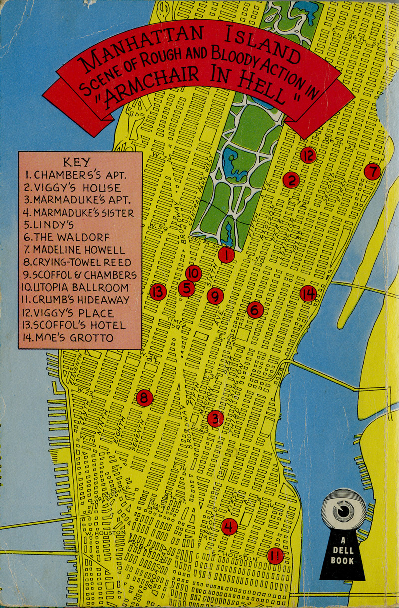
Even trashy paperbacks vary from decade to decade, go through various cover designs. The one below is one in my collection. I have no idea what this book is about from this cover and the reissue I found online (to the left) doesn't make things any clearer. Editorial wasn't really marketing the story in either edition. They were marketing sex. That was their only interest. The one to the left was from 1956, the one below is from the 1940s. (To see the one to the left larger click here. The site also offers some sort of way to turn the cover into a puzzle.)

Armchair in Hell_front_tatteredandlost

Armchair in Hell_back_tatteredandlost
Click on either image to see them larger.

I bought this book for the cover. Plain and simple. I found it in a used book store and loved the illustration. It was part of the Dell "eye-in-the-keyhole" or "mapback" series. This was book no. 316 and included a map on the back showing heaven knows what. The front cover would work today, it's timeless.
Dell's earliest venture into paperback publishing began because of its close association with Western Publishing. ". . . Dell needed paper, which Western had in 1942, and because Western by this time needed printing work, which Dell could supply in the form of its new paperback line. So Dell Books was born, created by Delacorte of Dell and Lloyd E. Smith of Western."Dell began publishing paperbacks in 1942 at a time when mass-market paperbacks were a relatively new idea for the United States market — its principal competitor, Pocket Books, had only been publishing since 1939. An examination of paperback books available at this time shows no consensus on standardization of any feature; each early company was attempting to distinguish itself from its competitors. "Dell achieved more variety than any of its early competitors. It did so, at first, with an instantly identifiable format of vibrant airbrushed covers for its predominantly genre fiction, varying 'eye-in-keyhole' logos, maps on the back covers, lists of the books' characters, and 'tantalizer-pages'. The design was merchandising genius; it successfully attracted buyers, it sold books."

The first four books did not feature maps on the back cover; this began with Dell #5, Four Frightened Women by George Harmon Coxe. (A later re-issue of Dell #4, The American Gun Mystery by Ellery Queen, added a map.) The map was meant as an aid to the reader, to show the location of the principal activity of the novel. Some were incredibly detailed; others somewhat stylized and abstract. The books were almost immediately known as "mapbacks", and that nomenclature has lasted among collectors to this day. The maps were "delicate and detailed".

The novels in the mapback series were primarily mysteries/detective fiction, but ran the gamut from romances (Self-Made Woman by Faith Baldwin, #163) to science fiction (The First Men in the Moon by H.G. Wells, #201), war books (I Was A Nazi Flyer by Gottfried Leske, #21 and Eisenhower Was My Boss by Kay Summersby, #286), many westerns (Gunsmoke and Trail Dust by Bliss Lomax, #271), joke books (Liberty Laughs, Cavanah & Weir, #38), and even crossword puzzles (Second Dell Book of Crossword Puzzles, ed. Kathleen Rafferty, #278, one of the rarest titles today). There were a few movie tie-in editions (The Harvey Girls by Samuel Hopkins Adams, #130, and Rope as by Alfred Hitchcock, #262) and the occasional attempt at more artistic non-genre fiction (To A God Unknown by John Steinbeck, #407). Novels which are today long forgotten, by largely unknown authors (Death Wears A White Gardenia, by Zelda Popkin, #13) are in the same series as valuable original paperback editions of famous authors (A Man Called Spade, by Dashiell Hammett, #90). "The back cover map was very popular with readers and remains popular with collectors . . . the Dell "mapbacks" are among the most well-known vintage paperbacks." (SOURCE: Wikipedia)
To see an example of a dreadful book jacket where they tried to be too literal with something in the plot take a look at my post AARON MARC STEIN, The Dead Thing In the Pool. They'd have been smarter trying to sell sex.

4/7/10

THE LITTLE TRAIN that did


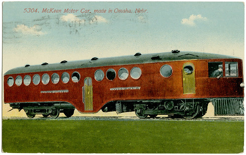
I don't know where he's going, but I'd be happy to take a ride.

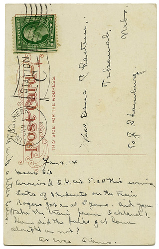
I love this little self-contained internal combustion-engined train car. There were only 152 of these built between 1905 and 1917 by the McKeen Motor Car Company in Omaha, Nebraska. This postcard was sent on January 4, 1914. Lucky lady got to ride on one.

It's just, dare I say it...cute. All those portholes down the sides make me think of being aboard ship.

I'd love to have one of these little cars fixed up, placed on the rails, and enough time and money to wander all over the continent. What a dream. Just putter along in your own little car with enough windows to see everything.

McKeen Motor Car_1914_tatteredandlost
McKeen_1914 post card_tatteredandlost
Click on either image to see it larger.

There are several sites with information about the McKeen company and the history of the little cars.
History of the McKeen Motor Car - includes a photo of the interior seats)

The McKeen Motor Car - includes an old photo of one that was used as a diner in Carson City, NV


Nevada Appeal - an article about the restoration of car No. 22 for the Nevada State Railroad Museum
And if you're going to be near Carson City, Nevada on May 9, 2010...
V&T McKeen Motor Car Celebration – Sunday, May 9, 2010
The Nevada State Railroad Museum, Carson City, NV, announces that it will celebrate both the 100th birthday (to the day) of the delivery of McKeen Motor Car, V&T No. 22 to the railroad in Carson City and the completion of the decade-long restoration of the car at the museum on Sunday, May 9, 2010. The celebration will get underway at Noon on Mother’s Day, May 9th on the platform of the historic Wabuska Depot. Numerous Local, State and Federal officials and noted railroad historians have been invited to attend and participate. The Bernhard family, donors of the car will be honored guests. During the ceremony a representative of Preserve Nevada will announce the 2010 list of the “Eleven Most Endangered Historic Places” in Nevada.
To read more about this celebration click here. I'm thinking I need to make a trip over the mountain this spring to Reno and Carson City.

All aboard!

4/6/10

A LITTLE FRESH AIR never hurt anyone


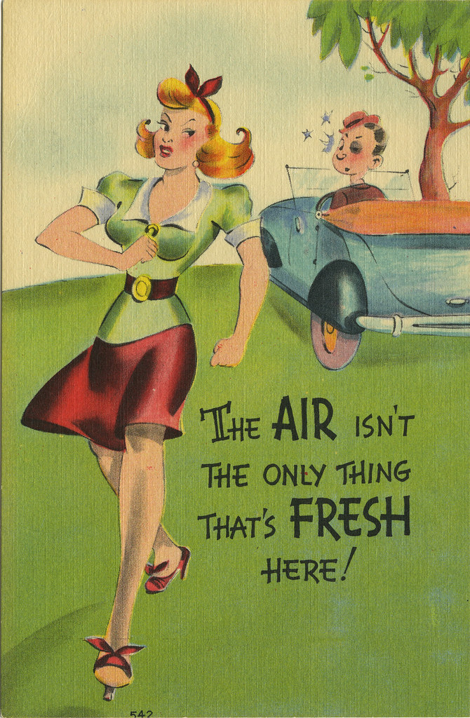
I've always loved this silly card. It belonged to my maternal grandmother. I love the illustration style, the colors, and the handlettering. I know nothing about the artist, which is a shame. It was so rare that a post card artist was given credit. Of course, the two I showed yesterday...don't really care. But this one I'd like to know about the person and I'd like to see more of their silly cards.

fresh air_tatteredandlost
Click on image to see it larger.

This one was also printed by the Metropolitan Lithograph Company, the company responsible for the two I showed yesterday. The card includes the logo of the "M" in a circle. On this one no publisher is indicated. I'd say this one dates to the mid-to-late 1940s.

If anyone has any cards that look like they might be by the same artist I'd love to see them.

4/5/10

SNICKER OR RIP-SNORT, it's still barely funny


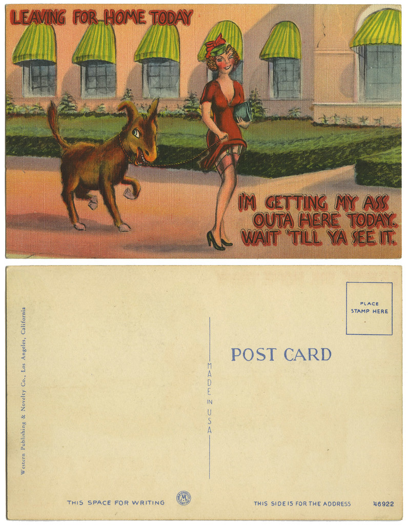
Western Publishing_donkey_tatteredandlost

Do they still make post cards like these? I call them "snicker" cards because really about the best I can do when seeing them is snicker. I worry about people who find them thigh slapping tears running down their face funny. Nope. The best I can do is snicker or, if it catches me in the right moment, perhaps a light rip-snort.

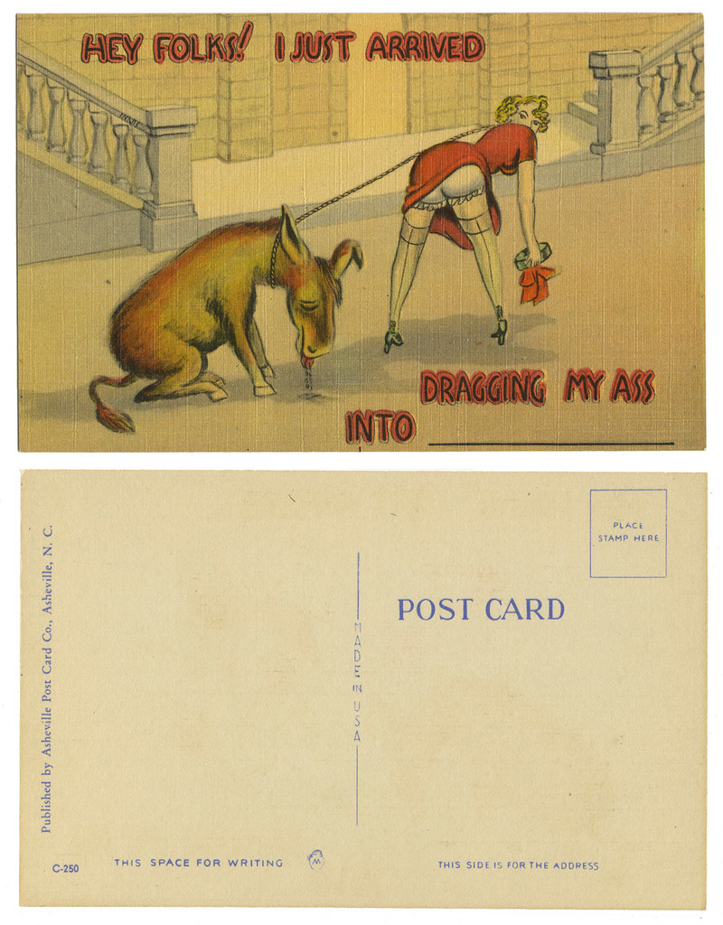
Asheville Post Card_donkey_tatteredandlost

The printing of these is sort of strange. The first says it's from the "Western Publishing & Novelty Co." located in Los Angeles. The second is from the "Asheville Post Card Company" located in Asheville, N.C. Drawn by the same person? I don't know. The lettering certainly looks the same, but that was probably put on later. Neither could be considered particularly good art. The face of the woman on the first card is incredibly bad, not that the back end on the other looks much better.

What I find most confusing is how similar the cards are and yet by different companies. But then we get down to the little almost insignificant logo. Each card has a different logo, but each features the letter "M". The first logo indicates the card was printed by the Metropolitan Lithograph Company that was located in Everett, Massachusetts. Is the second card also by them with a different logo which also featured an "M"?

If imitation is the sincerest form of flattery then who the heck was copying? Which "ass" card came first? And why were "ass" cards popular? Okay, sorry if I offended by referring to them as "ass" cards, but "donkey" or "burro" would have made the punch lines fall flat...on their ummmmmm...keister.

Oh no, I suppose this is a category. I will need to collect more. Then again, maybe not. Two is enough.

4/4/10

Happy Easter stickers


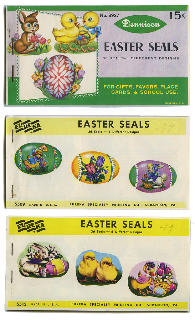
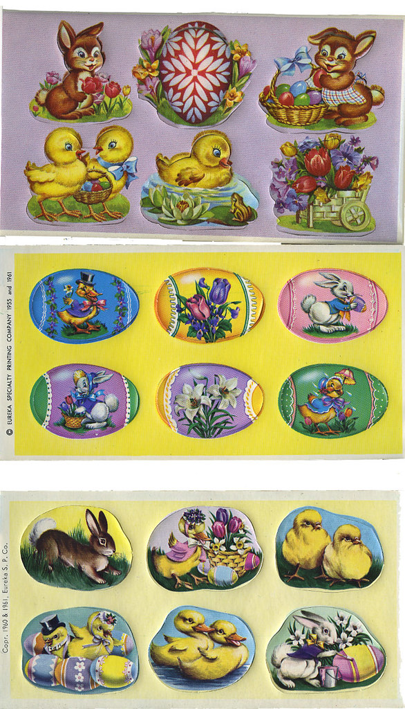
Found this in the bottom of a box at the flea market last year. 5 packets of Easter stickers, 3 for Valentine's Day. "How much?" The guy was busy. "A dollar." I left happy. The only thing I found that day worth buying.

I think if you click on these the larger images would be a decent enough size for you to print out for the wee ones.

Happy Easter.

sticker book covers_tatteredandlost
inside sticker books_tatteredandlost
Click on images to see them larger.

4/3/10

The battle for EASTER!


Christine at The Daily Postcard has today posted substantial evidence that there is a battle each Easter that we might not have even been aware existed. No, I'm not talking the Christians versus the Romans. She's pointing out the battle between the Bunnies and the Chickies. Battle indeed!

I will now provide evidence of the Trojan Egg.

"Heeeeeeeeeeeeeeere's Chickie!"


Click on image to see it larger...if you dare!

WHAT DID YOU WANT TO BE when you grew up?


From the April 1974 Cricket. Illustration by Maurice Sendak. Words by Ruth Krauss.


Click on images to see them larger.

4/2/10

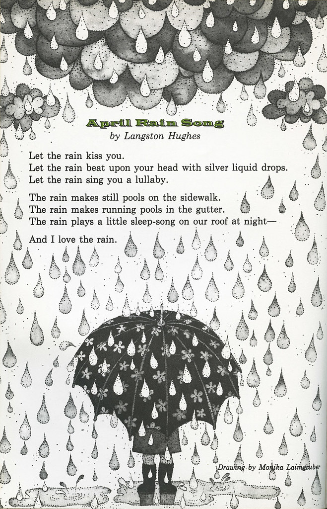
APRIL Showers


April Rain Showers_Crickett_April 1974_tatteredandlost
Click on image to see it larger. (SOURCE: April, 1974 Cricket)

Poem by Langston Hughes. Illustration by Monika Laimgruber.

Click here to go to my other site to hear Mel Torme sing April Showers.

4/1/10

LET'S TALK ABOUT HANDS, shall we?


My hands have reached the point where they show my age. Oh, heck, my whole being shows my age. Somedays I look 80+ and feel it. Other days, if the light catches me just right in a store window I look...who am I kidding. I look old. My mind is still 12, but my body and brain apparently aren't keeping in touch anymore. I'm lucky that my face isn't lined and there are no bags under my eyes. But oyyyyyyyy, some days...my hands. I look down and think, "Who do these belong to?" There's a whole Creature from the Black Lagoon thing going on when I notice them.

Well, let us step back in time to 1942 with the following ads, both from the March Cosmopolitan with Lana Turner on the cover. (What did Lana do when her hands started looking old?)

Jergens ad_1942_tatteredandlost
Click on image to see it larger.

Jergens Lotion. The company is still in business. I have a little travel size bottle that's been around since probably the 1960s or '70s that still contains lotion, still with the same nice fragrance. I keep it in the cupboard with all my old tins and various vintage packaging. But then there's this ad:
"Jergens Lotion smooths on in a jiffy--never feels sticky."
Was this a serious problem back in the '40s. Was there a need for jiffy lotion? Did other lotions take an interminable amout of time to apply? I get the whole "never feels sticky" part, but the jiffy part? I guess I've just never felt that hand lotion was taking up too much precious time.

I love the way they're trying to convince woman with short stubby fingers that Jergens will solve their problem. No, it won't miraculously elongate your fingers but...
"Rather short fingers indicate a capable hand. And this "achieving" hand can be romantic, too."
Well, that's good to know because seriously the only thing that comes to mind with short fingers that are achieving is milking a cow. Good farm hands is what they're saying. You can have good farm hands and still there's a guy out there for you. Which brings me to the next product...
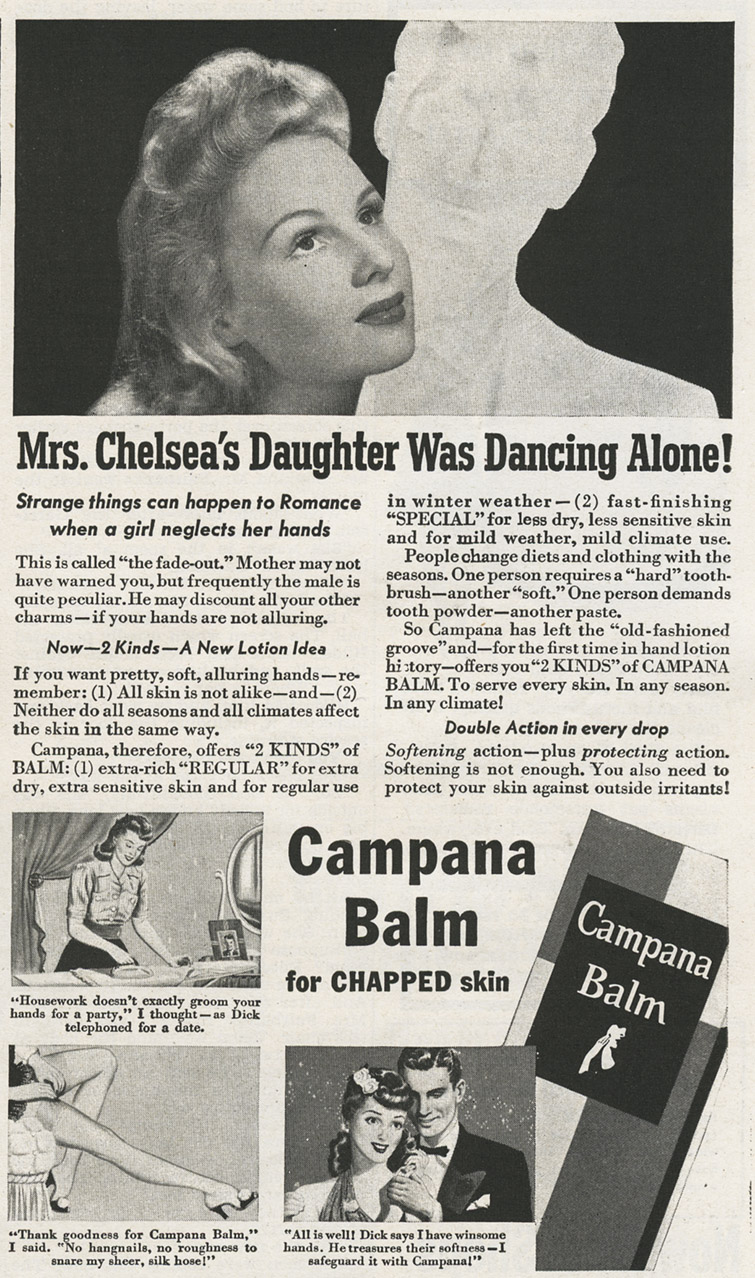
Campana Balm_1942_tatteredandlost
Click on image to see it larger.

Campana Balm. I don't know why, but whenever I hear the word "balm" I think of a cow's udder. Perhaps it's because I still have some old Watkins products from the 1930s when my paternal grandfather was a Watkin's dealer. I know on one of the tins it says something about udders. The product was good for humans and cow udders. It was a balm. I shall not mention udders again in this post. I'm through with udders. There, I just said it again.
"Strange things can happen to Romance when a girl neglects her hands. This is called "the fade-out." Mother may not have warned you, but frequently the male is quite peculiar. He may discount all your other charms--if your hands are not alluring."
Okay, seriously? I needed Campana to tell me "frequently the male is quite peculiar"? And today, with everyone and their mother figuring they could write a screenplay "fade-out" just means a transition from one scene to the next. I never knew it was what you called the situation when the guy never calls back. I've experienced enough fade-outs. Perhaps it was because I didn't have "winsome hands." Yes, that's what it says below the last image panel.
"All is well! Dick says I have winsome hands. He treasures their softness--I safeguard it with Campana!"
Here's the deal. Campana Balm used to be called Italian Balm until WWII came along. Then people didn't like Italian things so much. You know, it was like...fogetaboutit. So they changed their products name to Campana after the Canadian doctor who invented it. Okay, that makes sense...but why was it originally called Italian Balm? Have no idea, but here's a little bit of history about the company. All signs lead to Dow Chemical:
The Campana Company began business in 1927. The imposing building at the northwest corner of Fabyan Parkway and Rt. 31 was built to house the Corporation in 1937. In it was manufactured the popular product, Italian Balm, a hand lotion and a number of other feminine products. During World War II, when Italy was an enemy of the United States, Ernest Oswalt, the company's founder, changed the name of his balm to Campana Balm after the Canadian doctor from whom he had purchased the formula.

The unique Campana Building, designed by architects Frank D. Chase and William James Smith, is an all-steel frame building with glass blocks and bricks used extensively in the design. Inside the lobby are Deco bathing ladies that can be seen through the second-level windows. The Campana Tower is a landmark in the valley and encases a 45,000 gallon water tank used for water circulation for air conditioning and fire sprinklers.

In June 1962, Campana Corporation became a member of the Purex Corporation of California, a subsidiary of Allied Laboratories. In 1960, Allied merged with Dow Chemical Company. The company's products continued to be made in Batavia until operations were eventually moved to other facilities out of state.

Ernest Oswalt was one of the first entrepreneurs to see the value of media advertising. He used newspapers, magazines, billboards, and radio to get his message out. Oswalt hired Florence Ward, a fiction writer who lived in Batavia, to write radio scripts for the company's famous "First Nighter" radio program. Italian Balm was introduced nationally through this show. The program was a fixture on radio in American homes for twenty-two years. (SOURCE: Batavia Historical Society)
Okay, what other "feminine products" did they make? I'm sorry, but my first thought when I read this is Italian sanitary napkins. What exactly would have set apart Italian sanitary napkins from those made by other companies? Make up your own jokes here, I'm not touching it.

Now, if you like historical buildings, art deco style, take a look at the old Campana HQ located in Illinois at the following links: Landmarks Illinois, Agilitynut.com, and Waymarking.com.

So, what have we learned the last two days?

1. Massage your gums if you want to get people applauding when you play the piano.
2. If you've got bad breath you might want to buy yourself a nice headstone.
3. If you're short on time buy Jergen's products.
4. If you don't use Campana Balm you might end up like Billy Idol "Dancing with Myself."

Let's see...which body part to worry about next?

One last thought...if an Italian has dry hands does it impede their ability to talk? I'm just askin'?